
Wild Bessie Outdoorwear
Vik Bailie had been sea swimming long enough to know the problem intimately. You emerge from the water, hands numb, skin damp, and need to get dressed quickly and warmly. The options available — bulky, unflattering, designed for function with no consideration of style — consistently fell short. So she sketched something better, found a fellow swimmer who could sew, and between them invented a category of clothing that didn't really exist yet.
Wild Bessie began with fleece-lined soft cord trousers and dungapettes — a cross between dungarees and salopettes, designed without zips or buttons so they can be pulled on easily over damp skin with cold hands. Practical, warm, genuinely stylish. Alongside the clothing, a multi-use blanket that doubles as a changing robe and a wet kit carrier.
The ambition behind the brand was significant from the outset. Vik had worked as brand marketing and comms director at Skyscanner before leaving to focus on family — she understood brand building, she understood audience and she understood what it took to build something with genuine market presence. The dream was to do for post-swim trousers what DryRobe had done for changing robes: define the category and own it.
The brief
The brand needed to feel like the women it was made for. Active, unpretentious, part of a community. Confident enough to stand alongside established outdoor lifestyle brands — Patagonia, Lucy & Yak, Passenger — without borrowing their aesthetic. Anything twee, fussy or overtly feminine was off the table from the start.
The tone Vik described was specific and useful: down to earth, able to laugh at itself, self-deprecating in a thoroughly British way, honest about what the brand wasn't yet and excited about what it was becoming. The language of wild swimming — Baltic, chittery, arms aloft — was part of the cultural territory the brand needed to inhabit comfortably.
Inclusivity wasn't a marketing position. It was a founding value. All sizes, all ages, real women who actually live the outdoor lifestyle — not young leggy models in studio shots.
Words from the client
“Sarah is just a superstar. Her creativity, enthusiasm and understanding of what I was looking for were just way beyond what I was even hoping for. I love the results so much.”
The identity
The logomark sits at the centre of the identity and carries the most creative thinking. The brief pointed towards raised arms — the universal gesture of someone who has just emerged from cold water feeling absolutely brilliant about it — and from that starting point the design explored negative space, symbolism and the multiple references a single mark could hold simultaneously.
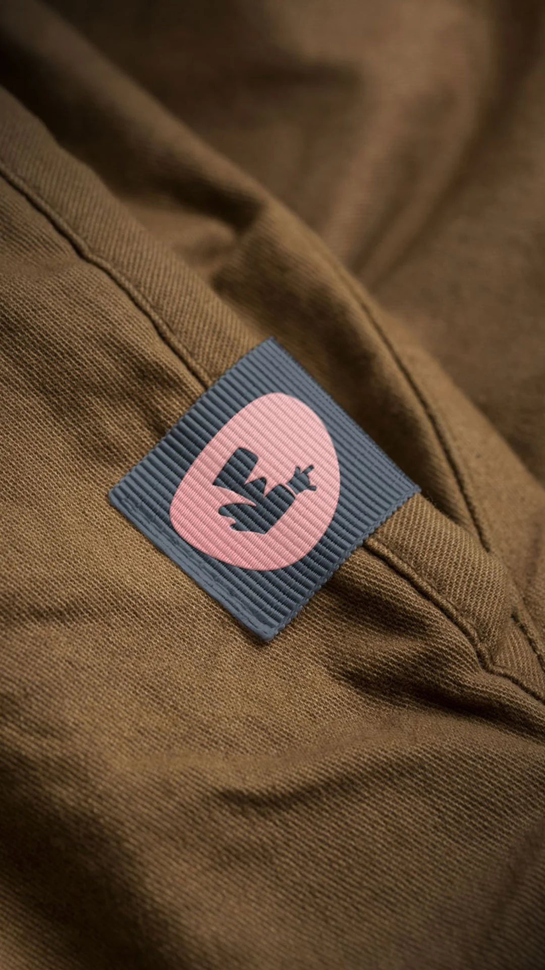
The final icon works on several levels at once. Arms raised in joy and freedom. The suggestion of a cresting wave. A road disappearing into mountains. The Hawaiian shaka — the hand gesture of surfers and outdoor communities — woven into the form. None of these readings demand to be noticed, but each one rewards it. That kind of layered meaning in a logo mark is harder to achieve than it appears and gives the brand genuine depth without visual complexity.
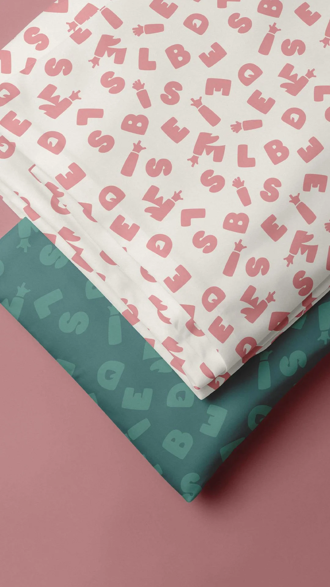
The colour palette carries the brand's energy. Coral pink — joyful and spirited without being saccharine. Teal — the colour of cold water and forest paths in equal measure. Yellow bringing brightness and warmth. Secondary tones of peach, light blue and slate give the system range and grounding, allowing the brand to flex between the exhilaration of an outdoor adventure and the warmth of coming home afterwards.
A system built to scale
The logo system was developed across a primary lockup for general use, a secondary lockup for flexible applications and a standalone icon mark for smaller spaces — garment labels, stickers, social avatars. For a product-led brand where the logo needs to work on swing tags, clothing labels, packaging tape and blanket prints as well as digital channels, that range of variants is a practical necessity rather than a nice-to-have.
Brand guidelines were developed to give Wild Bessie the tools to roll out consistently across social channels, new products and printed collateral as the business grows — without needing to return to the design process every time something new is added.
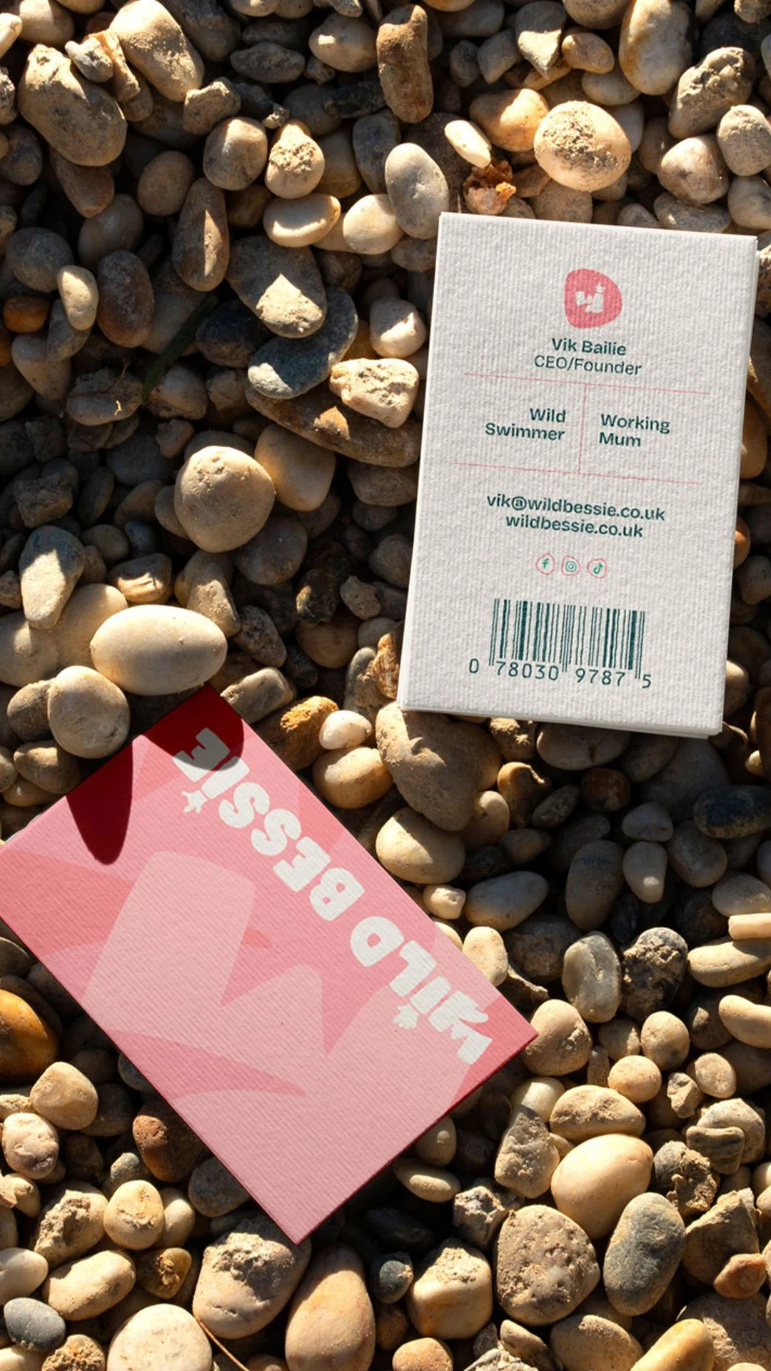
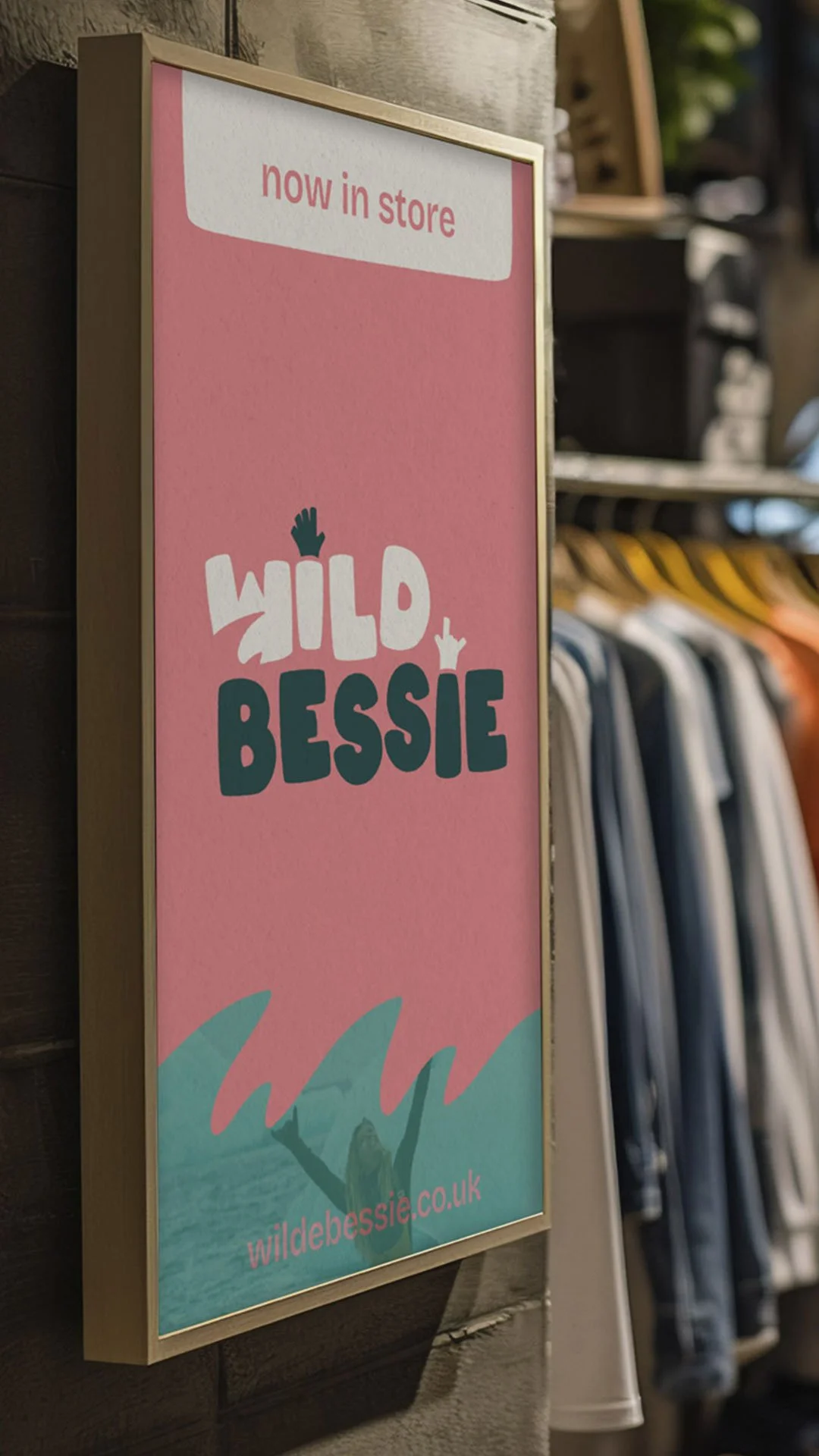
Mockups across swing tags, products, social media and business cards demonstrated the identity in context, giving a clear picture of how the brand would read in the real world before a single product had been manufactured at scale.
What it stands for
Wild Bessie is a brand with genuine values behind it. Ethical production, size and age inclusivity, a commitment to transitioning to recycled fabrics, a community orientation that prioritises real women over aspirational imagery. Those values aren't decorative — they're the reason the brand exists and the reason its audience will choose it over alternatives.
The visual identity was built to carry those values clearly. Nothing about it is performative or positioned. It looks like a brand founded by someone who actually does what the product is for — because it was.
We can help bring your independent clothing business to life by creating the perfect branding.
