
Panmuir Property Developers
Panmuir Developments was founded in 2022 to fill a specific gap in the Edinburgh and East Lothian construction market. Between sole traders and larger regional firms, there was room for a business that could offer the flexibility and personal attention of the former alongside the operational and financial rigour of the latter.
The target client was clear from the outset: relatively affluent professionals and families, predominantly in East Lothian and Edinburgh, working through the building planning process and looking for a contractor they could genuinely trust. People who understood the value of a referral, did their due diligence and weren't necessarily looking for the cheapest option — but expected to get what they paid for.
The challenge inherent in launching into that market is that trust is built through track record, and track record takes time. The brand had to do some of that work in the interim — communicating quality, reliability and professionalism before the portfolio existed to prove it.
The brief
Anton came with a clear sense of the values the brand needed to reflect: doing what you say you'll do, being solution-based, operating with transparency and remaining flexible when the project demands it. Practical, honest, commercially grounded. Professional without being stiff.
The name itself was deliberately chosen for clarity. Panmuir — uncluttered, easy to pronounce and remember — was designed to become the working name the business was known by, with Developments Limited retained for credibility in formal contexts. The identity needed to reflect that thinking: clean, purposeful and built for longevity.
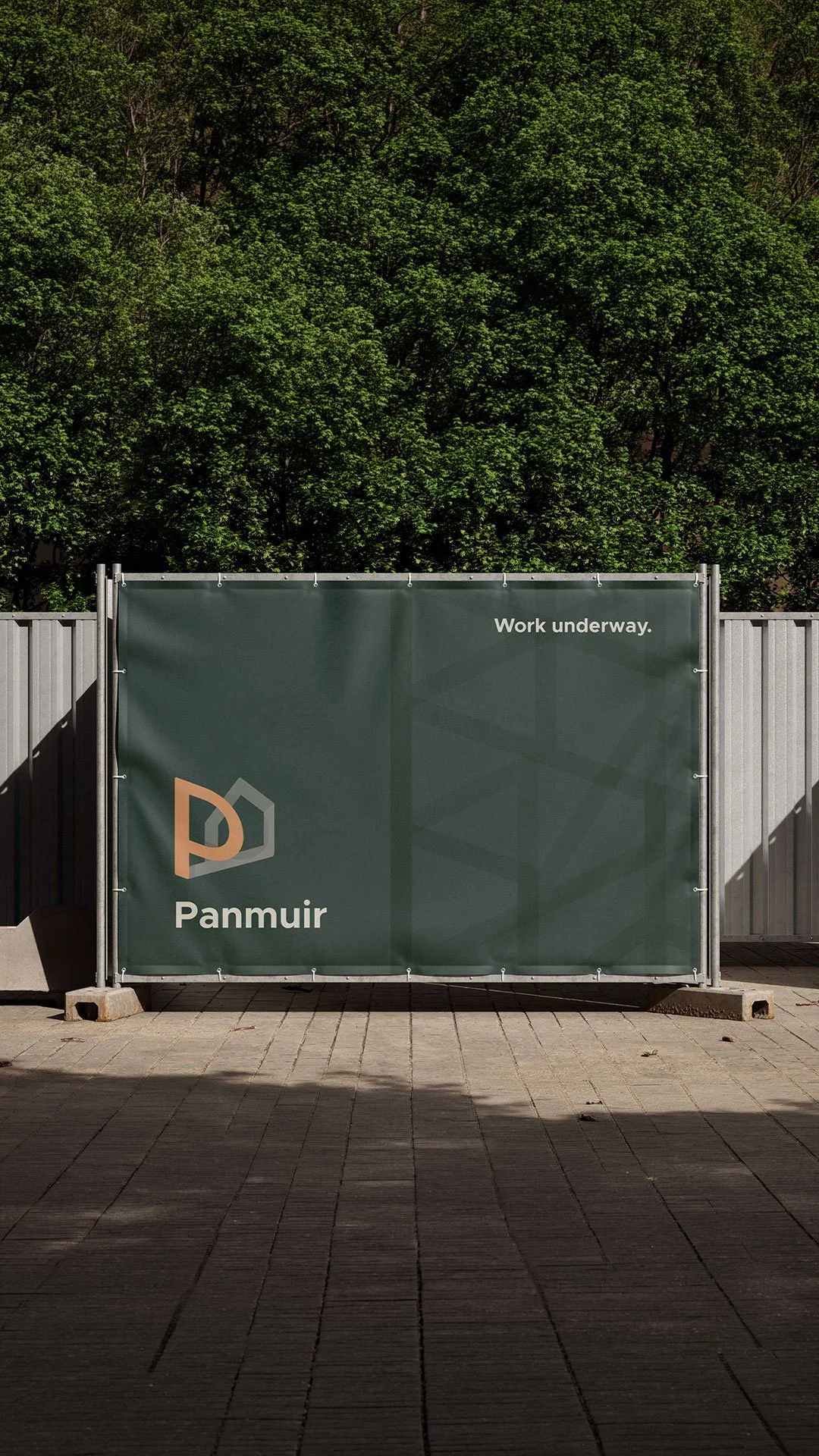
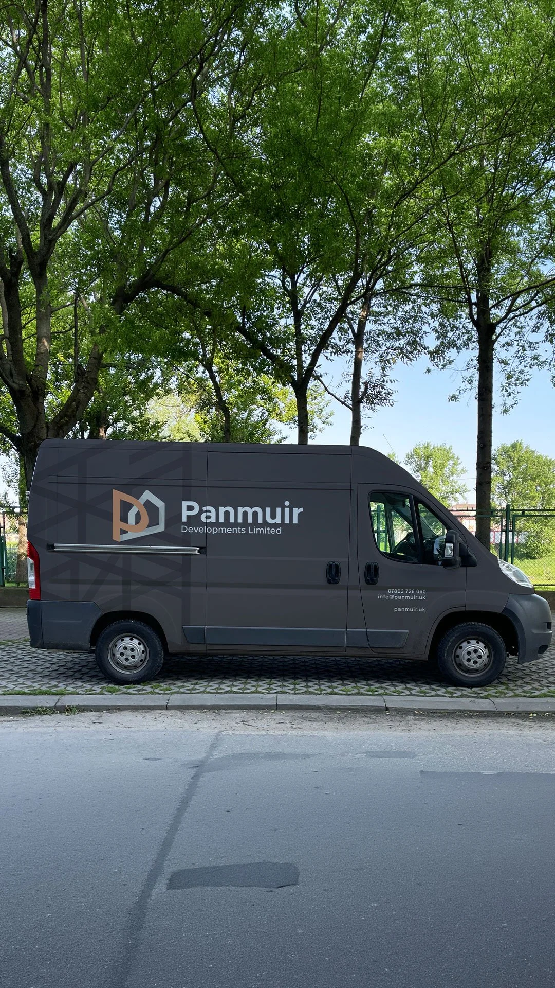
The practical applications were demanding from the outset. Site signage, Heras fencing, team clothing, vehicle graphics, stationery. A construction brand lives in physical environments at large scale, often in prominent locations — it needs to hold up under those conditions and make an impression while doing it.
The identity
The logo development centred on an abstract P mark — a structural anchor designed to reference both the gable end of a building and the solid foundations the business was built on. It's the kind of mark that communicates industry without being literal about it: architectural in its proportions, stable in its form, distinct enough to be immediately recognisable on a site hoarding or vehicle door.
The colour palette drew from the natural materials that quality construction uses and references. Dark greens, timber tones, subtle concrete neutrals. These aren't arbitrary choices — they carry associations of strength, craft and environmental awareness that align with how Panmuir positioned itself relative to more generic developer branding. The timber shade in particular became a key visual identifier, bringing warmth to an identity that could easily have read as cold or corporate.
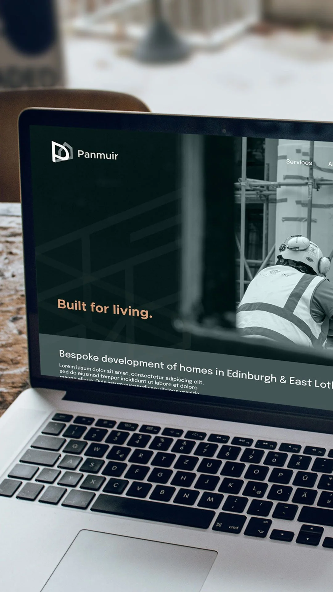
Typography was selected for its combination of modern simplicity and distinctive character — clean enough to be versatile across print and digital, considered enough to feel like a deliberate choice rather than a default.
The isometric blueprint
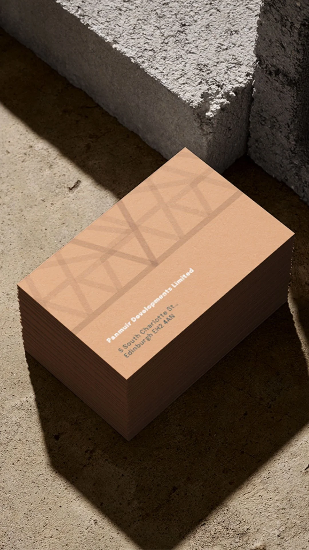
Alongside the core identity, an additional pictogram was developed — a grid-based graphic derived directly from the letterforms of the Panmuir name, which we named the isometric blueprint. The connection between the visual pattern and the brand name adds a layer of considered meaning that rewards closer inspection, referencing both the precision of architectural planning and the meticulous attention to detail that Panmuir's work demands.
It's the kind of supplementary asset that gives a brand system genuine depth — something that works as a background texture, a print element or a decorative motif without ever feeling arbitrary or decorative for its own sake.
Designed for the real world
Mockups across site signage, Heras fencing panels, vehicle graphics, stationery and business cards were developed to demonstrate how the identity would function in the environments it actually needed to inhabit. For a construction firm, those environments are often far more demanding than a screen — a brand that looks considered on a business card has to hold up just as well across a twelve-metre hoarding.
That real-world focus shaped the design decisions throughout. Contrast, scale, legibility at distance — the identity was built with those requirements in mind from the outset rather than adapted for them after the fact.
What it establishes
For a business entering a market where credibility is everything and where the most powerful form of marketing is a recommendation, a brand that looks genuinely established from launch carries real commercial value.
Panmuir Developments now has an identity that reflects the quality and professionalism of the business it represents — warm enough to feel approachable, considered enough to inspire confidence and built to grow as the company does. When the portfolio of completed projects grows to match it, the brand will already be doing its job.
Looking for a brand starter kit for your luxury property development business?
