
The Bonnie Wee Bothy
The Bonnie Wee Bothy sits on a farm in East Lothian, right on the John Muir Way. Off-grid, built by local craftsmen, designed for couples and walkers who want to step away from everything for a few days. The idea came to founder Missy one evening in a bell tent, looking out over the farm, and the philosophy that followed has shaped every decision since: do one thing properly before doing the next, and make the experience genuinely worth coming back for.
A tree is planted for every stay. Welcome hampers are filled by local suppliers. The huts are built from scratch, not ordered from a catalogue. The commitment to sustainability and place runs through the whole business — and the brand needed to carry all of that without having to explain it.
The brief
East Lothian has a growing hospitality market, but Missy identified something specific that was missing: shepherds' huts built by hand, in a genuinely secluded location, with the kind of attention to detail that makes a stay feel considered rather than commodified. The brand needed to reflect that distinction — rustic and warm, but with enough personality and polish to stand clearly apart from more generic glamping offerings.
The tone was equally clear. Quirky, outdoorsy, comforting. The kind of brand that makes someone stop scrolling and think — what's that? — before they've read a word.
Words from the client
“When Sarah presented her initial draft, it was spot on, she absolutely nailed it on the first try! What we loved most about working with Sarah is how she just “gets it.” Even with our million ideas at the start, she asked the right questions and guided us to narrow down our vision. We couldn’t be happier with the final result and would highly recommend Studio Creates to anyone needing help with branding, websites, or any aspect of design. They truly know it all!”
The identity
The creative process began, as it always does, with moodboarding and close conversation with Missy about what the bothy experience actually felt like — what colours, textures and references rang true. Rustic charm, natural comfort, a touch of gentle eccentricity. The East Lothian landscape provided the palette: soft earthy tones with the warmth of interiors done thoughtfully, and vibrant accents that brought the personality of the place through without tipping into novelty.
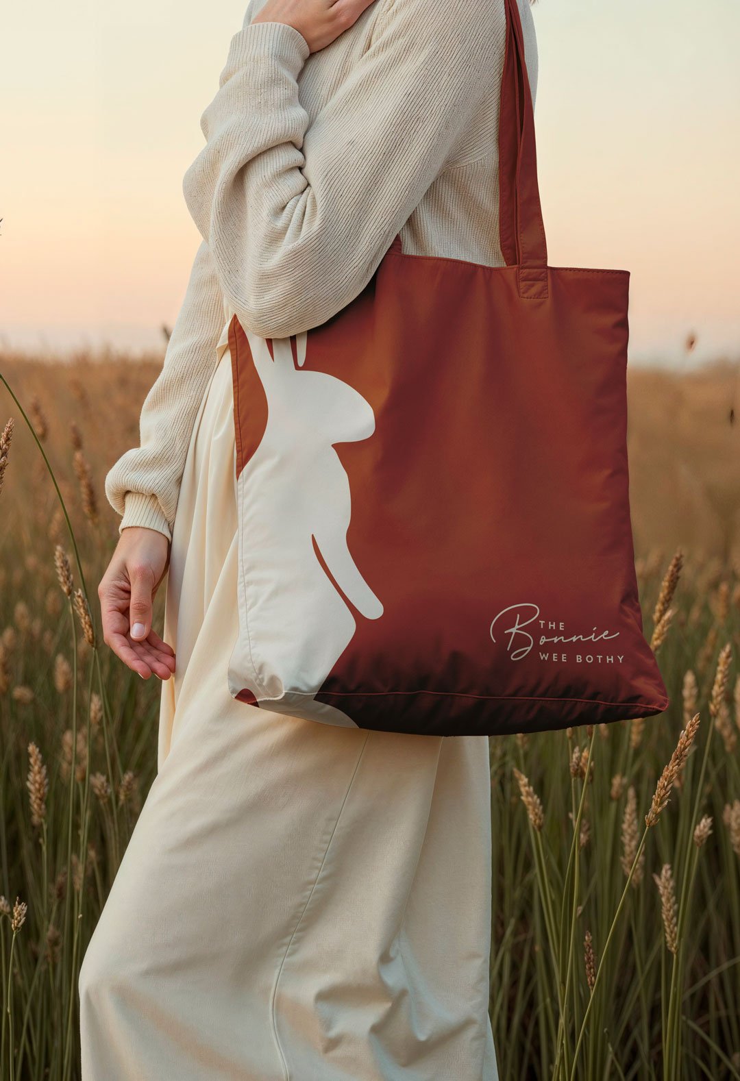
The centrepiece of the logo system is a hare — a curious local regular spotted near the bothy, and exactly the kind of detail that gives a hospitality brand genuine character. Wildlife illustration in brand identity can easily read as generic countryside shorthand. Here it works because it's specific: this particular hare, in this particular place, with the slightly knowing quality that makes it feel like an encounter rather than a decoration. Playful but not cartoonish. At home in the landscape without being obvious about it.
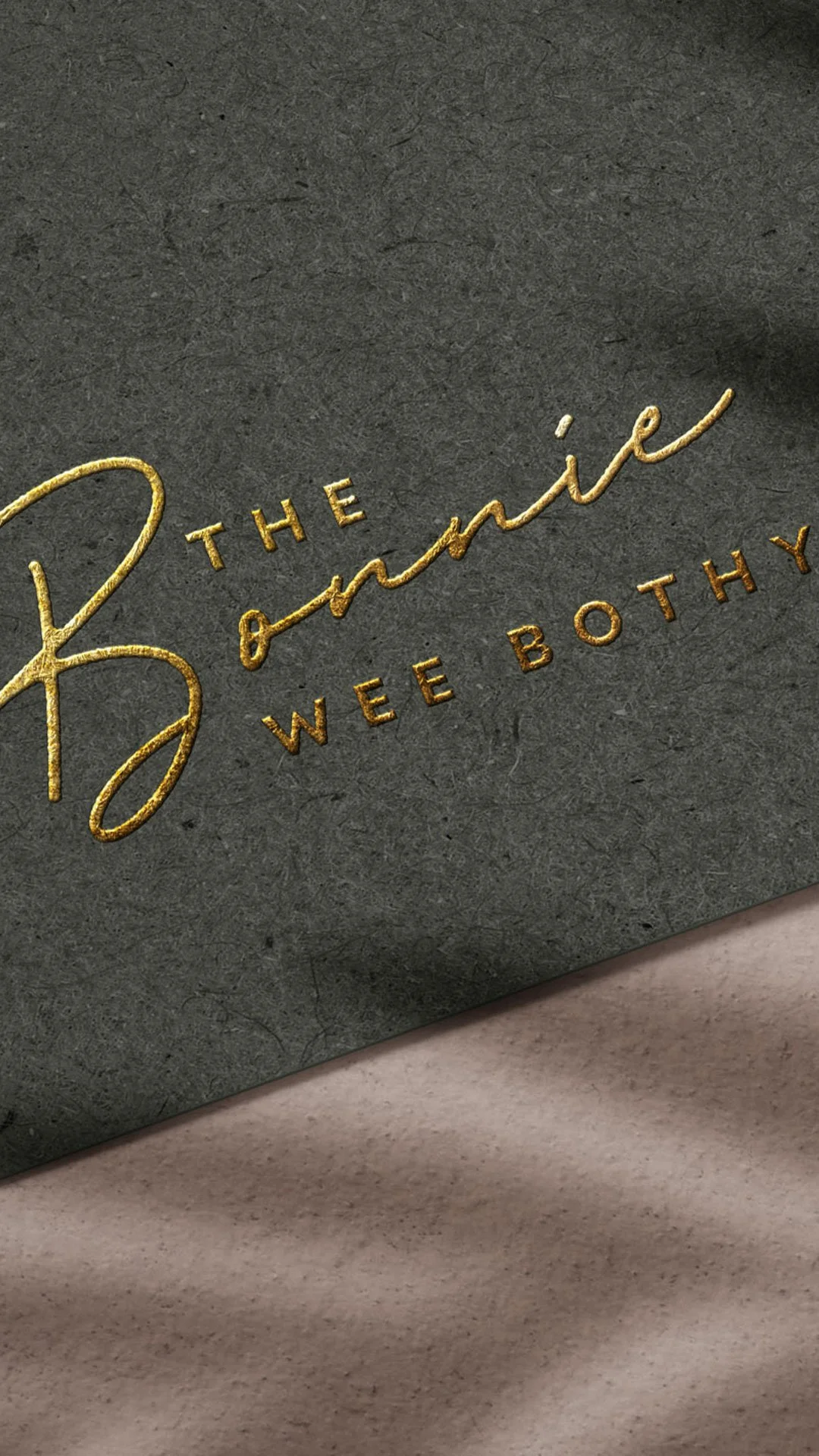
The wider brand suite — typography, colour palette and supporting elements — was developed to feel handcrafted and considered rather than polished in a way that would undercut the off-grid authenticity of the experience.
Where it lives
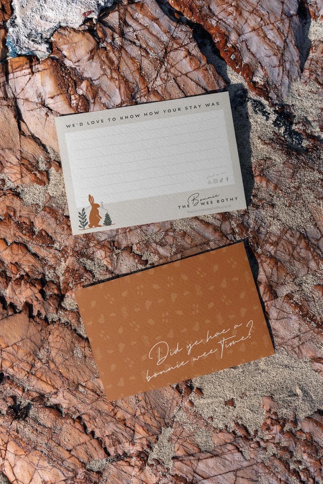
The brand carries through every part of the guest experience. Website, social media, signage, mugs, dressing gowns, bags, cards — the range of physical touchpoints the identity needed to work across was clear from the brief, and the system was designed with that breadth in mind from the outset.
For a hospitality brand, the physical guest experience is where the identity does its most important work. Someone staying at The Bonnie Wee Bothy encounters the brand on the signage as they arrive, on the dressing gown hanging in the hut, on the mug they're drinking from the following morning. Those moments of contact — small, tactile, repeated — are what make a stay feel genuinely coherent rather than assembled from parts.
Getting that right requires a brand that's been thought through properly at the physical level, not just the digital one. The Bonnie Wee Bothy identity was designed for both in equal measure.
What it communicates
The values behind The Bonnie Wee Bothy — sustainability, local sourcing, craftsmanship, genuine connection to place — aren't communicated through statements on the website alone. They're embedded in the identity: the earthy palette, the hand-drawn quality of the illustration, the care in the details. Guests pick up on those signals before they've read anything, and they reinforce the story the business is telling at every point.
In a growing market for rural and off-grid accommodation, that kind of brand coherence is a meaningful advantage. The Bonnie Wee Bothy doesn't look like everything else in the category — which is exactly the point.
We’d be delighted to help bring ideas for your accommodation business to life, let’s chat!
