
Elevologie Yoga
Laura sold her share in a law firm to start again. That decision came after a serious spinal injury in December 2019. The physiotherapy that followed was interrupted almost immediately by lockdown. With access to professional support cut off, she bought a cheap mat and started practising yoga from YouTube.
What followed was a recovery that changed how she understood movement, resilience and the relationship between the two. Before the injury, Laura had run ultra marathons. She can't run at all now. She describes herself as being in better physical condition through yoga than she was during that previous chapter — a claim that speaks to what consistent, thoughtful practice can actually do.
Elevologie was built to share that. Not as an inspirational story, but as a practical offer: functional yoga for real people, taught by someone who started from a very low mobility position and built from there. Classes spanning power yoga, yoga for runners and cyclists, somatic and yin yoga, Inside Flow — all of them grounded in the principle of meeting people where they are.
Where the brand started
The initial brief pointed towards something calm and grounded. Muted teal tones, soft lines, paired-back typography, a clean aesthetic that sat in broadly the same territory as Lululemon. No lotus flowers. No Buddhas. Clarity, care and strength. The early creative direction reflected the recovery-led dimension of Laura's story — warm, inclusive, gentle.
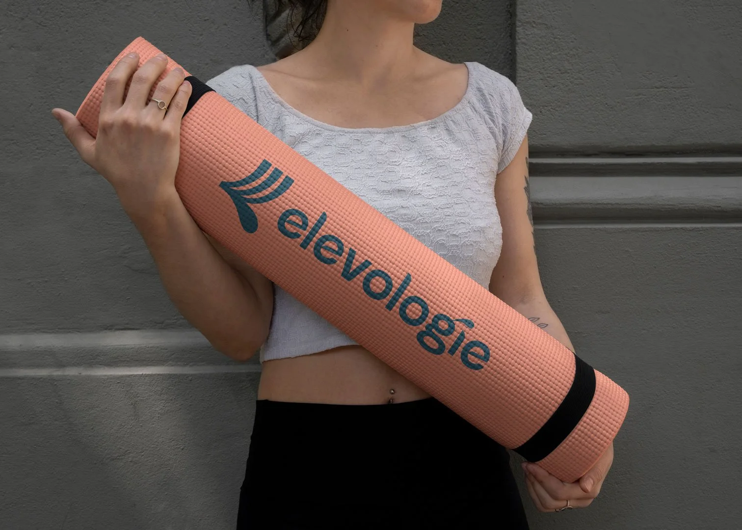
That direction produced something considered and quietly confident. A wordmark and icon built around soft curves and restrained colour. The kind of identity that would have served a certain kind of yoga brand well — restorative, accessible, reassuring.
But it wasn't quite Elevologie. Not yet.
The pivot
Partway through the project, the brief shifted. Not through dissatisfaction with the work, but through something more interesting: Laura was gaining clarity about who she was as a teacher and what Elevologie was actually going to be.
The recovery story was real and remained important. But it wasn't the whole picture. Laura also teaches Inside Flow — a dance-inspired, music-led practice with genuine energy and physicality. She works with athletes. She's building an online platform. The business she was creating was empowering as much as it was restorative, expressive as much as it was calm.
The brand needed to reflect that. She came back asking for something vivid, bold and rule-breaking. Significant words for a yoga brand, and exactly the right instinct.
The evolved identity
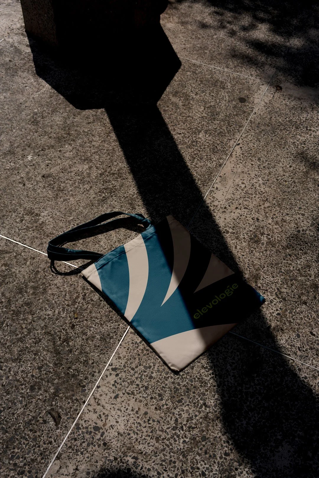
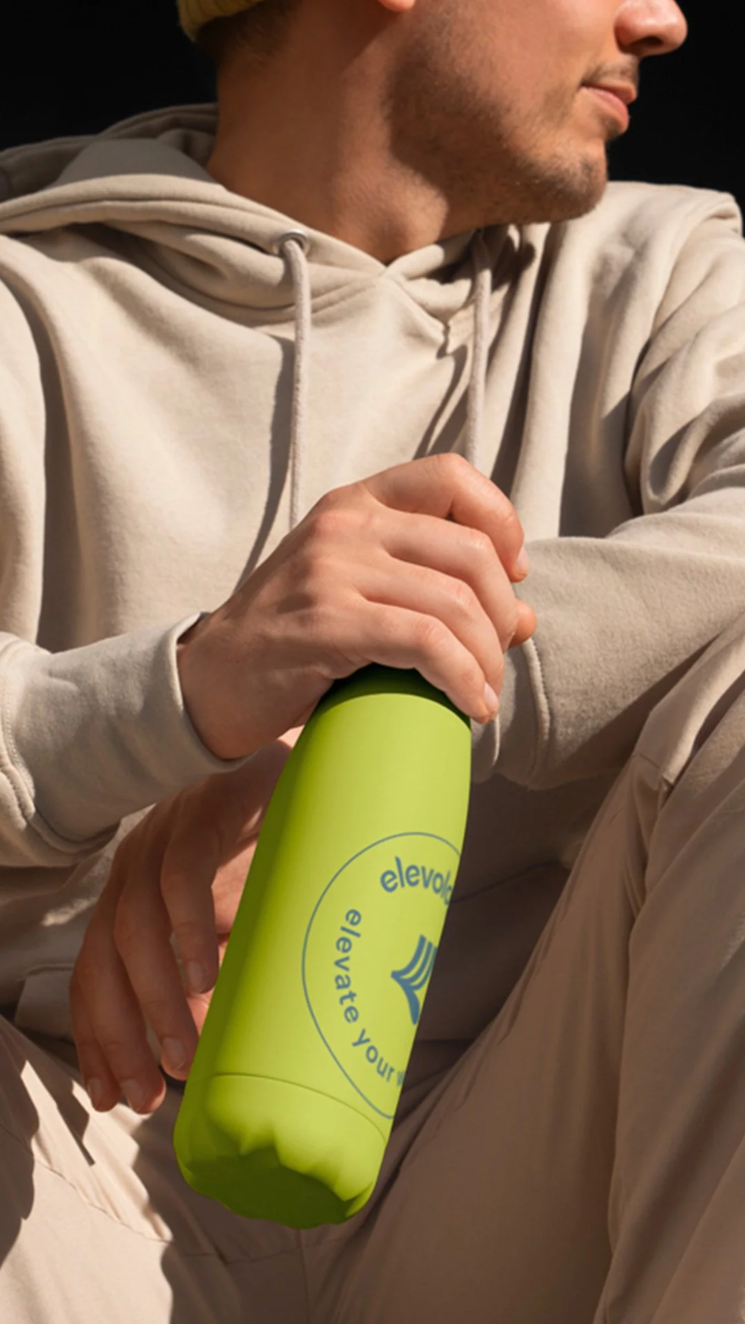
Starting again from that new position produced a fundamentally different piece of work. Bold colour, expressive energy, visual confidence. A brand that felt like movement rather than stillness — that communicated the dynamism of a strong physical practice without abandoning the warmth and inclusivity that had been there from the beginning.
The shift also made strategic sense for the audience Elevologie serves. Younger students drawn to Inside Flow and high-energy practices. Runners, cyclists and climbers looking for complementary movement work. Alongside them, the older clients who need restorative and somatic practices — and who, in our experience, are often more drawn to confidence and clarity in a brand than the soft-edged wellness aesthetic that's become the default in the category.
A bold identity serves both audiences more honestly than a muted one would have.
What the process demonstrated
This project is a useful illustration of something that happens in early-stage founder brands more often than it's acknowledged: the act of developing a visual identity surfaces clarity that wasn't fully there at the start.
Laura came to the project with a genuine story and a clear sense of her values — but some uncertainty about how to translate those into a brand. Working through the initial direction, responding to it, and then redirecting towards something truer took time and required trust on both sides. The result was a brand that genuinely reflects where Elevologie was heading, rather than where it seemed to be starting from.
That's not a design problem. It's actually one of the most valuable things a proper brand process can produce.
What Elevologie now has
A brand identity with the energy and confidence to grow alongside a business that has ambitions well beyond a single hire hall. An online platform, one-to-one programmes for injury recovery, YouTube content, a growing student base — all of it supported by an identity that reflects the full range of what Elevologie offers rather than just one dimension of it.
Laura started from a very vulnerable place. The brand she now has reflects where the work has taken her since.
Let’s talk about your ideas for bringing your health and wellness business to life.
