
Morningside Farm Yoga Retreat
Lucy didn't arrive with a conventional brief. No bullet points, no competitor references, no list of deliverables. What she brought instead was language — rich, instinctive and rooted in the physical experience being at Morningside.
Curving old fences. Ancient trees. Purple moorland and yellow gorse. Red kites circling overhead. Children playing wild outdoors until they collapsed by the fire. Sunsets rolling across the hills, the kind of quiet that lets people switch off.
It was lyrical, honest and, as it turned out, more useful than any questionnaire. Because within in that language was something many early-stage brands struggle to surface: a genuine emotional connection to the land and a clear sense of what the place could make people feel.

The farm and its plans
Morningside Farm is a smallholding on the edge of the moors and mountains in rural Perthshire — currently home to a one-bedroom off-grid cottage, hogget boxes and eggs sold to local families, and a growing vision for what the land can become.
Lucy has planning consent for a wellness retreat dome, a wood-fired hot tub and sauna, and two additional self-catering bothies. The business model spans private hire of the dome, hosted wellness day retreats — where Lucy facilitates the day herself, bringing in nutritionists, massage therapists and other practitioners as needed — and continued accommodation. Future plans include farm-grown produce for guests: honey, herbs, vegetables from polytunnels and a kitchen garden that's still in the making.
Three distinct income streams, one farm, one identity. The brand had to hold all of it — not just what existed at the point of commission, but what was still being built.
The strategic foundations
Before any visual direction was explored, the emotional and strategic foundations of the business were defined. Space to breathe. Connection to nature. Honest hospitality. The integrity of slow rural living and a family-run smallholding that doesn't pretend to be anything other than what it is.
Those foundations shaped both the visual identity and the digital approach that followed. They also helped clarify the business's position: Morningside Farm sits in a growing market for rural wellness retreats in Scotland, but it occupies distinct territory within that market. The scale is intentional, the hosting genuinely personal and the setting — accessible within an hour and a half from Edinburgh, Glasgow, Dundee, Perth and Stirling — gives it a practical advantage that most comparable venues can't offer.
The identity
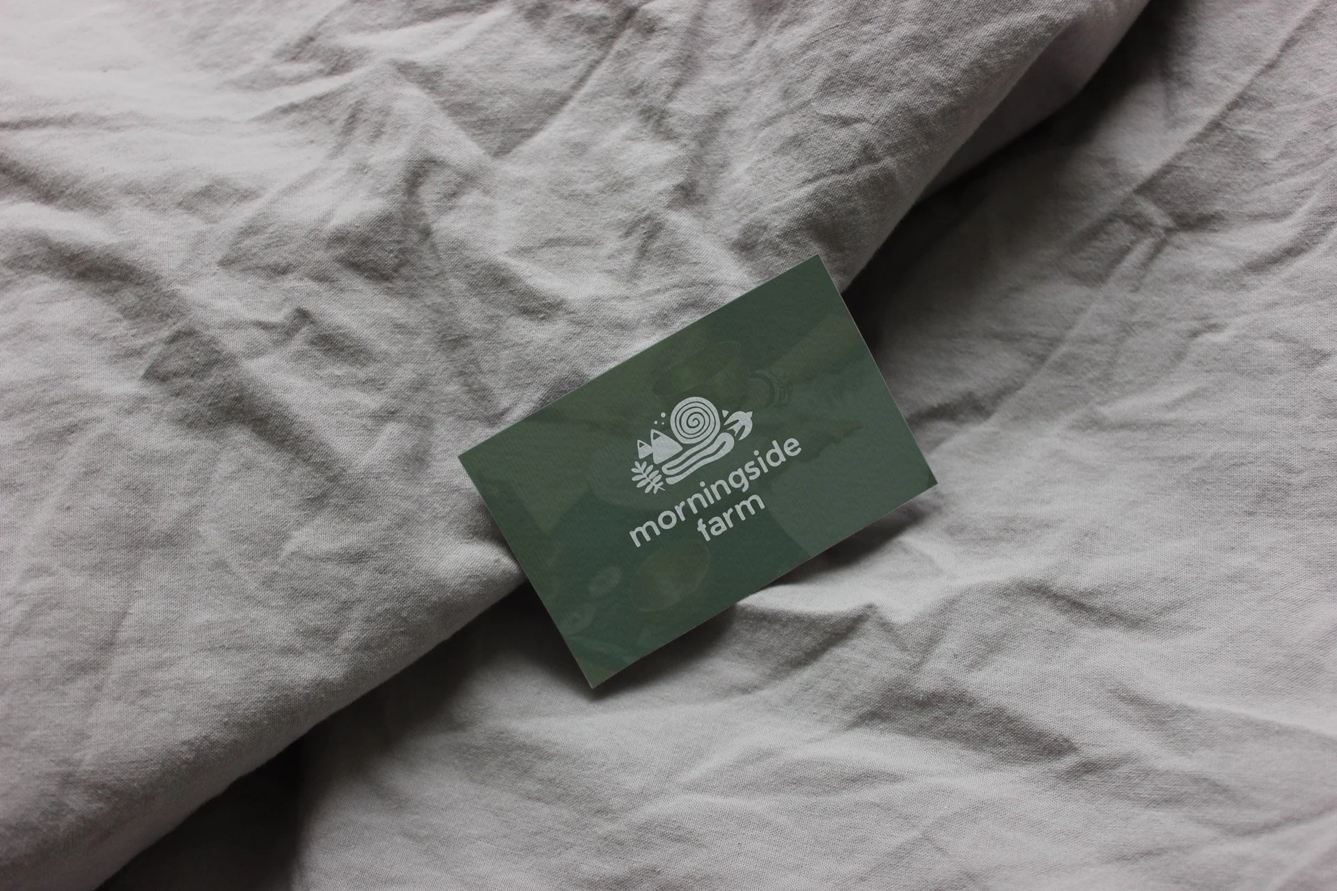
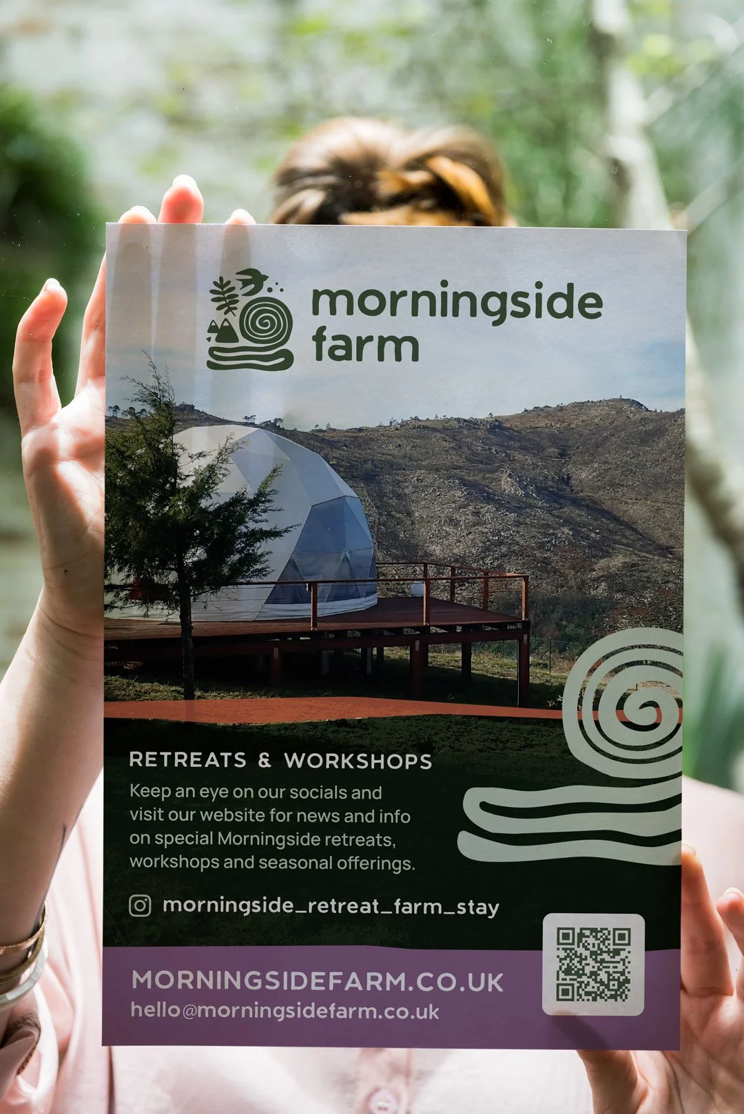
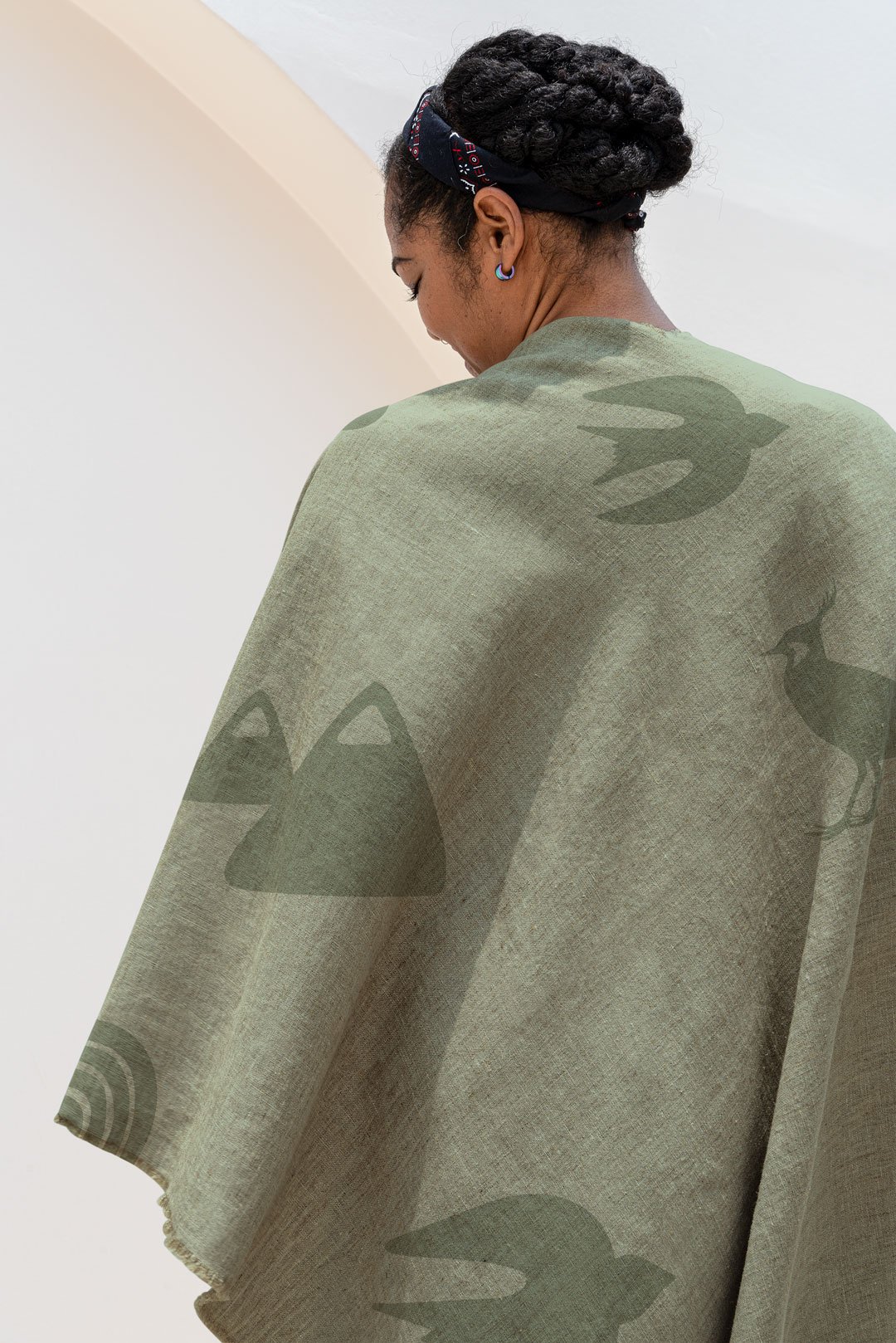
The visual identity was designed to feel rooted rather than overly rustic — a distinction worth making carefully in rural hospitality branding, where the pull towards tartan and rough timber can flatten everything into the same register.
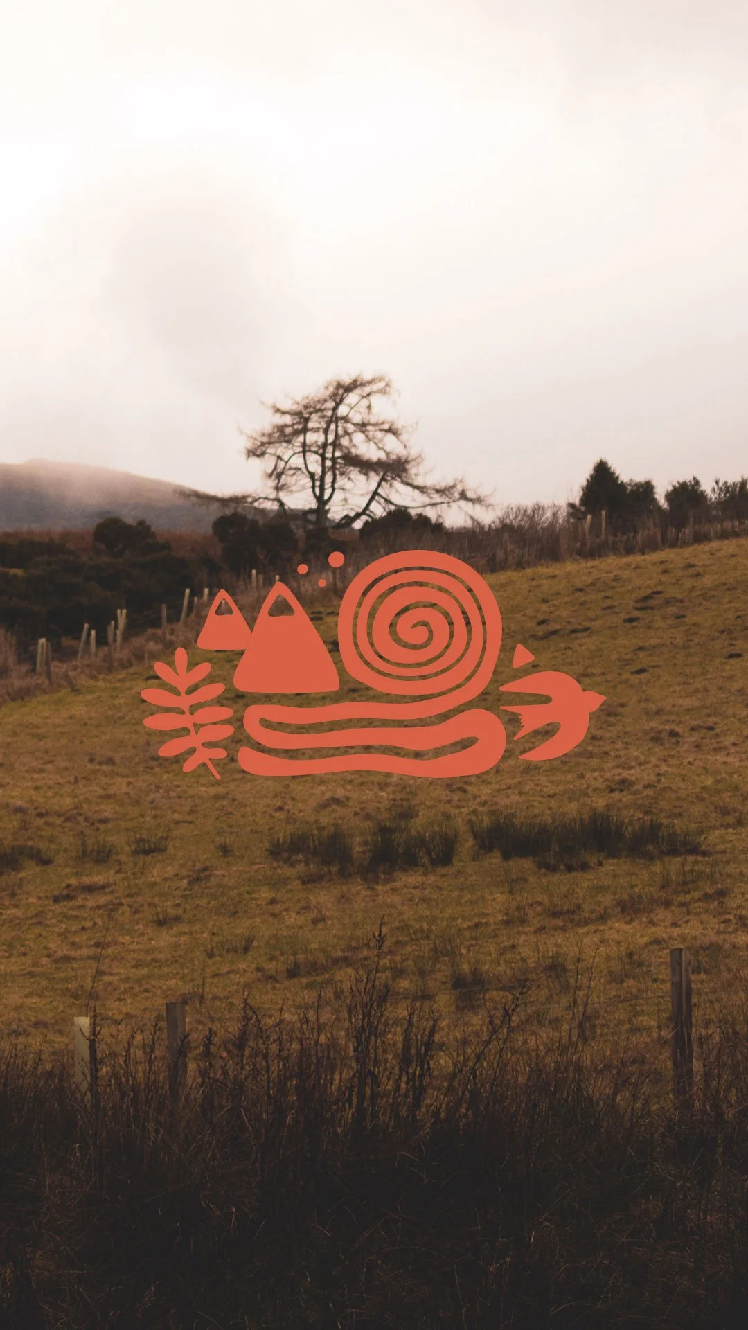
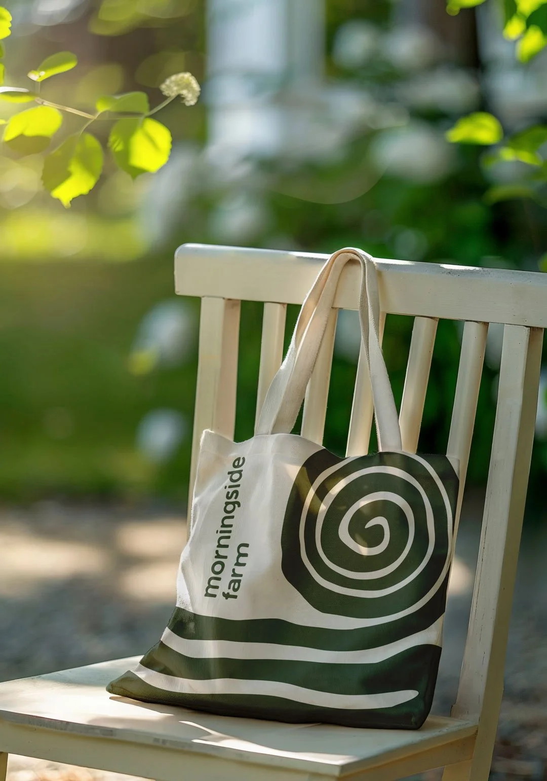
Earth-led tones drawn from the land itself. Seasonal, lived-in rather than styled. Typography that balances warmth with quiet confidence without tilting towards either the commercial or the handcrafted extreme. The brandmark references the surrounding landscape — hills, horizon lines, open skies — giving it a sense of place and movement without being literal. Gentle curves. A feeling of light rising over land.
Everything was designed to feel considered but unforced. The brand needed to sit comfortably between rural and refined, and to have enough space within it to grow as the farm grows — without requiring reinvention each time a new element of the business opens.
The digital approach
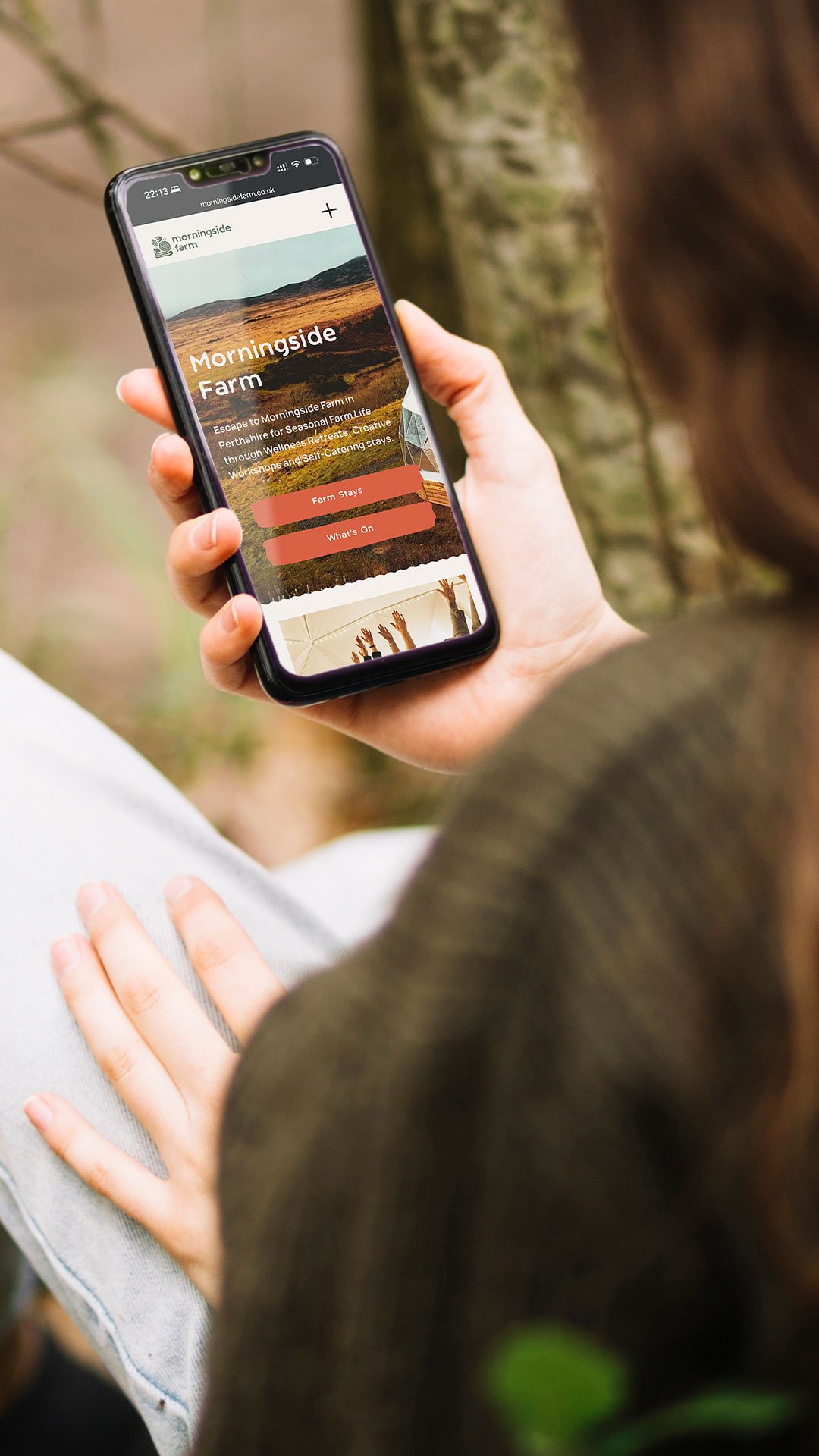
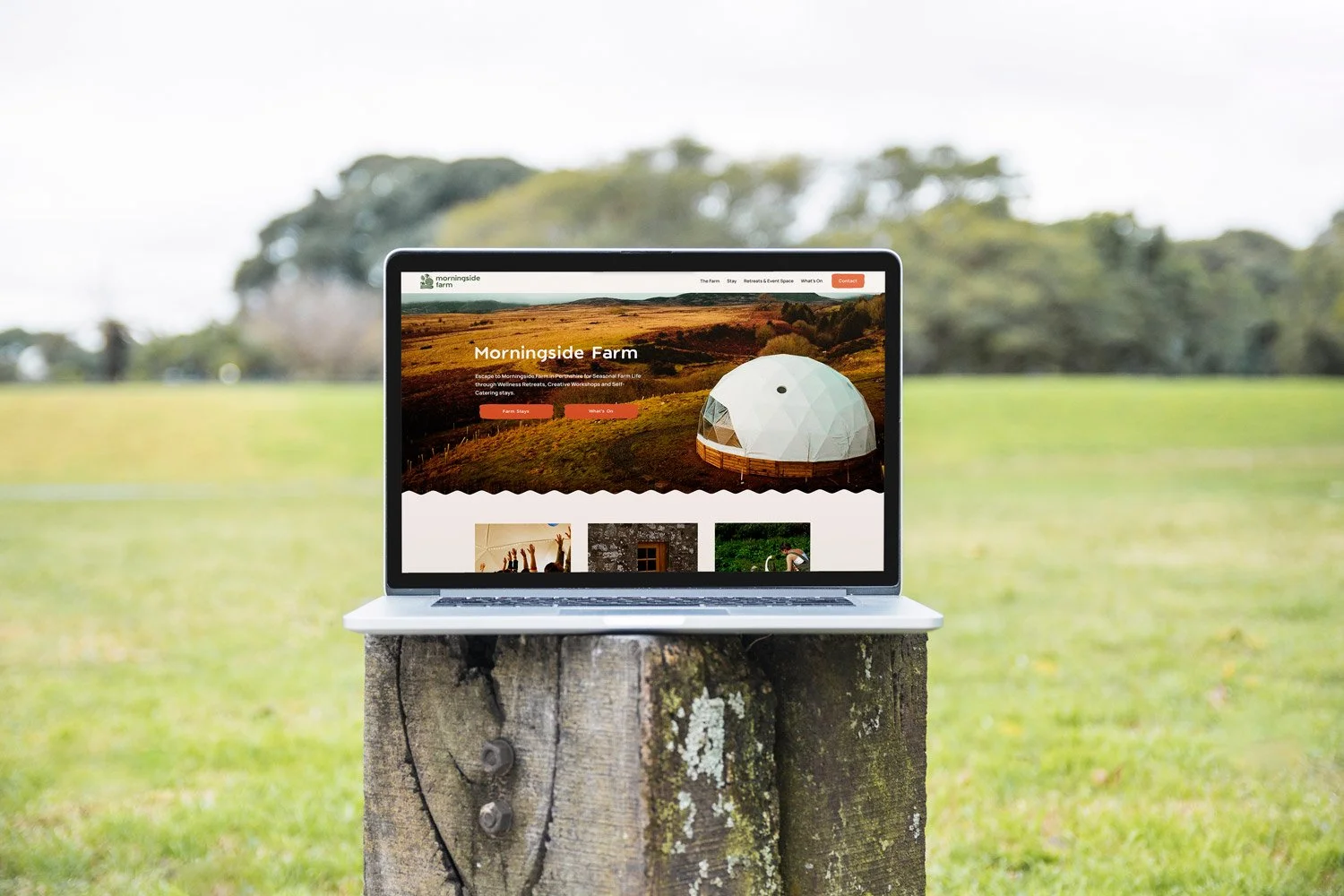
The website brief was handled in phases, which was the right approach for a business at this stage of development. Building a complete, fully-featured digital presence before the retreat facilities were open would have produced something that looked ahead of where the business actually was.
Instead, a holding page was launched to begin building awareness and a mailing list while the wider development took shape. The broader site architecture was planned with future expansion in mind: accommodation pages, a wellness calendar and booking integration, events, future e-commerce for farm produce and the kind of enquiry-led journey that retreat hire requires.
The UX approach prioritised calm, clear navigation — appropriate for a brand that promises space to breathe — and let the landscape photography lead the experience rather than compete with it. Accessibility considerations, including the dome's disabled access, were factored into the information architecture from the outset.
What it gave Lucy
Before this project, the vision for Morningside Farm existed mostly in conversations and in Lucy's own imagination. A brand and a digital foundation — however early-stage — gave it somewhere to live publicly. A way to begin sharing the wider vision, attracting interest and building a community around the farm before the dome was built and the bothies were finished.
That's one of the more underappreciated things a brand can do at the early stage of a business: make something real enough to talk about. Lucy can now point people towards Morningside Farm with confidence, knowing that what they encounter reflects the quality and character of what she's building.
A note on process
This project was a reminder that the strongest creative direction doesn't always come from moodboards or trend references. Sometimes it comes from listening carefully to the way someone naturally describes the place they love most.
Lucy's words shaped the direction from the beginning. That trust — in the process and in the people running it — made the difference between a brand that looks like a farm retreat and one that feels like this particular farm retreat.
We can help create a strong visual identity and a website that delivers.
