
Cairn Labels & Packaging
Scotland has no shortage of distilleries, craft breweries and artisan food producers. What it has lacked, according to the founders of Cairn Labels, is a label manufacturing partner that truly understands that world — local, responsive and genuinely invested in the brands it produces for.
The reality for many Scottish producers has been distant suppliers, long lead times, rigid minimum orders and the kind of communication that makes a straightforward label job feel more complicated than it needs to be. The founders of Cairn came from within the UK label industry with the experience to recognise that gap clearly and the ambition to close it.
The brief was to build a brand that could signal all of that — trust, experience, local knowledge, genuine partnership — from the very first conversation. Not a startup feeling its way, but a business that knew what it was doing.
The name
The name Cairn did a lot of the strategic work before design had even begun. A cairn is a marker — a waypoint that tells you you're on the right path, placed by people who came before. It carries connotations of guidance, provenance and permanence without leaning on tartan shorthand or obvious Scottish clichés. It's ancient without being fussy.
The founders also noted that the word contains 'AI' — a quiet nod to future capability and innovation without making a performance of it. That kind of layered thinking in a brand name is relatively rare and worth building on.
The visual identity was developed to honour those associations: grounded and established in character, modern enough to support a business with genuine ambitions to scale and diversify.
The identity
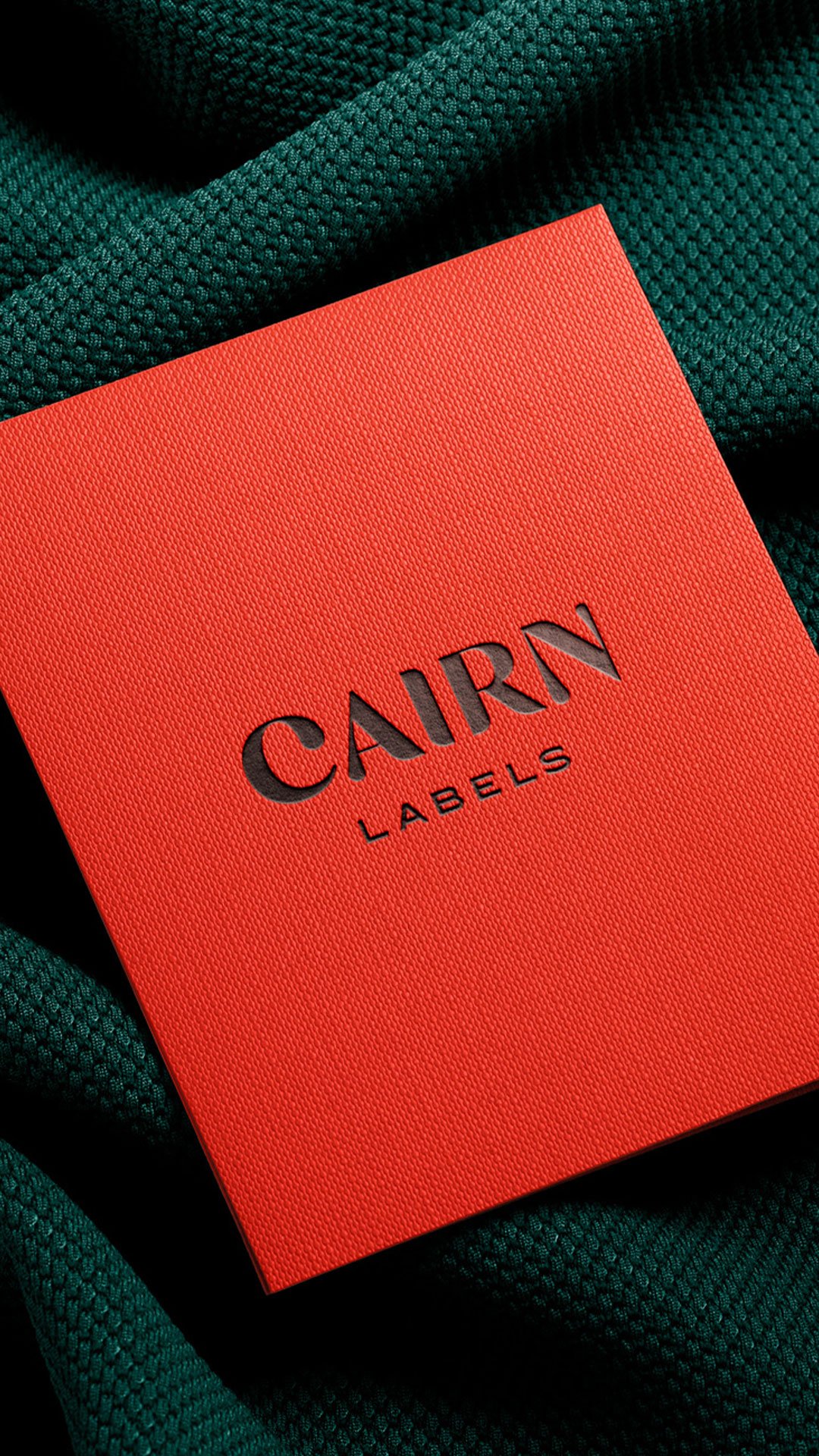
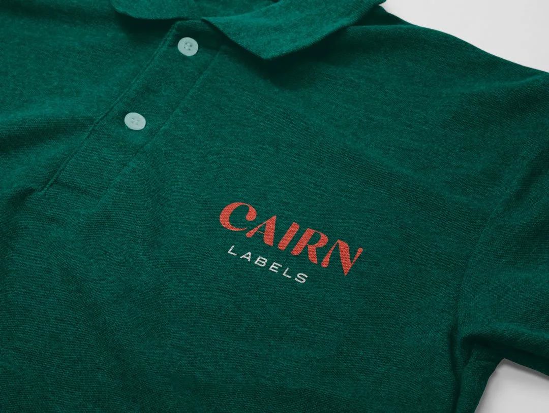
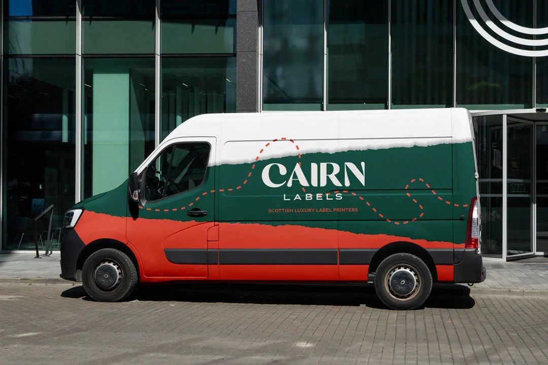
The approach centred on a strong, crafted wordmark paired with a refined typographic system that communicated solidity and expertise without feeling corporate or cold. Serif-led, considered and clean — the kind of identity that reads as established on first encounter, which is precisely what a new business entering a trust-led market needs.
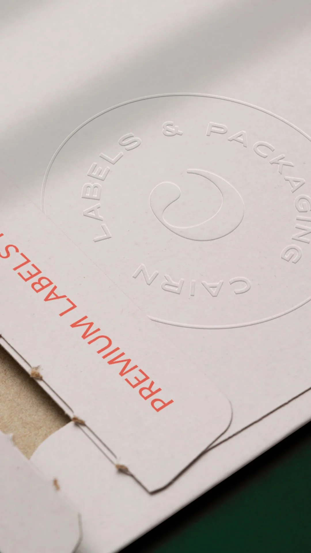
The customised capital C became a key structural asset within the system. From it, a flexible set of marks was developed: a primary lockup for formal applications, a secondary arrangement for tighter spaces and a monogram for smaller contexts — labels, packaging slips, digital icons. That range of variants is a practical necessity for a label manufacturer whose brand needs to work across its own trade materials as convincingly as it does on a client's bottle.
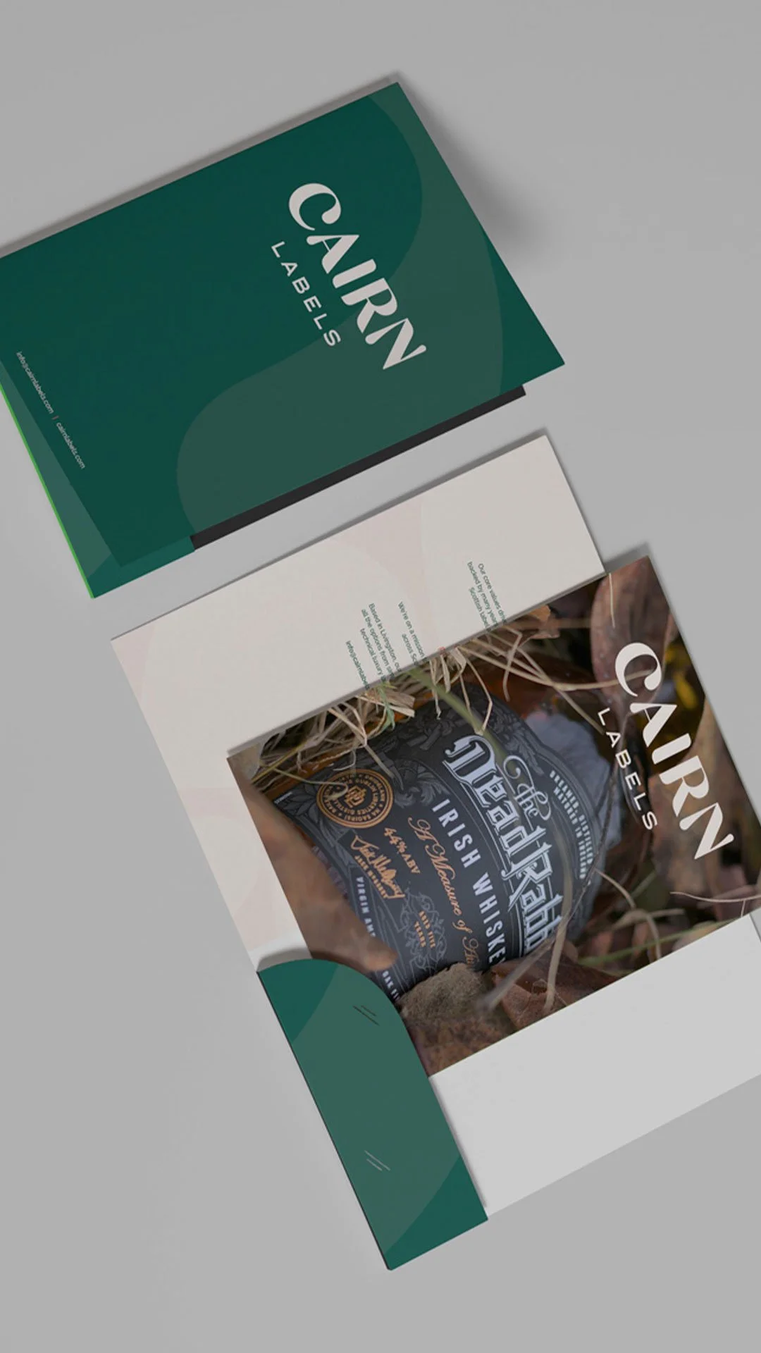
The colour palette was drawn from the Scottish landscape: deep forest greens, earthy neutrals and strong dark tones that establish credibility and gravitas. A warm accent colour — used sparingly — brings approachability and energy without softening the overall impression of dependability. The balance was deliberate: this is a service business, and the brand needed to feel like a partner worth trusting rather than simply a supplier worth pricing.
Approved at first presentation
The identity was presented once and approved in full — a relatively rare outcome on a brand project, and one that reflects how thoroughly the strategic and creative foundations were established before design began. When a brief is well-understood and a client's instincts are clearly articulated, the first presentation can do the job that multiple rounds of revision sometimes struggle to achieve.
That outcome gave the founders a confident platform to begin trading immediately, approaching distilleries, breweries and FMCG producers with a brand that reflected the experience behind the business rather than the early stage of its trading history.
Beyond the identity
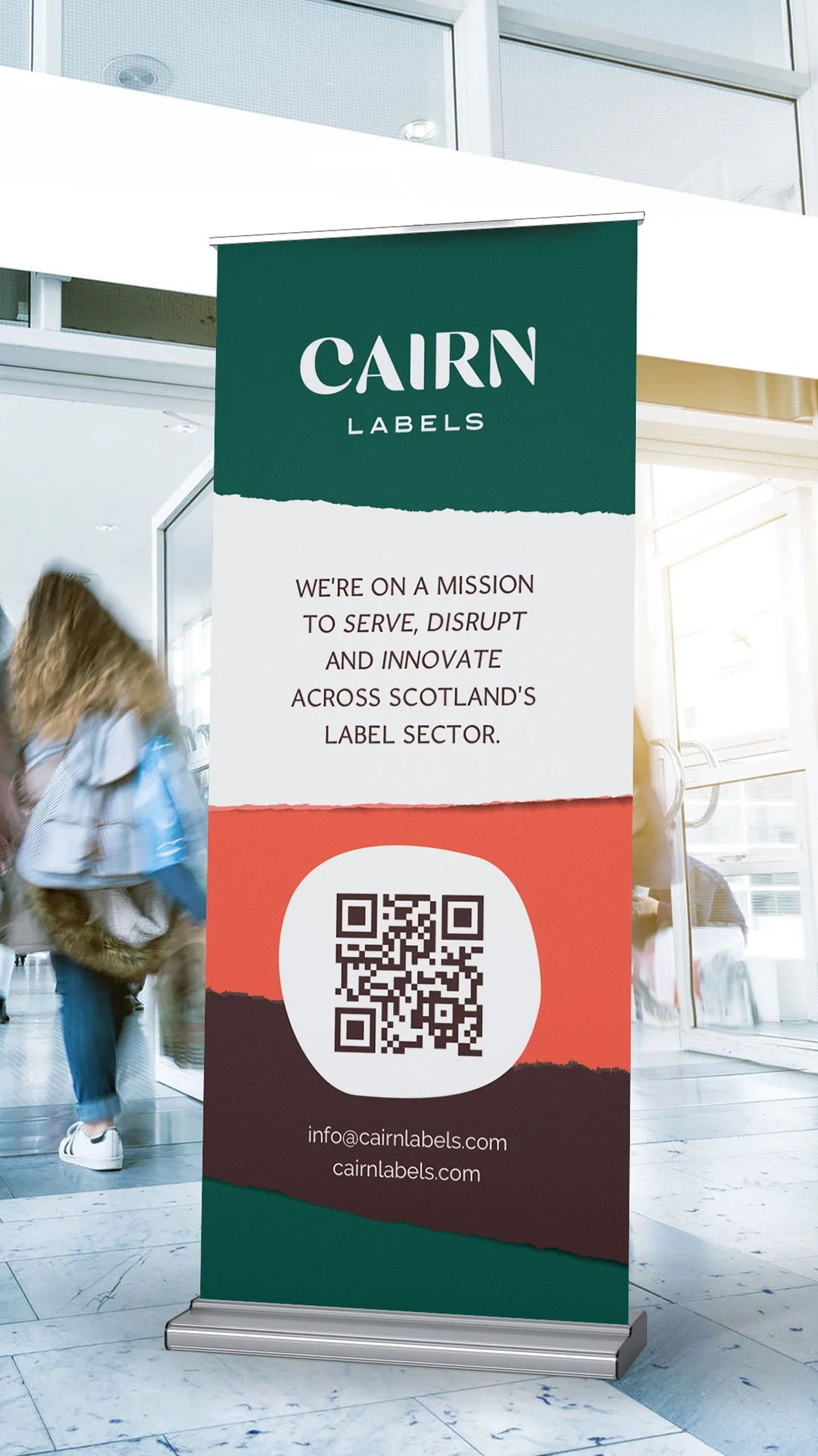
The work extended into trade show collateral — banners, signage and exhibition materials for Cairn's first appearances in front of the market. Trade shows in the drinks and FMCG sector are where supplier relationships are initiated and where first impressions carry significant commercial weight. The collateral needed to hold up in that environment alongside established competitors.
Training presentations and templates for internal use were also developed, giving the Cairn team consistent materials to work from as they brought new people into the business and began building out their processes.
What it sets up
Cairn Labels now has a brand identity capable of carrying the business into the market it was built to serve. The visual system is practical and scalable — designed for real-world application across packaging, print, digital and trade environments rather than looking good only in a brand guidelines document.
For a business whose entire value proposition is dependability and quality, a brand that demonstrates those qualities at every touchpoint is not a luxury. It's a baseline requirement. The Cairn identity meets that standard from day one.
Creating a new company? Let us help with your brand foundations.
