
Moonjelli Wellness
Walk through any health food shop and the supplement aisle tells a consistent story. Stacked with products that are either aggressively clinical — white labels, pharmaceutical typography, bold health claims — or occupying the opposite extreme of neon colours, overcrowded packaging and promises that read more like fiction than science.
Moonjelli was founded by someone who had experienced that frustration directly. Navigating supplements and fertility nutrition from the inside — not as a marketeer but as a person trying to make considered choices — created a clear sense of what was missing. Something that felt kind and clear. That took quality seriously without making the experience joyless. That treated the customer as an intelligent adult rather than a medical case or a lifestyle aspiration.
That gap became the brief.
The brand
Moonjelli started with fertility-supporting gummies and expanded quickly into immune health, energy, sleep and children's supplements. The ambition from the outset was to build a genuine wellness platform — with a product range, a blog rooted in honest and helpful content, and a brand architecture capable of growing across very different product categories without losing coherence.
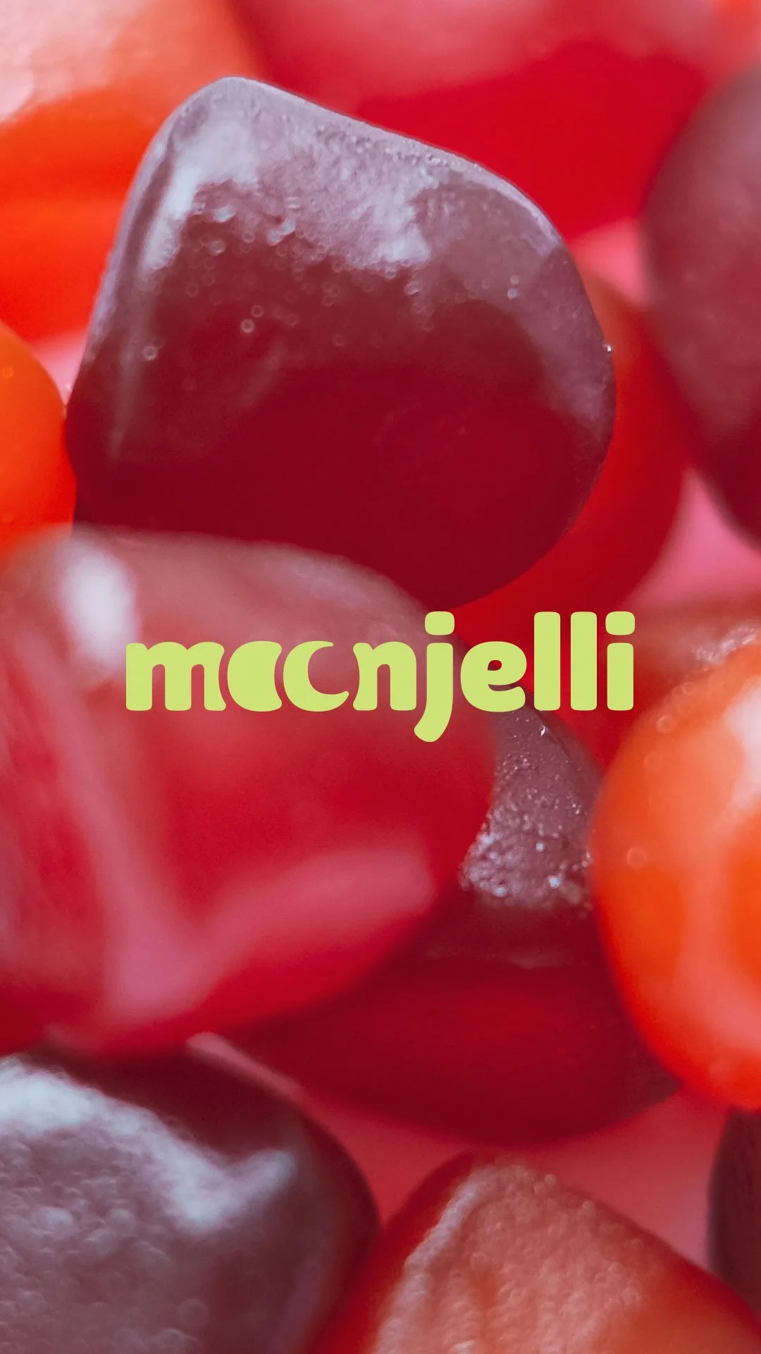
Gummies as the starting format was a considered choice. They're actually enjoyable to take. They remove the friction that makes supplement habits hard to sustain. And they give a brand genuine creative space — colour, texture, character — that pills and powders don't. The format and the brand needed to reinforce each other.
Words from the client
“We worked with Studio Creates on the Moonjelli brand and had a really positive experience throughout. Sarah took the time to properly understand what we were trying to build and translated that into a brand that feels considered, premium, and true to us.
The process was well structured, communication was clear, and feedback was always taken on board thoughtfully. The final outcome works beautifully across packaging and digital, and gives us a strong foundation to build on as the brand grows.
We would happily recommend Sarah and Studio Creates to anyone looking for branding that is both creative and commercially sound.”
The name
Moonjelli as a name does quiet but useful work. It hints at cycles and rhythm — relevant for a brand beginning in women's health and fertility — while carrying a softness and playfulness that immediately separates it from the category conventions. It's memorable without being obvious, and modern without trying too hard.
The lunar reference also gave the visual identity a direction without locking it into obvious moon iconography. The brandmark uses rounded forms and a subtle nod to lunar shapes — present enough to feel intentional, restrained enough not to become a cliché.
The identity
The visual and strategic reference points for this project were specifically not the dominant wellness aesthetic. Ultra-minimalism, sterile white space, the kind of premium that signals exclusivity rather than warmth — all deliberately set aside. The references that informed the direction were closer to Olipop: nostalgic warmth, confident colour, illustration accents and a sense of genuine personality.
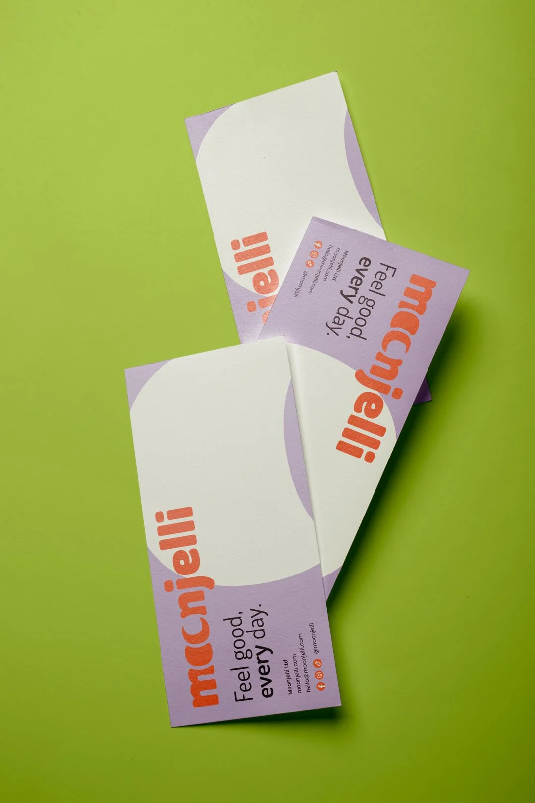
Colour does significant work throughout the identity. Warm, expressive and carefully weighted — not the muted pastels that have become shorthand for 'clean' wellness branding, but tones with enough saturation to feel uplifting and enough care in their selection to feel considered. Custom colour names give the palette personality beyond a hex code and reinforce the brand's tone at every point of contact.
Typography was chosen for character and legibility in equal measure. Slightly softened geometric forms with enough personality to feel human — legible at label scale and distinctive at display size, which is a combination that takes more finding than it sounds.
The overall system avoids the trap that catches many wellness brands: designing for one product or one audience and discovering the limitations when the range expands. The Moonjelli identity was built with a clear brand architecture in mind from the outset — Moonjelli Sleep, Moonjelli Focus, Moonjelli Mum — giving the business a coherent framework to develop new products within without requiring the identity to be revisited each time.
Packaging direction
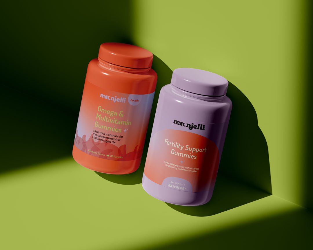
The packaging brief was developed alongside the identity, with an eye on both the immediate launch requirements and the longer-term aspiration. Initial formats centred on label and tin design, with the structural direction pointing towards reusable outers and refill pouches — a practical and environmental choice that also reinforces the brand's values around transparency and responsibility.
Print-ready templates were developed to pass to the manufacturer, alongside guidance on how the brand system should be applied across different product variants. Getting that guidance right at the outset — before production runs begin — prevents the inconsistencies that tend to creep in when brand application is left to interpretation rather than specification.
Built for digital and retail
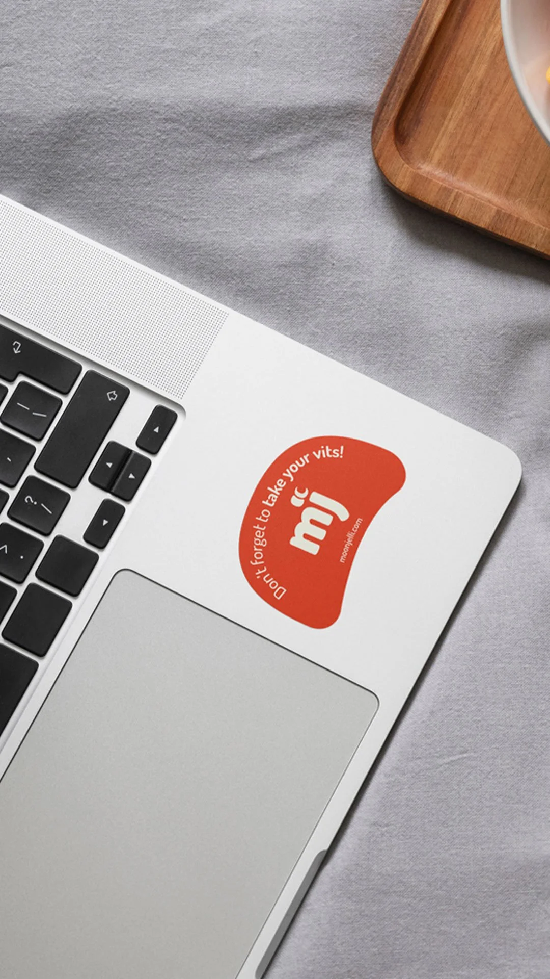
The identity system extends across Shopify assets, email marketing, social media and future retail environments. A Canva brand kit gives the team the tools to create consistent materials independently as the business scales and content output grows.
The tone of voice direction was formalised alongside the visual identity — not as a restrictive rulebook, but as a practical guide to maintaining the brand's character across product descriptions, blog content, social captions and customer communications. Clear, honest, friendly, confident and playful — in that order, and never at the expense of each other.
What it sets up
Moonjelli now has a brand built to grow with it — from first product launch to retail shelf, influencer partnership and beyond. More importantly, it has an identity that speaks directly to real people: informed but time-poor, curious but rightly sceptical of overclaiming.
In a category full of brands that either take themselves too seriously or not seriously enough, Moonjelli occupies distinct ground. Wellness that feels human, joyful and genuinely achievable — without losing sight of the science behind it.
We’d love to help make your retail product branding jump off the shelf.
