
Raven Botanicals
Raven Botanicals came to us at a natural moment of evolution. The packaging had served its purpose but the brand had grown beyond it — and with a structural change to the box dieline providing the practical prompt, it felt like the right time to approach the redesign properly rather than incrementally.
The goal was clear: something simpler, more resolved and built to last. Not just better-looking packaging, but a system that could grow alongside a range already expanding into new product categories.


Thinking in systems
The most important early decision was to treat this as a packaging system rather than a single redesign. Raven Botanicals had a growing product range with further expansion planned — body wash, hand wash, candles and wider lifestyle products already in view. Any solution that solved today's problem without anticipating tomorrow's would have created more work further down the line.
The approach was to develop a packaging convention: a repeatable design logic and colour architecture that could be applied consistently across all current products and extended naturally to new ones without requiring everything to be rethought each time. Colour, hierarchy, pattern, finish — all of it considered as a scalable system rather than a series of individual decisions.
The design
Multiple creative directions were presented with annotated rationale and walkthrough videos explaining the thinking behind each route. That transparency — bringing the client into the reasoning rather than simply presenting visuals — shaped how the project developed throughout.
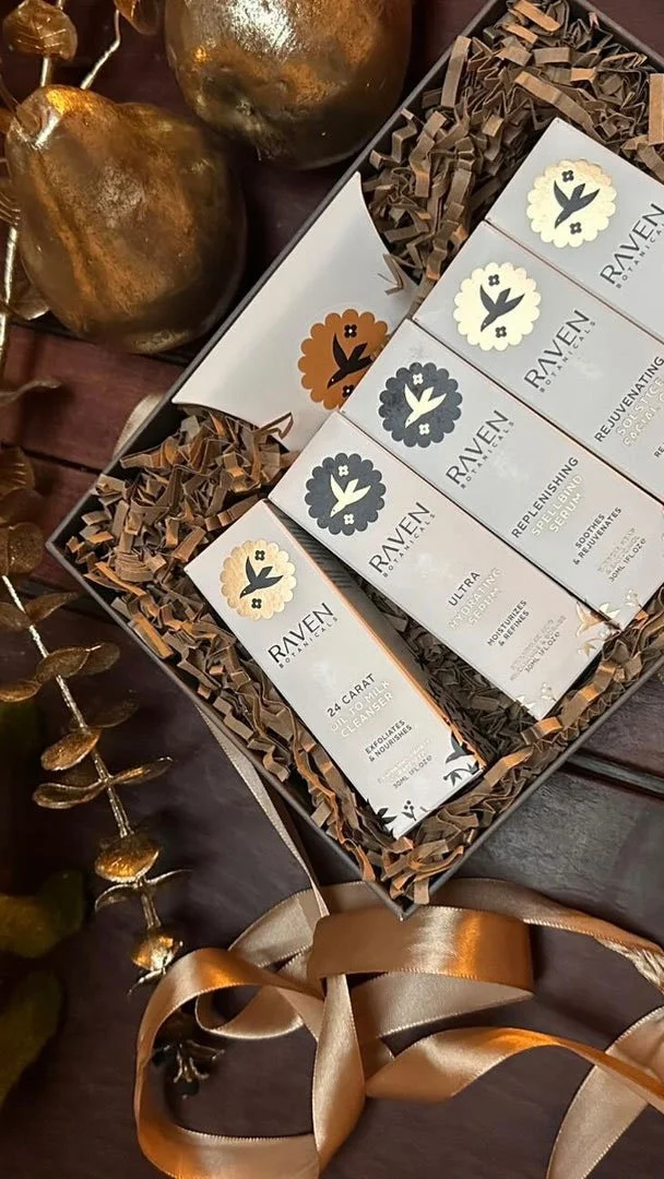
The final direction emerged from a conversation between two initial routes: one more minimal and restrained, the other more pattern-led and distinctive. Both had merit. What Arabella identified was that the two could be brought together — the pattern becoming more scattered and organic, spilling across panels to create a visual connection between the faces of each box. When products sit together on shelf, the pattern bridges between them, creating something that reads as a coherent range rather than a collection of individual units.
The bird badge — a distinctive brand asset that had been undersized and underconfident in the original packaging — was given proper prominence within the hierarchy. Accreditation marks were consolidated. Product naming and benefit copy were reorganised for clarity and shelf readability. The overall impression shifted from crowded to considered.
Arabella described the result as feeling more resolved, more distinctive and, in the way the pattern connected across the range, quietly clever.
Colour as a strategic tool
A structured colour architecture was developed across the range — not assigning colours arbitrarily to products, but building a system where colour communicated something meaningful about each product's ingredients, mood and function.
The aim was shelf coherence alongside product distinction: a range that reads as a family from a distance while still allowing a returning customer to find exactly what they're looking for. That system was documented as a scalable reference for Raven Botanicals to use as the range continues to grow — practical guidance for future product development rather than a decision that needs revisiting each time.
Production knowledge
Getting packaging to look as good in someone's hands as it does on screen requires genuine production understanding. Finish choices — soft-touch laminate, foiling, spot gloss — were worked through in terms of both their visual impact and their practical implications for cost and manufacturing. Colour specification was moved toward a more accurate production process to address consistency issues across different print runs.
Compliance requirements, mandatory information and evolving legislation were all managed within the design system — balancing the legal with the aesthetic so that the packaging could meet every requirement without feeling cluttered or compromised.
The final artwork was prepared to be genuinely production-ready, with batch coding, barcode placement and format-specific considerations all resolved before anything went to print. Arabella's priority throughout was getting to the end of the process with a design they loved and files they could trust.
What it delivers
Raven Botanicals now has a packaging system that reflects the quality of the products inside it. The brand mark is properly confident. The colour system is coherent and extensible. The pattern creates the kind of shelf recognition that builds over time. And the whole system is built to accommodate growth — so that as the range expands, the packaging expands with it rather than fragmenting.
We can help you evolve and grow your existing brand, without a full re-brand.
