
Blended Scents Home & Skin Care
Blended Scents began as a family passion project — handcrafted candles made with natural soy wax, pure essential oils and a genuine commitment to sustainable production. The brief at that stage was focused: a brand identity and packaging system to launch the business, primarily through an ecommerce website, with a range of candles and a vision to expand into complementary home fragrance products over time.
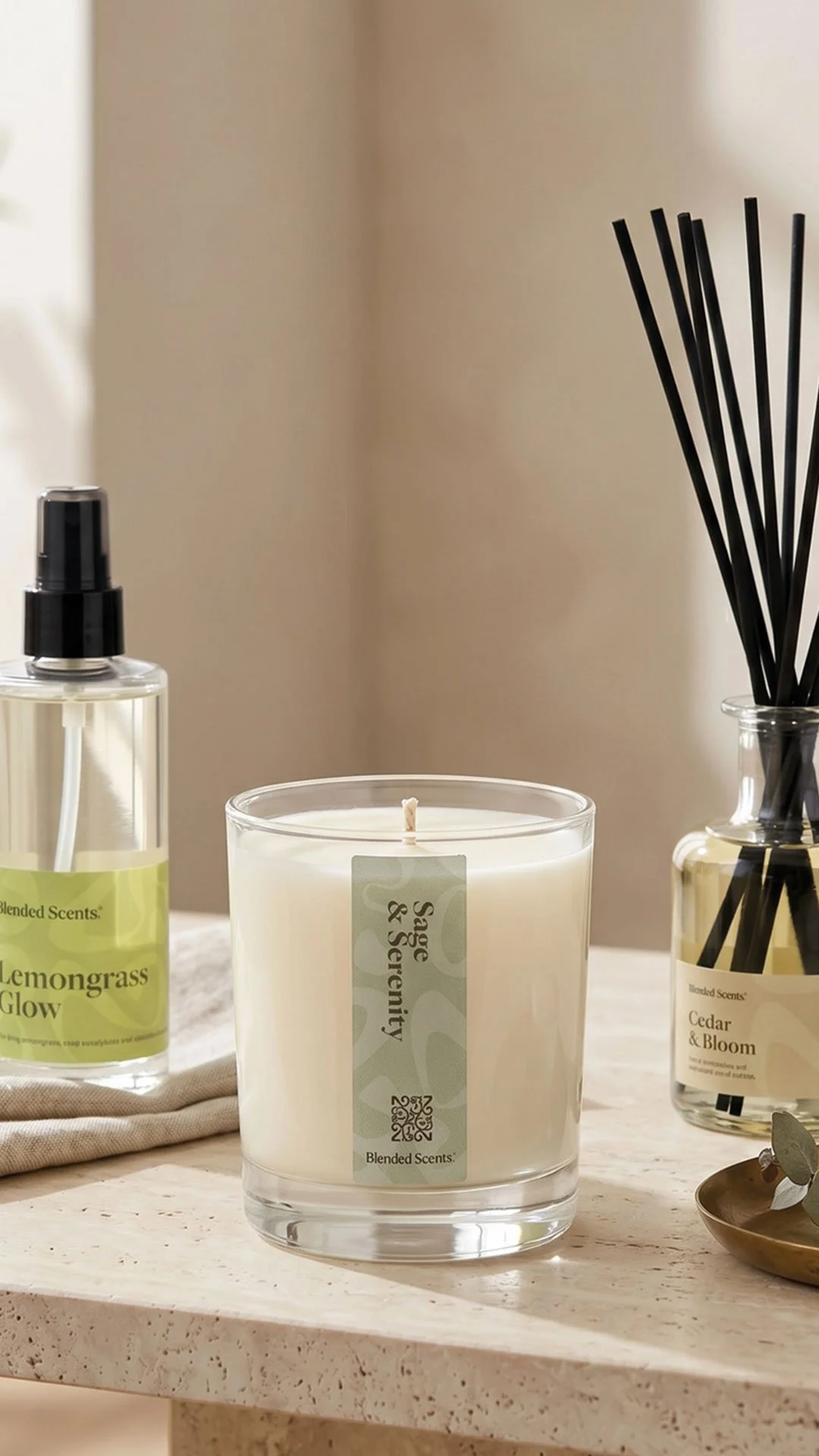
Fourteen months later, that initial brief had grown into something considerably larger. What began with a handful of products had expanded to 84 SKUs spanning candles, room sprays, reed diffusers, wax melts, skincare, body care, oils, creams and more. The project became one of the most sustained and wide-ranging packaging exercises we've undertaken — and one of the clearest examples of what it means to build a brand system rather than just a brand. All to launch in one go.
Building the identity
The creative direction phase focused on establishing a visual language that could hold the full range of what Blended Scents wanted to be: eco-conscious but premium, handcrafted but elevated, warm and family-led but with genuine shelf presence.
The brandmark was developed as an abstract, organic form — deliberately avoiding anything too literal. Candles were the starting point, but a flame-led mark would have limited the brand as the range expanded. Instead, the icon drew on ideas of scent movement, botanical influence and warmth in a more subtle way, creating something distinctive enough to anchor the identity without being tied to a single product category.
Typography, colour, photography direction and packaging mockups were developed together to help Paul see the brand as a complete system rather than evaluating a logo in isolation. That wider picture — understanding how the identity would translate across a jar label, a gift box and a social media profile simultaneously — shaped every decision from the outset.
A brief that grew
As Blended Scents developed, so did the scope of the work. New product categories were introduced, new vessel types added, new scents created. Each expansion brought its own packaging challenges: different label dimensions, different materials, different compliance requirements, different production constraints.
The work adapted throughout. This required patience and flexibility on both sides — a willingness to return to the system each time the brief changed and ensure the new additions sat coherently within what already existed rather than pulling away from it.
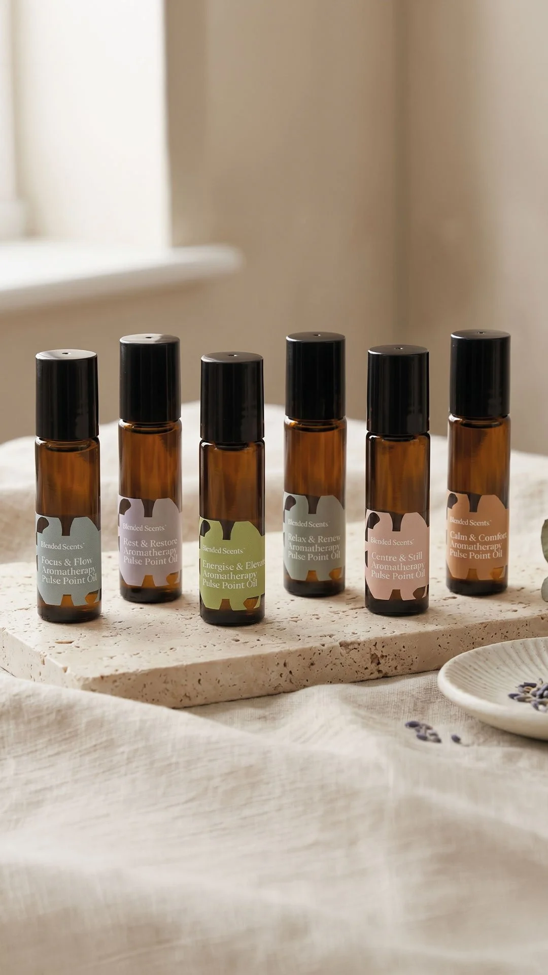
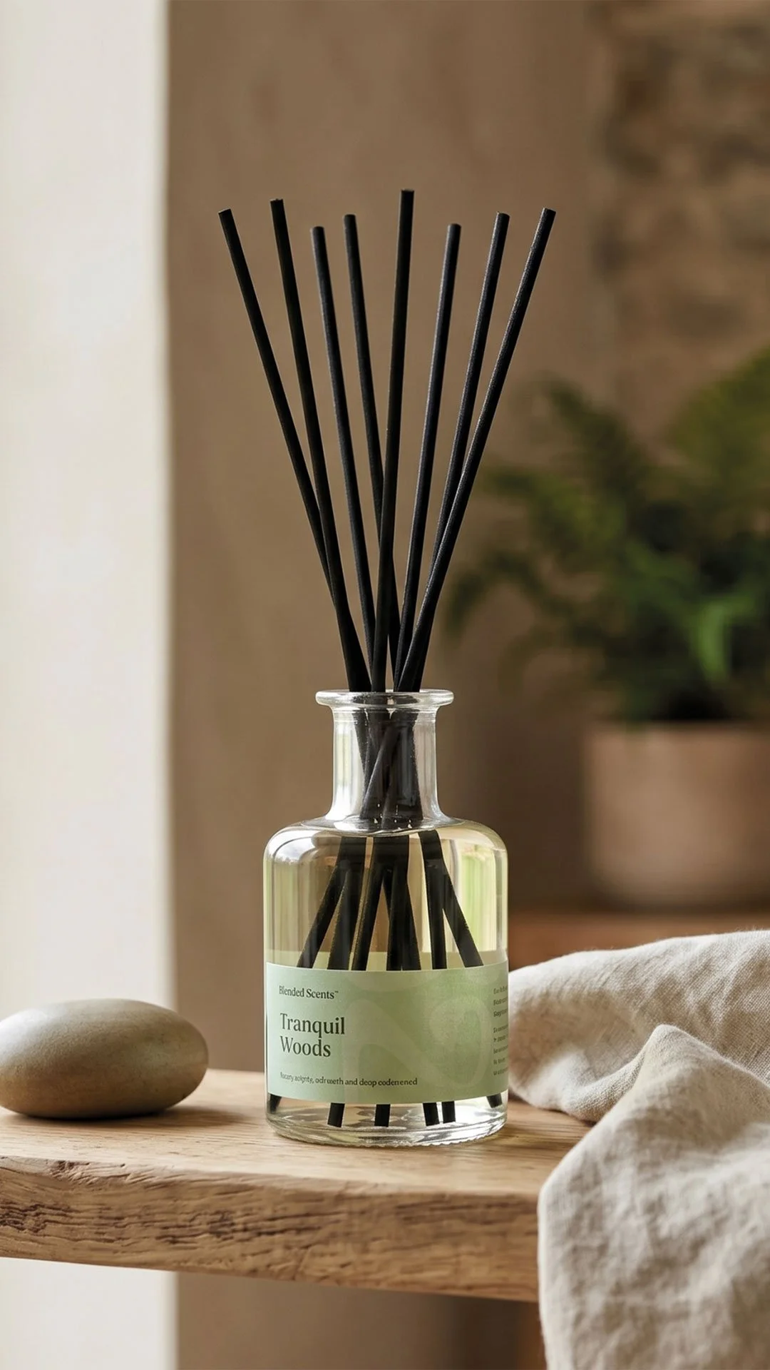
The most significant strategic decision came when the range began to grow rapidly: rather than commission individual botanical illustrations for every new scent, which would have become expensive and unwieldy as the product matrix expanded, the design moved toward an abstract, colour-led system for scent differentiation. Background patterns drawn from the wider brand identity replaced bespoke illustration, creating a scalable convention that could accommodate new products without requiring a new piece of artwork each time.
That decision — strategic restraint in service of long-term practicality — is one of the things that allowed the system to hold together across 84 SKUs.
The packaging system
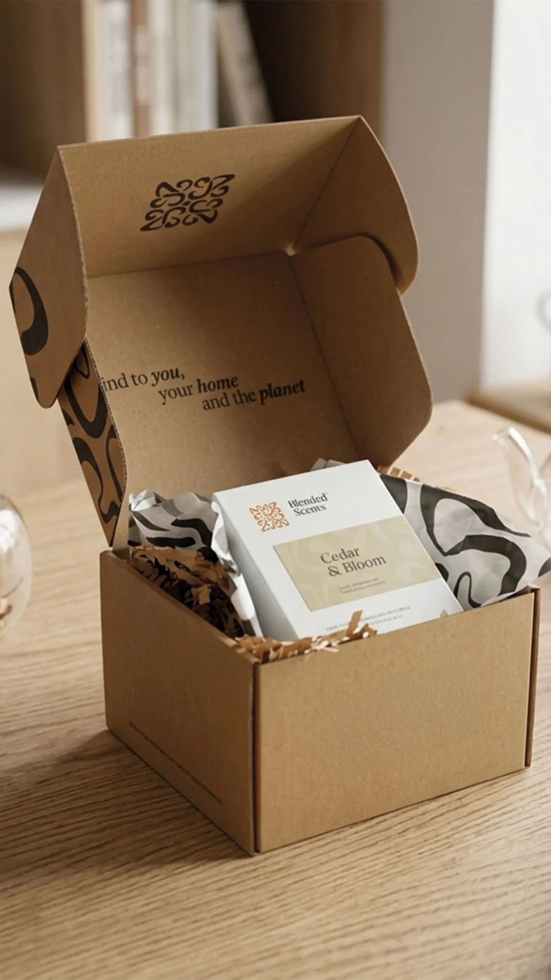
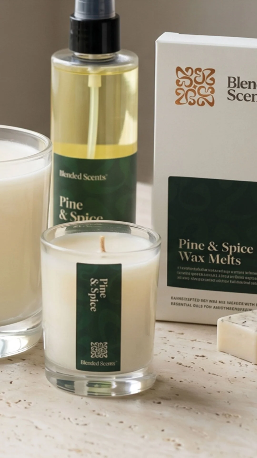
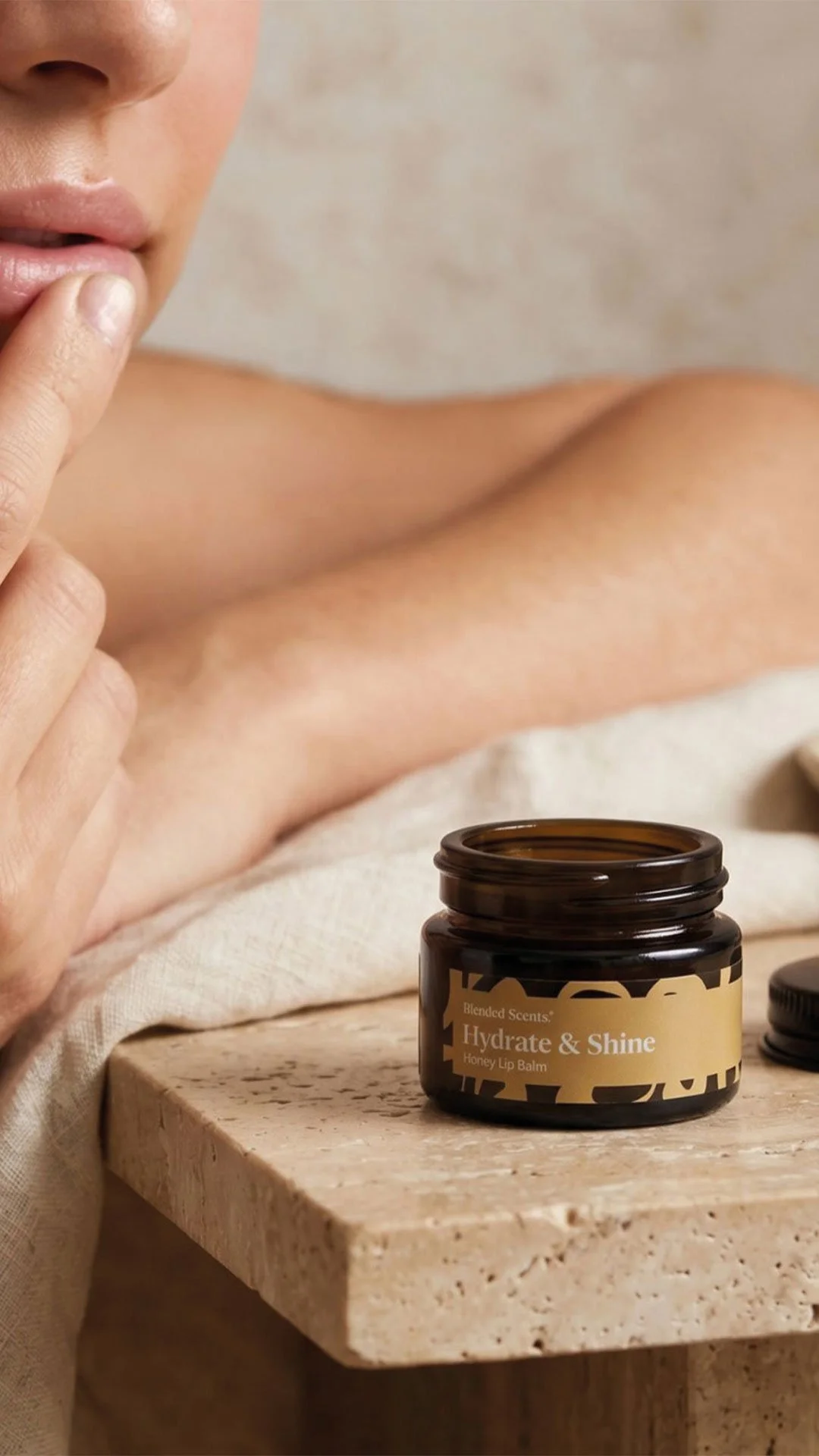
At its most complex, the label and box work spanned candle labels, diffuser labels, room spray labels, skincare labels, body care labels, beard oil, eye cream, face scrub, oils and creams — across clear glass, amber glass, plastic vessels, jars, bottles and boxes of various sizes. Each format had its own dimensions, its own label placement logic and its own production considerations.
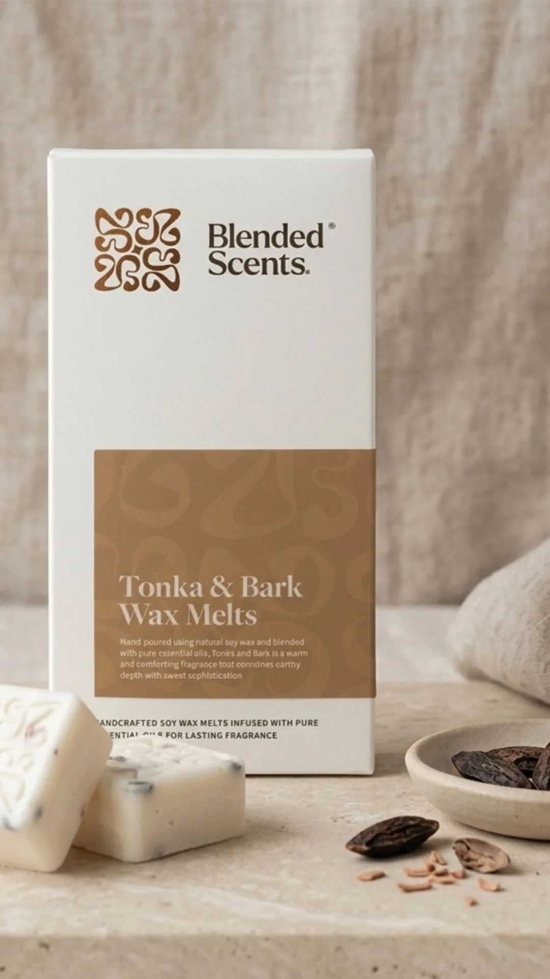
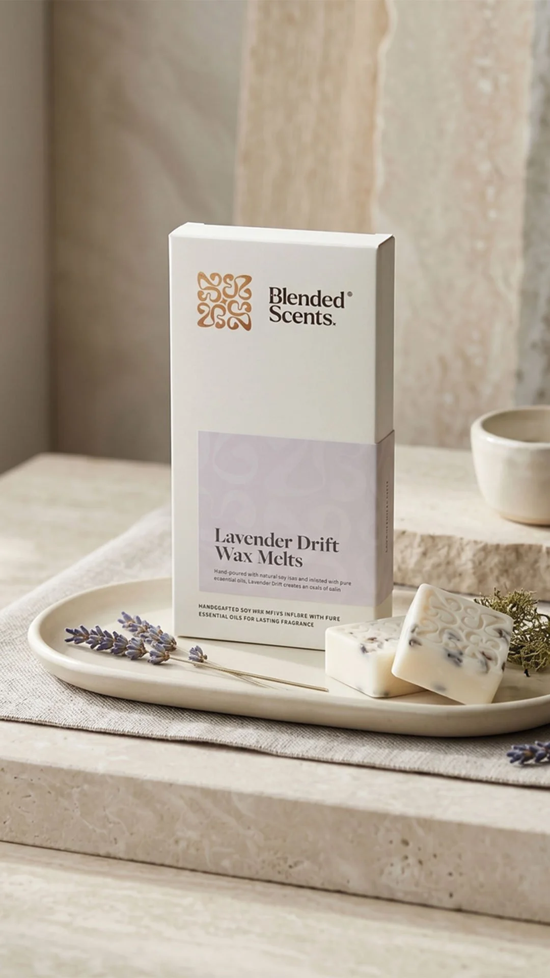
A structured approach to copy hierarchy helped manage the information load across different sizes. Shorter, functional product copy sat on small labels where space was tight. Fuller scent descriptions and product information moved to boxes, where there was room to breathe. Compliance and legal information was treated separately from marketing copy throughout, protecting the premium feel of the labels even as mandatory requirements grew.
Box artwork was developed across the full range — candle boxes, diffuser boxes, room spray boxes and skincare boxes — with foil areas, debossed areas, barcode placement, volume and weight information, recycling symbols and period-after-opening icons all resolved within the design. Production liaison with the print supplier ran throughout, working from supplied dielines, checking artwork against production templates and making practical decisions about what would be printed onto the box versus applied as a label. Foil plate logic and production efficiency were factored in from the start.
Physical testing was recommended throughout the process — label sizes confirmed on actual bottles and jars before production, finishes reviewed against physical samples rather than digital approximations alone. The goal was always to arrive at print-ready artwork that would come back from production looking exactly as intended.
What it amounts to
Blended Scents now has a brand and packaging system built for the scale the business has already reached and the growth still ahead. The identity is coherent across home fragrance and body care. The colour system differentiates products clearly while holding the range together on shelf. The packaging conventions are consistent enough to feel like a considered family and flexible enough to accommodate whatever comes next.
Eighty-four SKUs from a project that started with three; the system held.
We can help you take your brand from idea through to completion.
