
Peach Wellness Academy Platform
Peach Wellness Academy was founded by two practising medical doctors — a husband and wife with a combined 35 years of experience across medicine and the military — with a clear and considered mission: to improve health literacy and empower individuals to make informed choices about their wellbeing, regardless of age or background.
The platform takes a whole health approach, addressing physical, mental and emotional wellbeing together rather than in isolation. Where most products in this space focus on a single aspect of health and respond reactively, Peach Wellness Academy works proactively — building the foundations of healthy living through self-directed courses designed for schools, businesses and individuals alike.
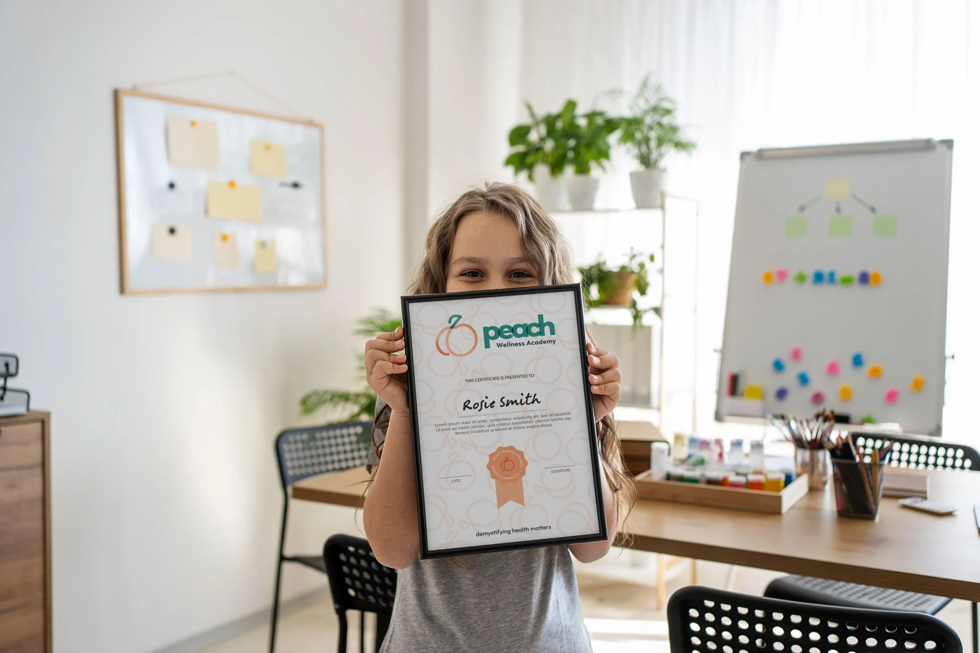
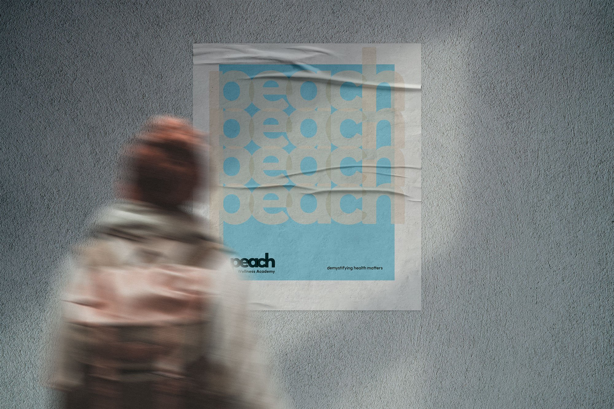

The brand
The brief was clear about what the brand needed to feel like — and equally clear about what it needed to avoid. Relaxed but professional. Friendly and open. Non-judgemental and empathetic. Nothing too medical, nothing too corporate, nothing patronising. For a platform founded by doctors and built on evidence-based content, that balance between authority and approachability was the central creative challenge.
The peach became the natural anchor for the identity — not just as a name reference but as a genuinely considered symbol. The brandmark uses a single flowing line to form an abstract peach shape, with a gradient drawing on the three colours that represent the platform's three core pillars: conversations with your body, conversations with yourself and conversations with the world.
That decision to use a gradient rather than three distinct, segmented colours was deliberate. Separating the colours into individual shapes would have implied that the three aspects of wellbeing were distinct and disconnected — which runs contrary to the whole health philosophy at the heart of Peach Wellness Academy. The gradient allows the colours to flow into one another, visually communicating the interdependency of physical, mental and emotional health within a single unified form.
A teal stem and leaf sit above the peach shape, bringing in growth and naturalism without overcomplicating the mark. The result is an icon that reads clearly as a peach, carries real conceptual depth and works as a standalone asset as well as part of the full identity system.
Typography was selected with accessibility as a primary consideration alongside aesthetics — important for a platform reaching younger audiences and those who may have difficulty reading on screen. The full identity system was developed across a primary lockup, secondary lockup, wordmark and standalone icon, with light and dark variations and a warm off-white used in place of stark white throughout to soften the overall feel and support accessibility.
The palette was built around warmth and meaning. Peach for positivity and openness. Teal for balance and individuality. A warm yellow for optimism and energy. A sky blue used more sparingly, as a supporting accent that brings calmness and trust without dominating the palette. Deep green — less harsh than black, and rooted in the health and education territory the brand inhabits — anchors the system at its darkest point.
Words from the client
“Sarah significantly exceeded our expectations while creating for and refining our brand. We cannot speak higher of her and her work. We are always getting compliments on our logo, colours and additional graphics. I’d recommend her to anyone.”
Social media management
Alongside the brand, Studio Creates develops and manages Peach Wellness Academy's social media presence across Instagram, Facebook, TikTok, YouTube Shorts and LinkedIn.
The strategic challenge was significant. Peach Wellness Academy needs to communicate meaningfully with several distinct audiences at once — parents, teenagers, educators, school decision-makers and wider wellness audiences — each requiring a different tone and a different kind of content to feel genuinely relevant. The approach was built around audience segmentation: educational support for parents, confidence-building and relatable content for teenagers, credible and evidence-led messaging for educators.
The content philosophy prioritises genuine connection and educational storytelling over sales messaging. Community building and long-term trust over short-term engagement spikes. For a brand whose entire proposition rests on being a trusted, non-judgemental resource, those aren't just aesthetic choices — they're strategic ones.
Social media management is delivered by Amy, Studio Creates' dedicated social media manager, whose background spans national communications campaigns, wildlife conservation and third-sector digital strategy. Her experience building engaged communities around complex topics made her a strong fit for the particular demands of a multi-audience health education brand.
Is your business looking for help with social media management? Let’s discuss your objectives.
