
The Lymphatic Method
Gillian Pringle spent twenty years in California immersed in the beauty and wellness industry, developing a specialism in facial sculpting and lymphatic drainage that goes considerably deeper than the surface-level treatments most people associate with skincare. Her approach is rooted in the understanding that genuine skin health comes from within — that addressing the underlying factors affecting lymphatic flow and systemic wellness produces results that conventional skincare simply cannot replicate.
Returning to Scotland, Gillian established The Lymphatic Method across North Berwick and Edinburgh: a practice built on expertise, a holistic philosophy and an aesthetic sensibility shaped by two decades in California's wellness culture.
The brand
The brief pointed in a clear direction from the outset. Clean, calm, boho-chic. Nothing cluttered, nothing overtly colourful. A brand that felt elevated and distinctly different from anything else operating in the local area — reflective of the Californian influence that runs through everything Gillian does, but grounded enough to feel genuinely at home in East Lothian.
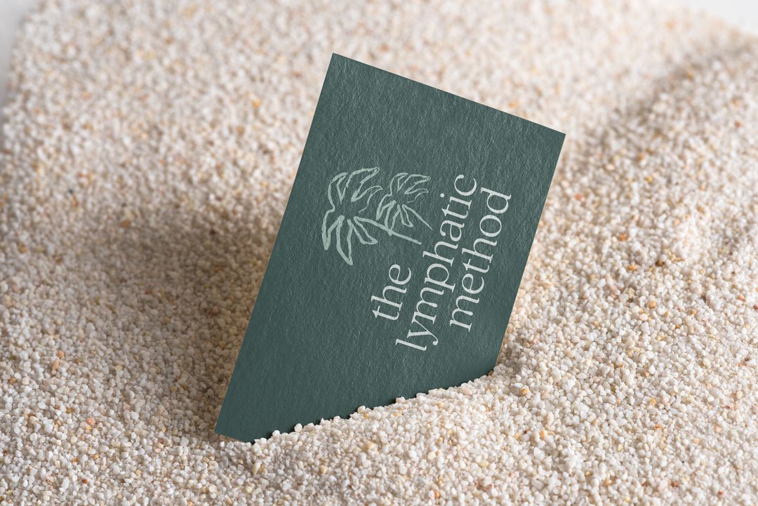
The creative direction settled on palm trees as the visual anchor — coastal, Californian, immediately evocative of the aesthetic Gillian had described — but rendered in a way that avoided the obvious. The illustration style chosen was distinctive rather than decorative: something with a little texture and intrigue that mirrored the specialism behind the practice. Not your typical wellness clinic iconography.
What made the mark more considered was how the two reference points — palms and hands — were brought together. Rather than treating them as separate elements, the design merged them: the hand cupping the palm trees, its lines echoing the fronds of the leaves above. Both present, working in harmony rather than competing. The gesture also reads as a wave, bringing the coastal connection in without stating it directly.
The palette was drawn from the natural world that runs through both California and the East Lothian coastline. Aqua, sea glass, mist, sand — colours chosen as much for their psychological associations as their visual qualities. Calm, vitality, serenity, warmth. Deep ocean replaced black at the darkest end of the palette, grounding the identity with the professionalism and authority the brand needed without the harshness that flat black would have introduced. Typography was set with generous spacing — letterforms that breathe, reinforcing the sense of calm and space the brand was communicating throughout.
The lowercase approach to the wordmark was deliberate. Minimalist in its confidence, it communicates expertise without formality — approachable but never ordinary.
Words from the client
“Sarah at Studio Creates is absolutely amazing! From the very beginning, she truly listened to me and understood what I wanted, even the things I couldn’t quite put into words. She brought The Lymphatic Method website and my branding to life in such a beautiful, thoughtful way. The end result was beyond anything I could have imagined. Sarah is kind, creative, and such a joy to work with. I would recommend her to anyone.”
A name worth noting
During the website redevelopment phase, an important strategic observation emerged. The original trading name — The Lymphatic Facialist — described a single treatment type rather than the broader wellness methodology Gillian had developed. As the practice evolved and the ambition to train other therapists and open multiple locations became more defined, that name was becoming a constraint.
The shift to The Lymphatic Method repositioned the business from a single-treatment descriptor to a broader philosophy and practice. It opened the brand architecture to accommodate future services, training programmes and multiple locations without requiring another rebrand. The original name was retained strategically within SEO body copy and search-facing content, ensuring no visibility was lost in the transition while the brand moved forward.
The website
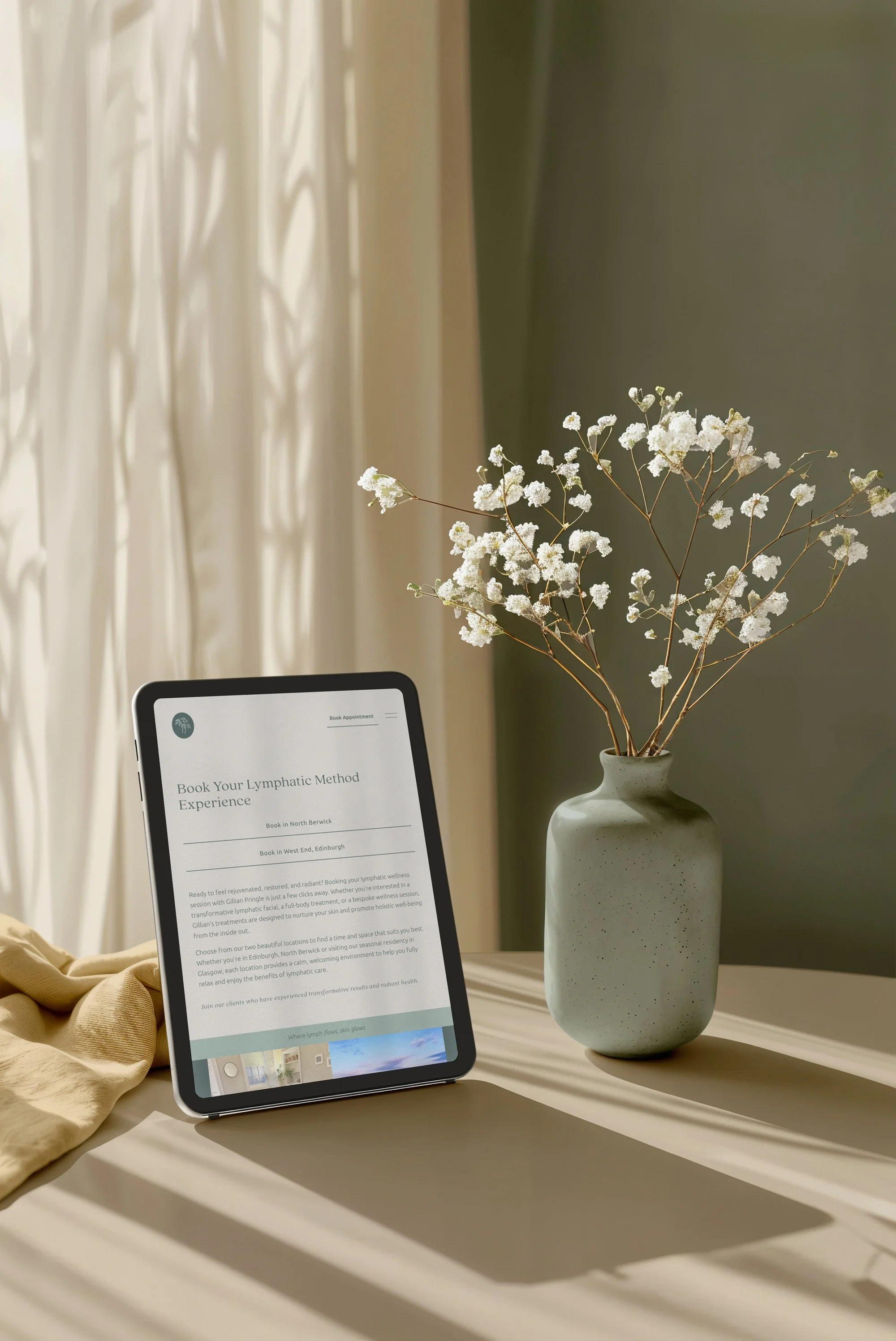
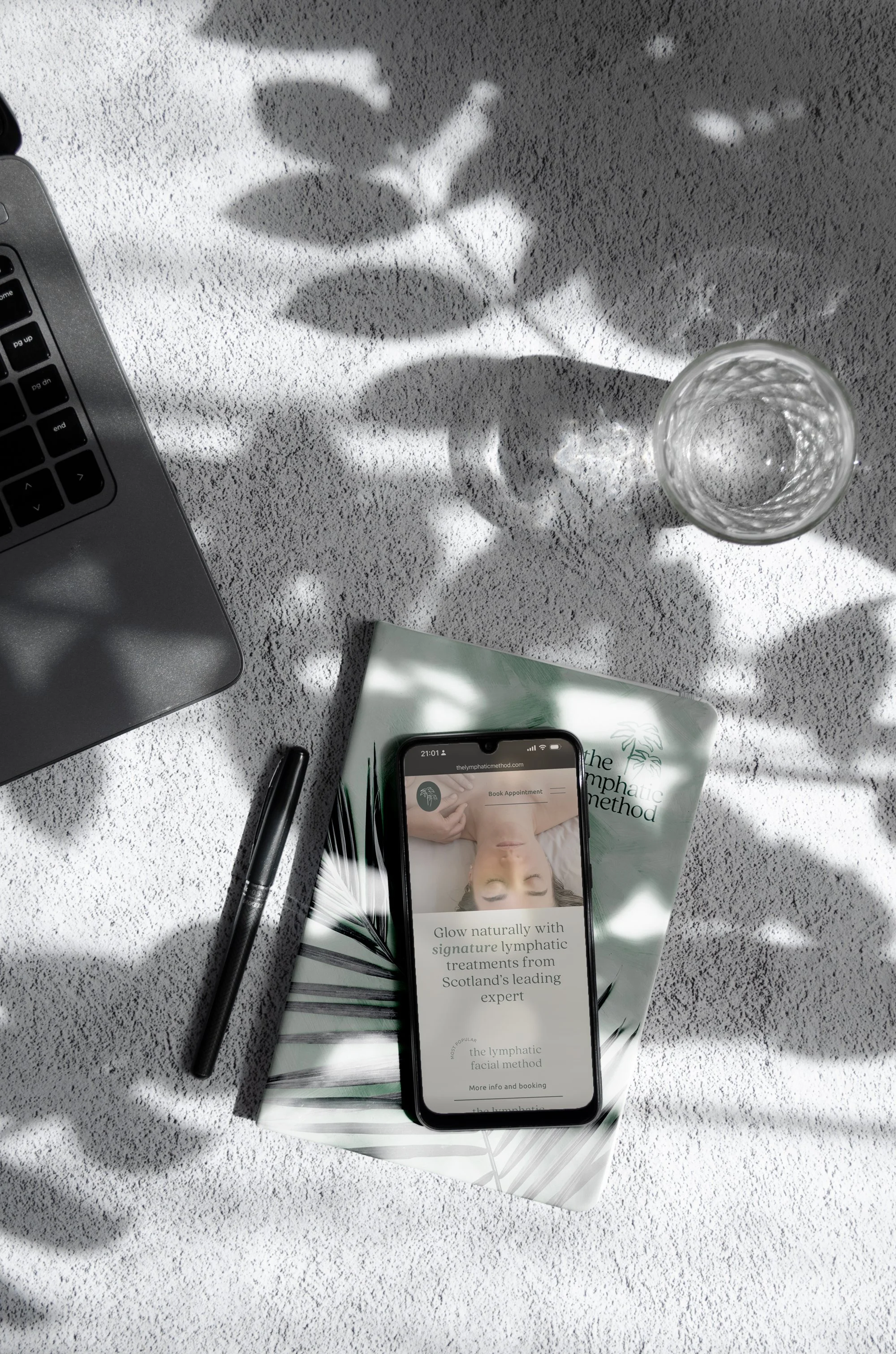
The website redevelopment came at a point of genuine business evolution. Gillian had recently consolidated into her own studio space, reducing commission costs and taking greater control of her client experience and booking system. It was the right moment to ensure the digital presence reflected where the business actually was.
The existing site was reviewed thoroughly before any design work began — navigation structure, conversion pathways, booking integration, mobile performance, imagery, SEO foundations. What came back was a clear picture of where friction existed and where opportunity had been left unrealised.
The redevelopment addressed all of it. A clearer navigation structure built around the user journey. Stronger treatment presentation. Better founder positioning that communicated Gillian's expertise and methodology rather than simply listing services. Booking flows integrated more effectively throughout the site rather than siloed to a single page. E-voucher functionality added. Newsletter sign-up given proper visibility. Google Analytics and Search Console set up properly for the first time.
The Glow Journal — a blog and educational content area — was introduced as part of the relaunch, with four SEO-focused launch articles written to begin building search visibility around lymphatic health and facial wellness. For a specialist practice in a relatively niche discipline, that educational content does two jobs simultaneously: it supports organic search performance over time, and it builds trust with prospective clients who may be encountering lymphatic drainage for the first time.
All imagery was optimised for loading speed and search visibility. SEO titles and meta descriptions were implemented site-wide. Acuity scheduling was restructured with branded client communications. A tutorial video and training resources were produced to give Gillian the confidence to manage the site independently post-launch.
What it delivers
The Lymphatic Method now has a brand and digital presence that reflects the quality and distinctiveness of what Gillian has spent two decades developing. The identity is calm, considered and entirely its own — nothing like the generic wellness clinic aesthetic that saturates the category. The website converts rather than just informs, with every element oriented toward getting the right clients to the right point of action.
For a practice with genuine ambitions to grow — multiple locations, a training programme, a broader methodology — the foundations are now in place to support that growth without requiring everything to be reconsidered from scratch.
We can get you looking professional, and online with a slick booking website to boot.
