
Castleton Farm Agritourism
Castleton Farm has been in the McNicol family since 1908. Four generations. 430 acres of arable land growing barley for malting, wheat for distilling and spring beans for flour.
A 1,950-tree fruit orchard planted in recent years — apples, pears and plums — with hundreds more cider apple trees to follow. A juicing and cidery plant in development. And an agritourism portfolio that now includes Drift, Escape Sauna and Seek Dog Park, with farm tours, scone-making classes and future retail space all part of the longer vision.
The view alone is worth noting. The farm overlooks the Firth of Forth, the Bass Rock, Tantallon Castle and North Berwick Law simultaneously. Three of East Lothian's most iconic landmarks, visible from a working farm that produces food and drink and welcomes visitors into the middle of it.
This is the context from which every sub-brand within the Castleton Farm portfolio has emerged. And it's the context the umbrella brand needed to hold and communicate.
The brief
By the time the Castleton Farm brand was commissioned, Studio Creates had already developed Drift's identity and was working across the growing portfolio. The brief was to create an overarching brand that could sit above Drift, Escape and Seek — connecting them visually and narratively as part of a single farm story — while being distinct enough to carry its own authority.
The key tension was one of register. Drift is a contemporary coastal eatery with a strong visual identity. The sub-brands that follow it are each distinct in character. Castleton Farm needed to feel older, more rooted, more agricultural — the origin rather than the destination — without feeling out of place alongside the more modern expressions of the businesses sitting beneath it.
The founding date of 1908 became a significant creative asset. Not as nostalgia for its own sake, but as genuine provenance — a signal that this is a working farm with real history, not an agritourism concept assembled from scratch.
The identity
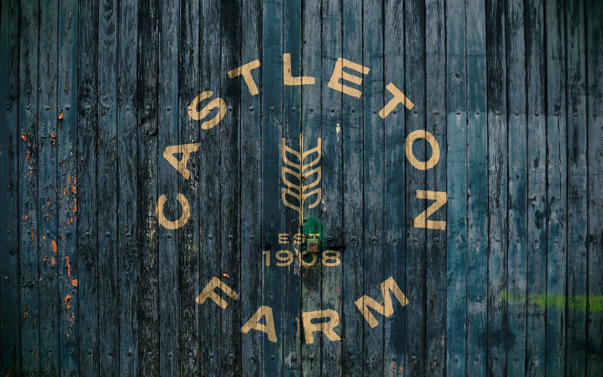
The creative direction drew on the visual language of farm branding from an earlier commercial era — the clean, stamp-like quality of how farms presented themselves in the mid-twentieth century, when you would see their marks on the sides of vehicles, on machinery, in local newspaper advertisements. Purposeful, legible and built to last rather than to follow a moment.
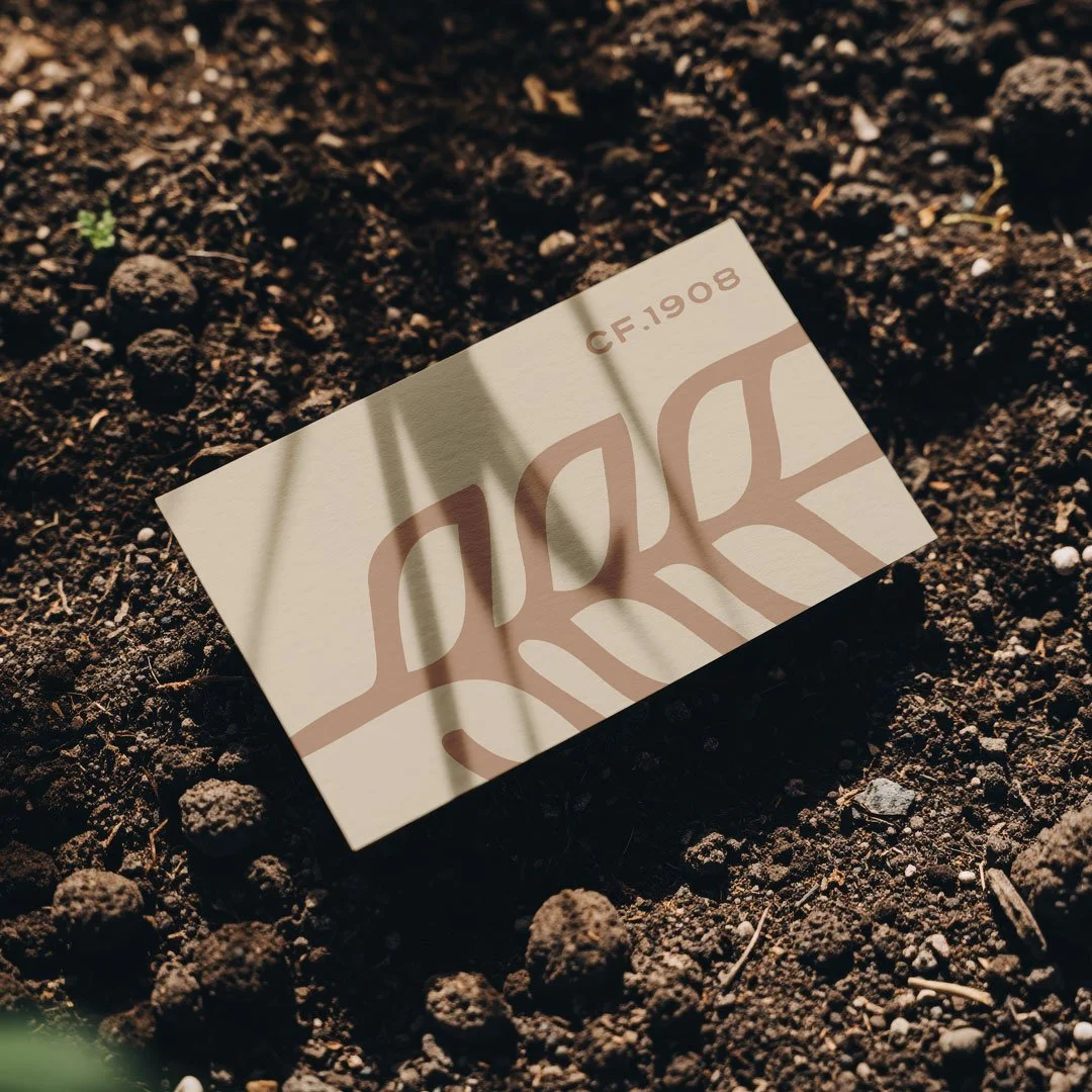
The central mark is a crop illustration — a nod to barley, the farm's principal crop — drawn with a deliberate hand-made quality that gives it a distressed, slightly imperfect character. Not as polished as the Drift iconography it sits alongside, which was intentional: Castleton Farm predates Drift and should feel like it. The illustration shares the open-ended graphic quality of the wider Drift icon family, maintaining visual coherence while occupying its own territory within it.
The typeface was adapted and distressed to reinforce the stamp-like quality — letterforms with a slightly eroded feel that communicates age and authenticity without tipping into heritage pastiche. The mark was developed as a roundal as well as a primary lockup, with the circular format lending itself naturally to barn doors, potato boxes, vehicle livery and the kind of large-scale applications a working farm generates.
The founding year — 1908 — was incorporated into the identity system. In one reading it functions as a heritage credential. In another it works like a serial number or traceability mark, which connects neatly with the agritourism narrative of knowing exactly where food and drink comes from.
The colour palette
The Castleton Farm palette was built as an expansion of the existing Drift colours rather than a replacement for them. The core dark tone and the sand that anchor Drift carry through, providing immediate visual continuity across the portfolio. A rosy apple tone was introduced — naturally suited to the cider and juice output from the orchard — alongside an earthy tone connected to the farming side of the business and a warm plum that brings richness appropriate to fruit, cider and the cidery events space in development.
Each colour within the system was given an intended association — food, farming, cider, agritourism — creating a practical logic for how the palette extends across different parts of the business as they come online. The full palette also provides the colour infrastructure from which each sub-brand draws, meaning Escape's teals and oranges and Seek's palette all trace back to Castleton as their visual origin point.
Flat white was avoided throughout in favour of a warmer, creamier off-white that reinforces the historical and heritage quality the brand was aiming for. Nothing within the identity feels clinical or contemporary — which is exactly the register a farm established in 1908 should occupy.
Built for a growing portfolio
The Castleton Farm identity was designed with its role as an umbrella brand explicitly in mind. It needed to function credibly at the top of a visual hierarchy — on farm buildings, signage at the entrance to each agritourism area, food packaging, clothing, vehicles and the website — while making space for the businesses beneath it to have their own distinct identities.
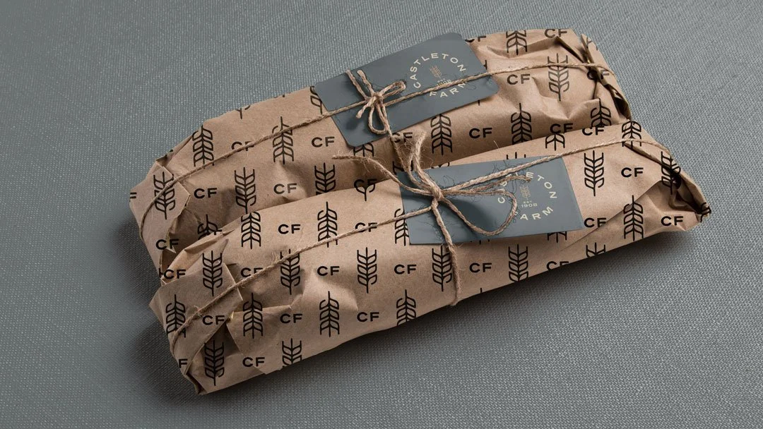
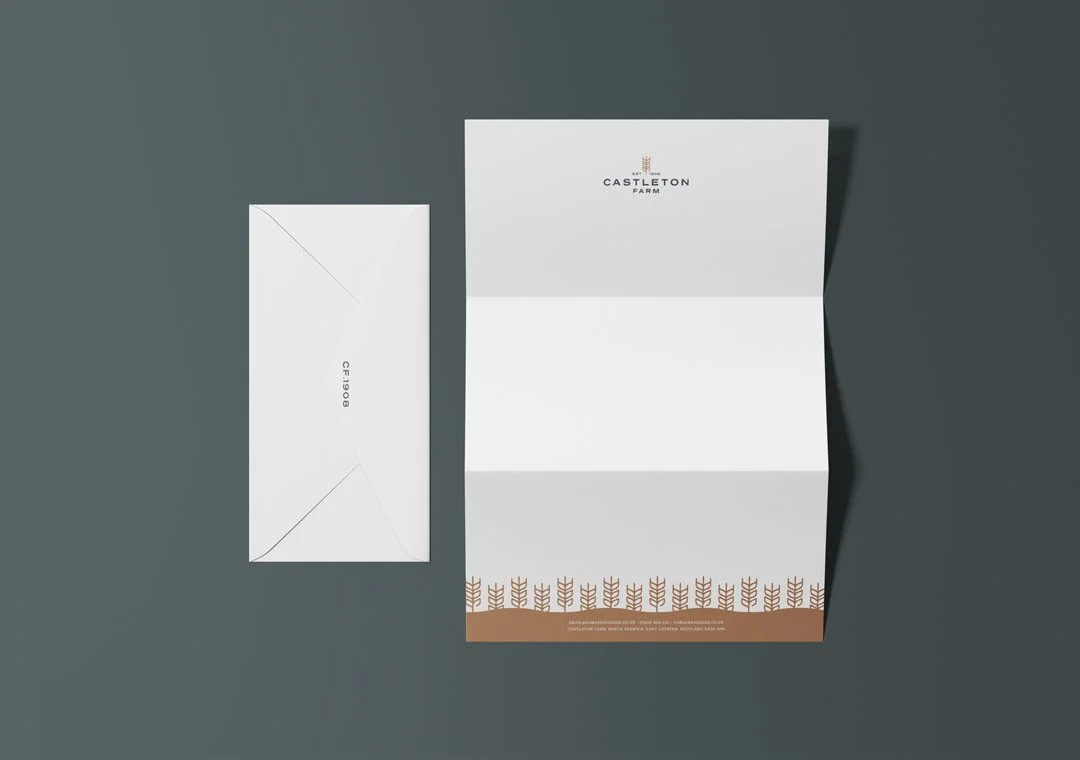
Mockups were developed across barn signage, the roundal at large scale, food packaging using repeating icon patterns, letterheads and vehicle livery. Each application demonstrated how the mark could feel at home in both the agricultural environment of the working farm and the more commercial contexts of packaging and print.
The bigger picture
Castleton Farm is where everything Studio Creates has built for this client begins. Drift was the first business, and the relationship that grew from it led to every subsequent brand and website within the portfolio. Castleton Farm as an identity came later — the moment when the portfolio was large enough and the vision clear enough to warrant a proper umbrella brand to hold it all together.
The farm, the people, the produce and the view have been there since 1908. The brand now reflects all of that — and gives the businesses growing from it a coherent foundation to build on for the next generation.
Working with a number of close brands that need careful consideration? We can help.
