
Drift Eatery
By 2025, Drift had grown considerably. The Castleton Farm portfolio now included Escape Sauna and Seek Dog Park. A polytunnel was in place to grow market garden vegetables for the specials menu. Evening events were on the horizon. And the original brand identity — which had served the business well in its earlier stages — was creating some unintended impressions.
There were two connected problems. The first was perception: operating near a busy road in a rural tourist area, Drift risked being mistaken for a standard café — generic takeaway food without anything communicating the quality, the provenance or the point of difference. The second was character: the existing identity had hard edges and a clinical, flat quality that didn't reflect how the team actually operated or how guests experienced the place. As Jo observed, it could inadvertently make people feel the welcome would be as cool as the visual language suggested.
The rebrand brief was to move from somewhere cold and clinical to something softer, warmer and more in line with the quality of what Drift had become — without losing the confidence and recognition the brand had built up over time.
The four brand words that anchored the creative direction were welcoming, grounded, thoughtful and local. Not just visual descriptors, but principles intended to run through everything — the way the brand looks, the way it speaks on social media, the way it reads on a website, the way it feels in an email.
The logo
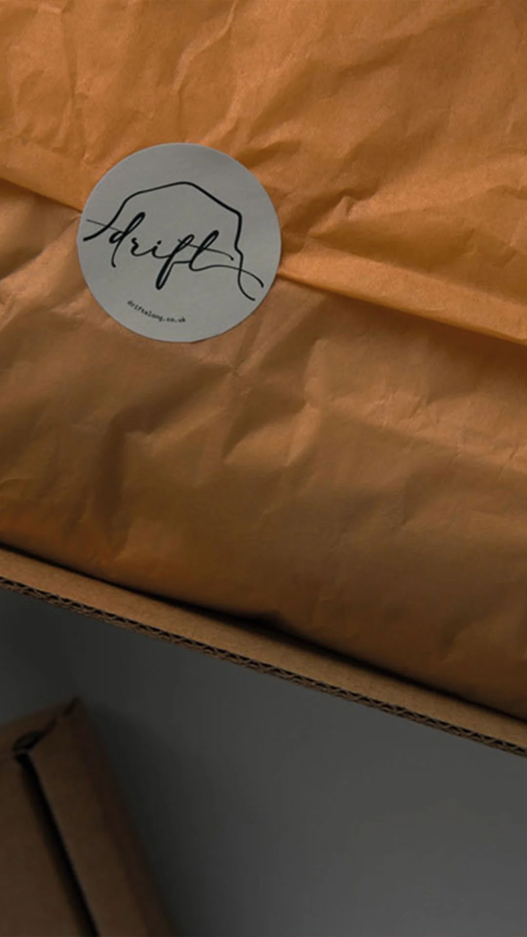
The primary brandmark was developed around two things that are genuinely specific to Drift: the view of the Bass Rock and the feeling of being by the water. The wordmark was drawn with a hand-derived quality, and the eye moves naturally from the lettering outward towards the Bass Rock silhouette and a seabird — almost replicating the actual view from inside the space: Drift in the foreground, the rock to the right.
The Bass Rock is admittedly ubiquitous in North Berwick branding. The decision to retain it was deliberate — it's what people most strongly associate with Drift's location, and moving away from it in favour of something more original would have been clever at the expense of clarity. What made the difference was execution: drawn organically, with the same hand-derived quality running through the whole mark, rather than a clean graphic element dropped in from outside the identity.
The seabird was carried forward from the existing brand, redrawn to match the new style. Wave forms in the stacked version echo the lapping of water and give the mark an organic movement entirely absent from the previous version. A full scalable system was developed across a primary lockup, a stacked version, a simple wordmark for smaller applications and an icon set for use throughout the identity.
Icons and graphics
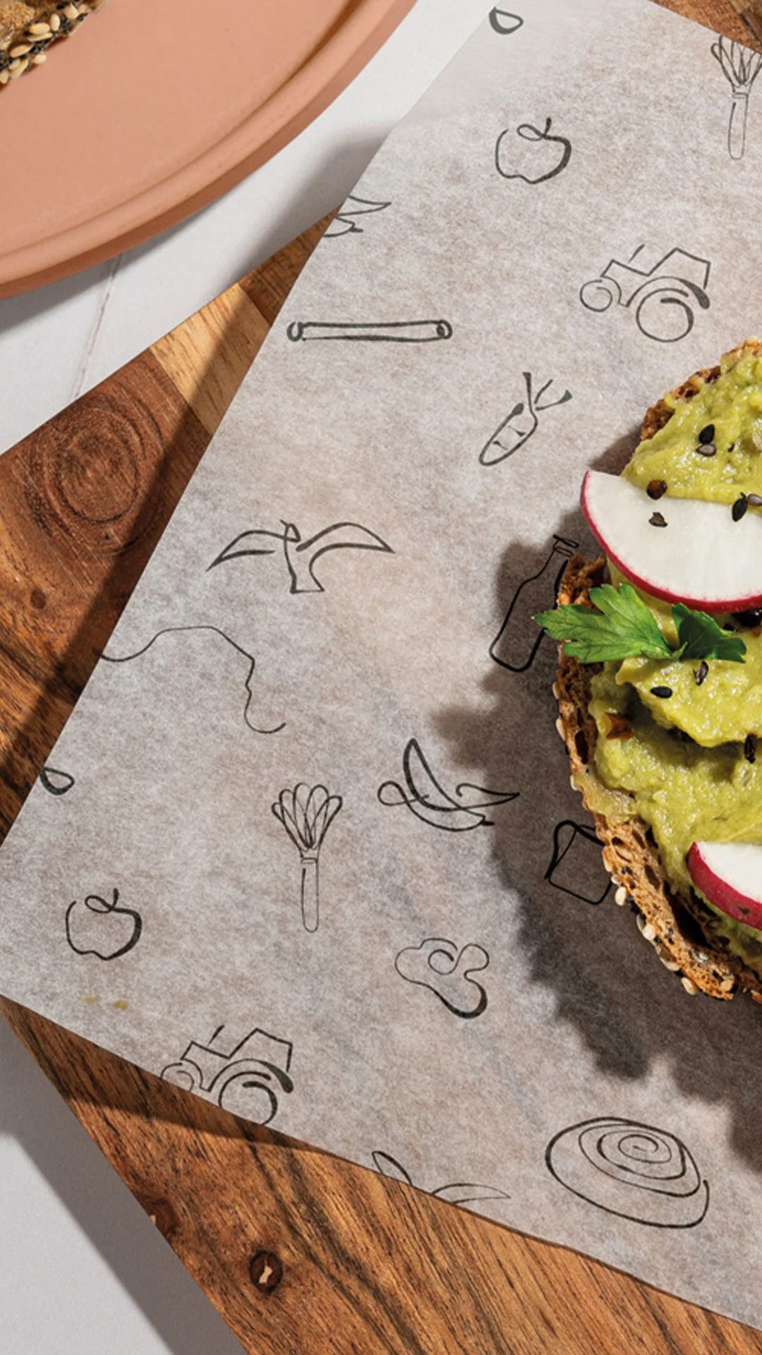
The icon suite was one of the most considered elements of the rebrand. The existing icons felt cold and harsh — drawn without the finesse the new brand required. The updated set was redrawn entirely in a consistent style: line drawings with warmth and movement, scalable from small label applications to large print.
The first group draws from the surroundings — the Bass Rock, seabirds, a tractor, references to the coastal landscape. But the more significant addition was a second suite built around food and drink: coffee, baked goods, produce from the market garden and orchard, farm references. These are the things Drift actually makes and serves, and their absence from the previous identity was a genuine gap. The brand had been communicating the landscape without communicating the food. Both now sit within the system, usable individually, in combination or as repeating patterns across packaging, food wrapping and printed materials.
Words from the client
“We have been working with Sarah now for 5 years. The impact she has made has been incredible. Our business has grown and she’s grown with it. Last year, we took the decision to rebrand. Not always easy when your brand is well known, however, recognising our coffeehouse had moved into more of an eatery it felt important our brand reflected that. Eat, drink, relax has always been our tag line and we wanted a brand which reflected it. Something softer, still drifting but something that also spoke of the landscape. In our opinion, Sarah delivered just that. It’s been well received by our existing customers and many have commented on it through our socials.
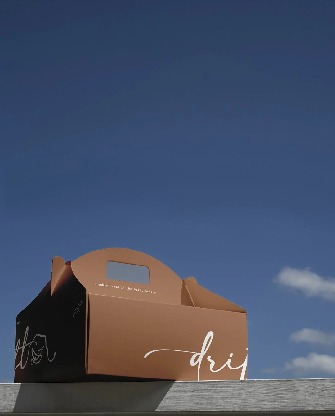
Sarah has also grown her own business. This in turn has helped ours further. It began with website design. Now we work with Sarah to produce everything related to our businesses. This ranges from signs, reservation table cards, tissue to wrap our bread, boxes for special occasion cakes to name but a few. And working with other local businesses to make it all happen.
With 3 Agritourism businesses going on generating content, for socials was becoming a nightmare. Vital to the business, but no time to spend on it. Amy has been tremendous in writing content and producing engaging social posts across each of our 3 brands. She has ideas we would never come up with. These are all then branded up my Andrea and Kelly ensuring consistency and thus creating a stronger more relatable brand.
I cannot thank Sarah and her team enough for the dedication and hard work they devote to helping us to continue to grow our business. I am truly excited for what is to come next.”
Typography
The typeface direction was to find something that retained the spirit of what had been used before — its weight and character — while shedding the harder edges that were contributing to the clinical feeling. The chosen typeface has a natural openness and breathing room to it that reinforces the unhurried quality Drift is trying to communicate: the feeling of slowing down, taking in the view, enjoying food that's been made carefully. It sits close enough to what came before to feel like a natural evolution rather than a departure.
Colour
The palette was rationalised and refreshed. The previous version had accumulated too many colours and several of them felt jarring against the softer direction the brand was moving in. The core dark tone was retained as the brand anchor. The brown that Jo had questioned wasn't removed but evolved — shifted from a flat tan towards something earthier, woodier and more alive. The green was given slightly more depth to prevent it reading as washed out. The misty blue was nudged towards something more modern. Flat white was replaced with a warm near-white that prevents any clinical feeling in lighter applications.
Across the palette, each colour was named for the landscape and surroundings of the farm — a quiet reminder of what the brand is rooted in and what it should communicate every time it appears.
Applied across the brand
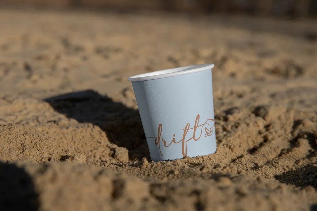
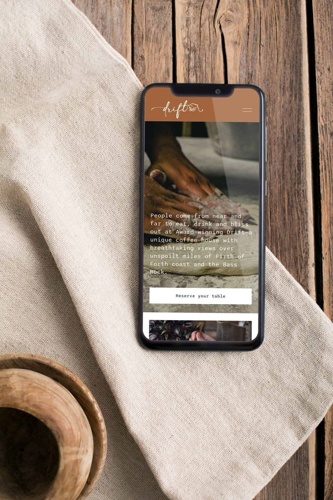
Mockups were developed across a wide range of applications: packaging using natural textures drawn from the produce itself, embroidered staff uniforms, takeaway cups stamped to carry the brand out into the world, food wrapping with icon patterns, gift vouchers, poster templates, trailer graphics and a website mock-up showing how the updated identity would translate digitally.
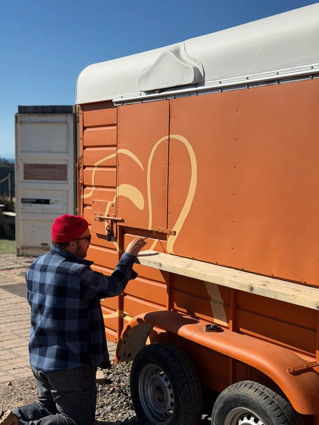
The trailer graphics reflect a considered environmental approach — using the warmer, more natural palette tones to allow the trailers to sit within their surroundings rather than against them. Combined with properly designed menu panels, the aim is a calmer, less visually cluttered service environment that reinforces the brand rather than contradicting it.
If you have an established business in need of design management, a re-brand or professional website maintenance then let’s talk.
