
Seek Dog Park
Seek is the third business within the Castleton Farm agritourism portfolio, sitting alongside Drift and Escape. Where Drift is grounded and confident — solid, structured, coastal — Seek needed to occupy very different creative territory. A secure off-lead dog park is a place of freedom, movement and joy. The brand had to reflect that without losing the coherence that makes the Castleton Farm family feel like a family.
That tension — playful and free, but connected to something more grounded — became the central creative challenge. And it produced some of the more interesting design thinking in the whole portfolio.
The identity
The brief pointed towards something that captured the way a dog uses its senses — scent trails, movement, the instinct to follow and explore. That became the conceptual thread running through the logo development.
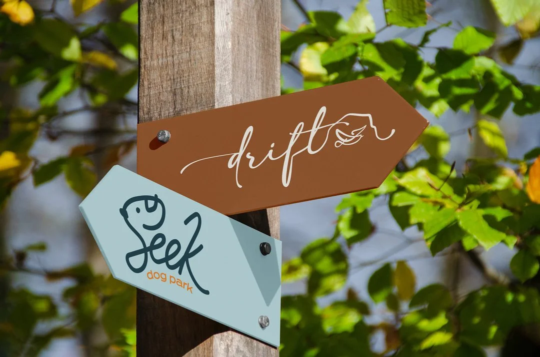
The Seek wordmark was hand-drawn rather than set in type. Loose, cursive and genuinely free-flowing — the opposite of the sturdy, contained quality that characterises the Drift identity. Where Drift uses square slab serifs that suggest solidity and reliability, Seek needed something that felt untethered. No straight lines. No rigid containers. The letterforms move.
The detail that makes the mark work is embedded within the letters themselves. The S carries the curve of a scent trail. The K has a tail. The elongated legs of the characters suggest a dog in motion without resorting to the kind of obvious dog illustration that would have tipped the whole thing into novelty territory. It reads as a dog to people who encounter it — the first person shown the mark said dog immediately — but it does so through suggestion rather than statement.
The supporting typography uses Pressacav, drawn from the wider Castleton Farm brand rather than Sanchez, which belongs firmly to Drift. That distinction matters: Sanchez carries the weight and character of the coastal accommodation brand and shouldn't be diluted across sub-brands that have their own distinct personality. Pressacav sits naturally alongside the handwritten Seek wordmark and gives the broader identity its own typographic identity within the family.
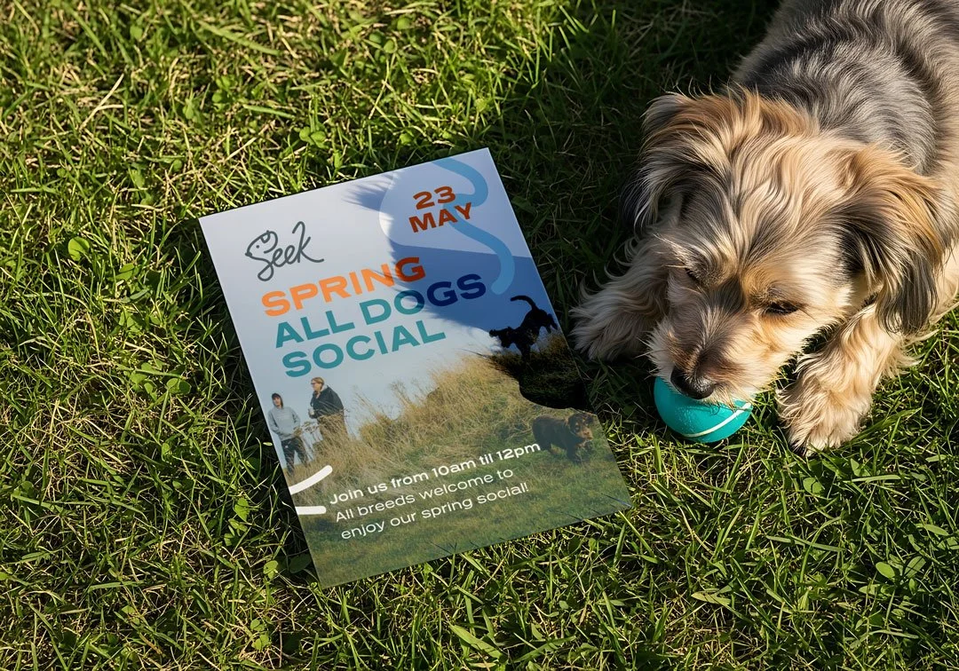
The colour palette draws from the established Castleton Farm colours — Seabuckthorn orange, Stormy Seas and teal — creating immediate visual connection to Drift and Escape while giving Seek enough of its own arrangement to feel distinct. The palette is deliberately lean: sufficient range for contrast and flexibility, without overcomplicating a brand that's ultimately about simplicity and freedom.
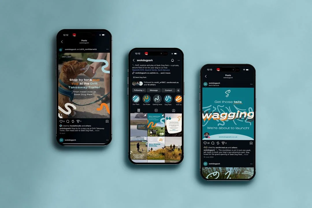
The supporting pattern system, developed for noticeboards, signage and print applications, extends the scent trail concept into something decorative and playful — curved, flowing forms that bring energy to any surface they're applied to without ever feeling chaotic.
The website
The booking platform followed the same operational logic established for Escape. Scheduling built in for session bookings, with packages available for regular visitors making multiple bookings. Gift vouchers, event listings and the ability to manage availability and promote slots independently — all handled through the integrated system without requiring developer support each time something changes.
For a dog park where session times, capacity and seasonal availability all need to flex, that operational independence is genuinely important. The site was built to be managed day to day by the team, not maintained externally.
Within the family
One of the more satisfying aspects of the Seek project is how clearly it demonstrates what a well-considered brand family looks like in practice. Drift, Escape and Seek share colours, share a typographic relationship and share an underlying design sensibility rooted in the East Lothian coast. But each has its own personality, its own visual register and its own identity that works independently.
A guest encountering the Seek brand at the dog park immediately recognises Castleton Farm. They also immediately understand that this is something different from the accommodation or the sauna — lighter, more playful, made for a different kind of visit. That clarity of character, within a coherent family, is what good sub-brand development produces.
Studio Creates manages the ongoing branding, websites and social media across the full Castleton Farm portfolio. Seek is the most recent addition to that work, and one of the more joyful projects in the retainer.
Words from the client
“We have been working with Sarah now for 5 years. The impact she has made has been incredible. Our business has grown and she’s grown with it. Last year, we took the decision to rebrand. Not always easy when your brand is well known, however, recognising our coffeehouse had moved into more of an eatery it felt important our brand reflected that. Eat, drink, relax has always been our tag line and we wanted a brand which reflected it. Something softer, still drifting but something that also spoke of the landscape. In our opinion, Sarah delivered just that. It’s been well received by our existing customers and many have commented on it through our socials.”
We’ll help to create a fun, professional brand for your bookable business.
