
Pellimont Skin & Hair Care
Pellimont was founded with a clear and genuinely considered position in the beauty market: no plastic. Not reduced plastic. Not recyclable plastic. None.
The product range — solid bars, dry powder refillable formulations and sustainable accessories — was built entirely around that commitment. Solid bars last longer, require minimal packaging and have a lower carbon footprint than their liquid counterparts. Refillable Miron violet glass containers were chosen for their longevity and their ability to preserve formulations naturally. Every material decision was deliberate and traceable.
The founder had spent two years studying with Formula Botanica, achieving diplomas in organic skincare and haircare, and brought that knowledge directly into the product formulations — small-batch, made in Inverness, vegan, plant-derived and free from synthetics, artificial fragrances and petroleum-based ingredients. The ingredients list alone was compelling: wild harvested organic coconut, mango butter, plum oil. The kind of formulations that deserve a brand capable of communicating their quality.
The name came from a personal place. Pellimont is a rework of Montpelier Place in Edinburgh — the street where the founder's mother had lived — bringing something rooted and meaningful into a brand that could easily have remained abstract.
The brief
The challenge was a particular one. Pellimont needed to stand apart in a beauty market that has become increasingly crowded with sustainable and natural skincare brands, many of which share similar values but express them through similar visual languages — muted palettes, organic textures, quiet typography.
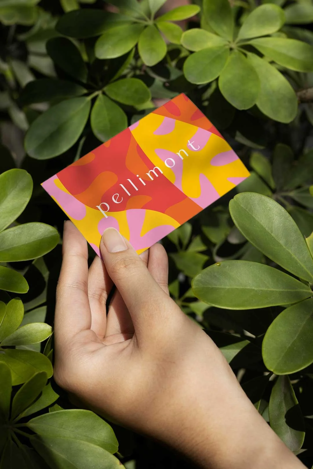
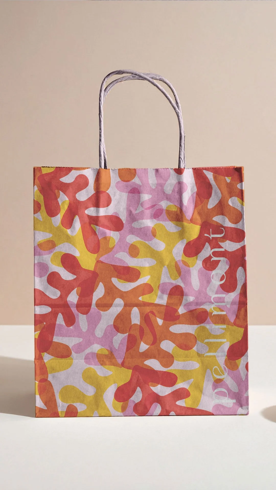
The founder's instinct was to go in a different direction. Vibrant orange and yellow. Bold typography. Something that felt cult and distinctive — approachable and friendly, but with enough edge to attract a following rather than simply an audience. Unisex in its appeal without being gender-neutral to the point of blandness. Premium in quality without being precious in presentation.
Those reference points pulled in an interesting creative direction. The identity needed to hold vibrancy and values simultaneously — to feel joyful without feeling lightweight, and sustainable without feeling earnest.
The identity
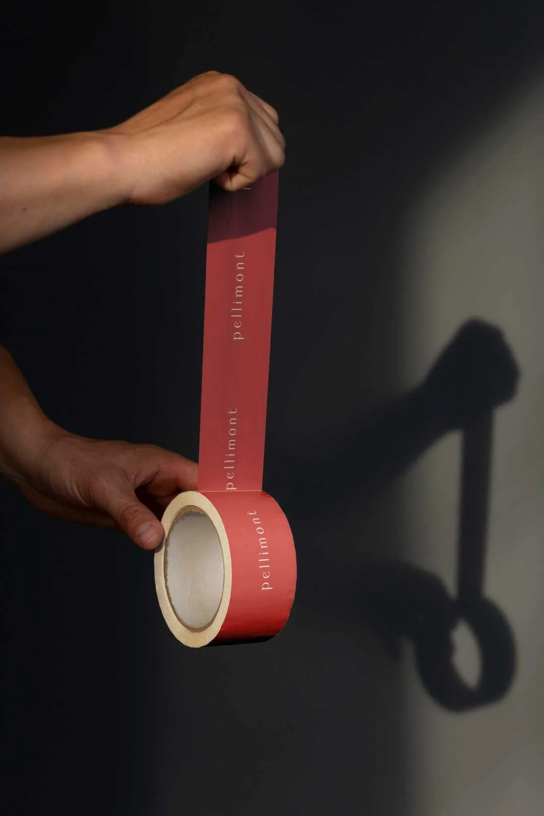
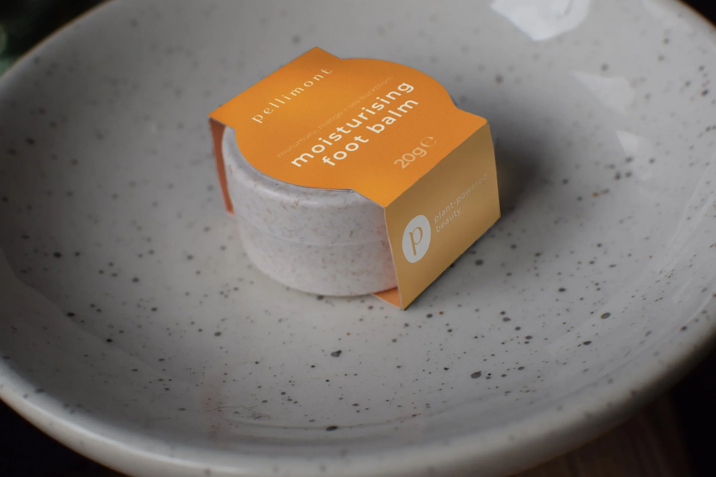
The work explored bold colour palettes anchored in the warm, energetic tones the founder had envisioned — oranges and yellows that felt fresh and confident rather than generic. The visual language was playful but considered, with flexible systems designed to work across embossed aluminium tins, refillable glass containers, cardboard packaging, solid bar moulds and digital platforms.
Designing for a plastic-free packaging range requires a different kind of thinking from the outset. The surfaces available — tin, glass, card — each have their own constraints and opportunities, and a brand system that works across all of them without losing coherence needs to be built with that range in mind from the start rather than adapted after the fact.
The identity was also designed with future growth in mind: a subscription model for regular-use products, retail placement in independent sustainable goods stores and a strong Instagram presence were all part of the founder's vision. The brand system needed enough flexibility to scale into those contexts without requiring a rethink.
Words from the client
“Sarah took the time to really understand my business and vision, and then translated this into a stunning brand identity. They provided valuable insights and guidance throughout the entire process. The attention to detail and professionalism is amazing, and they were always available to answer any questions or concerns I had. I would highly recommend Sarah and Studio Creates to anyone looking to elevate their brand and take their business to the next level.”
A note on the project
Pellimont was never publicly launched. Despite the brand being well-received and closely aligned with the original brief, the founder ultimately chose to take the project in a different direction. That happens occasionally in creative work, and it's worth being straightforward about it.
The work remains, in our view, a strong piece of values-led brand development — a considered response to a genuinely interesting brief, produced at a stage when the concept was still finding its commercial footing. Early-stage brand work carries its own particular challenges: the product isn't fully formed, the audience is hypothetical and the decisions being made have to anticipate a future that isn't guaranteed. Getting that work right matters, even when the path that follows it changes.
If you’re an independent skincare, homeware or lifestyle business and would like to discuss your branding, let’s talk!
