
Positive Balance Finance
Suzi had a clear why before she had a business name. In Scotland, only one in five businesses are female-led, and she'd built a career working closely enough with entrepreneurs to understand both what they needed from a finance partner and how rarely they felt they were getting it.
Positive Balance wasn't conceived as a traditional accountancy practice. The model was high-touch, relationship-led and future-focused; less interested in reporting on the past than in helping clients see what was possible ahead. Suzi described herself as a confidante, cheerleader and finance wingwoman. Over fifteen years of experience doing genuinely good work with SMEs and entrepreneurs, delivered with warmth, honesty and real investment in the outcome.
The brand needed to communicate all of that before a prospective client had read a single word.
The problem with accountancy branding
Suzi knew exactly what she didn't want. Blue. People looking at graphs. Calculator imagery. The visual language of a sector that had spent decades optimising for reassurance at the expense of personality; and in doing so had made most accounting firms look and feel identical.
That uniformity created a genuine opportunity. A brand that felt warm, approachable and visually confident would stand apart immediately in a sector where the bar for distinctiveness is low. But standing apart isn't enough on its own, the identity also needed to inspire trust. Someone handing over their business finances needs to feel that the person receiving them is competent and careful, not just likeable.
Approachable and authoritative. Vibrant and professional. The tension between those qualities was the central design challenge.
Words from the client
“Great experience from start to finish. Would highly recommend Studio Creates if you are looking for a website or branding for your business”
The identity
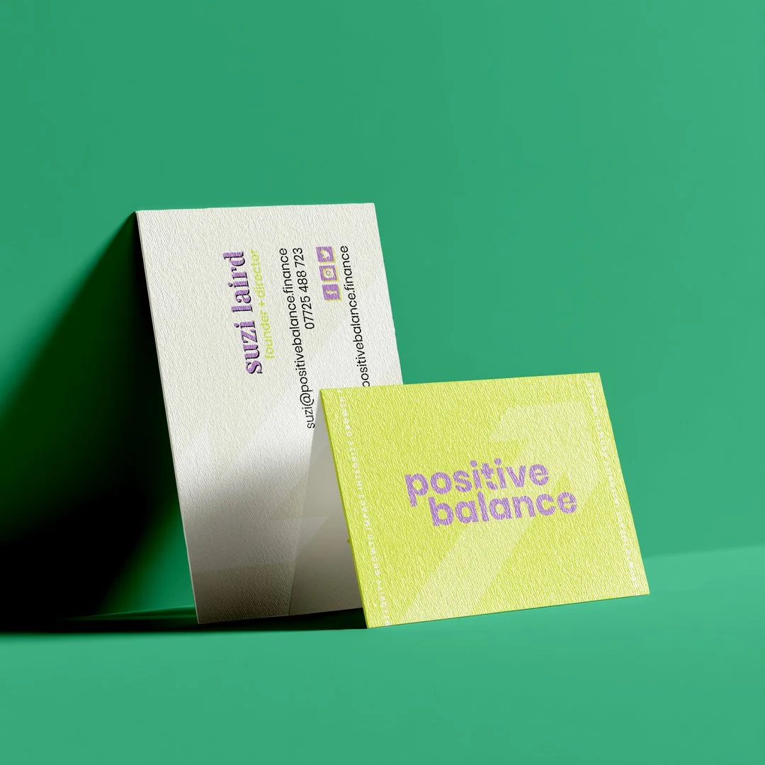
Suzi’s own aesthetic gave us a useful starting point. Her references pointed consistently towards clean, neutral foundations with deliberate pops of bright colour; safe but with something. The analogy she used herself was telling: white walls with bright accessories, a plain outfit lifted by a bold blazer. An approach to presentation that communicates confidence without noise.
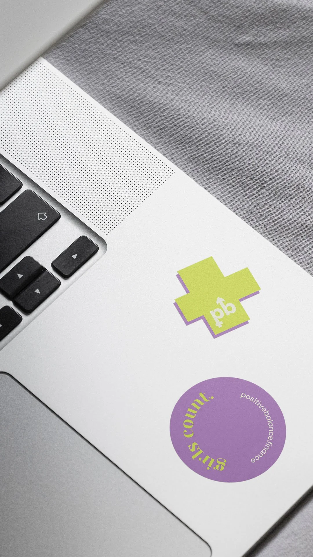
The resulting identity takes that sensibility into a brand system. Clean typography, a largely neutral base and carefully chosen colour accents that bring energy and optimism without tipping into informality. The palette feels calm and considered rather than corporate, closer to a lifestyle brand than a professional services firm, which is precisely the territory Positive Balance was designed to occupy.
Sans serif typography kept the identity feeling contemporary and accessible. Nothing about the brand visually signals the stuffy, jargon-heavy version of accountancy that Suzi had deliberately built her practice to move away from.
The wider brand positioning focused as much on filtering as on attracting. The right clients for Positive Balance are ambitious female founders who want a genuine partner in their business growth — not the cheapest option, and not someone who just files their returns. The identity and messaging were shaped from the outset to speak directly to that audience and gently redirect everyone else.
Shaping the digital foundations
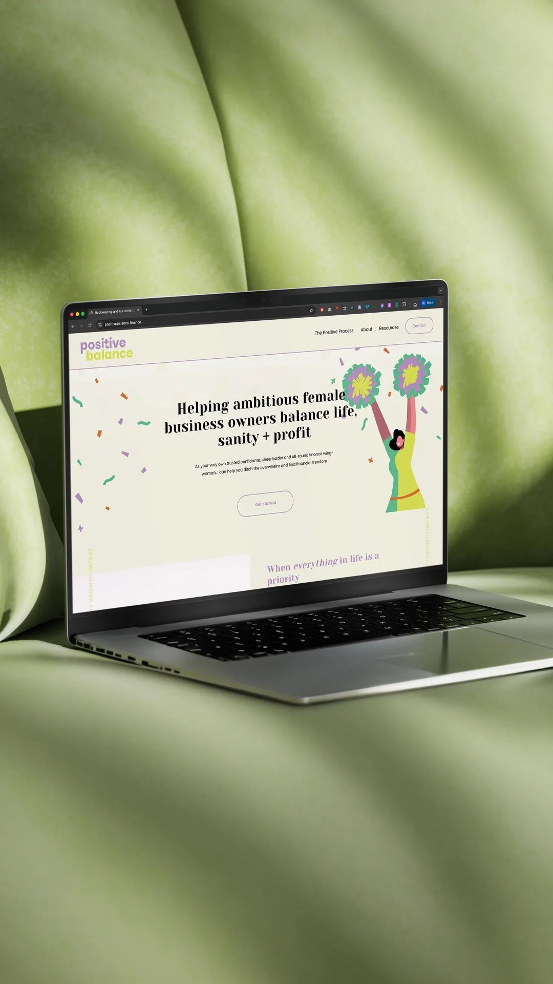
Alongside the visual identity, Studio Creates worked with Suzi on the foundations of her website experience; how the site should be structured, how it should communicate the offer and how it should filter for the right-fit clients from the first page.
For a service business built on personal relationships, the website does specific work: it needs to give a prospective client enough of a sense of Suzi's personality and approach that by the time they make contact, the fit is already more or less established. A discovery call that starts with genuine mutual interest is a better use of everyone's time than one that begins from scratch.
The content strategy and site architecture were built around that principle, clear on the offer, honest about who it's for and warm enough that the right people feel at home from the first visit.
What it represents
Positive Balance launched with a brand that had no interest in blending into the accountancy landscape. The identity reflects the values behind the business: optimistic, personal, direct and genuinely invested in the people it works with.
For Suzi, the brand was also the beginning of a longer journey. The five-year vision she articulated from the outset; multiple six figures, a growing team, eventually a business that could run without her at the centre of it — required foundations that could support that growth. A brand that already feels established, confident and distinct from competitors is one of those foundations.
The work began at the very start of the business. That's often where it matters most.
Looking to create a visual identity for your service-based business?
