
Fueling Greatness Podcast
Dr Laurent Bannock is not a newcomer to the field. Over a career spanning decades, he has worked with Olympians, professional athletes, national football teams, high-performance organisations and some of the most demanding clients in sport and business. He founded the We Do Science podcast — one of the most respected evidence-based sports nutrition resources available — and has built a reputation as someone who translates complex science into practical, high-impact application.
Fueling Greatness was the next step: a platform to extend that expertise more broadly, bringing together a newsletter, podcast, digital courses and coaching services under a single, cohesive brand. The audience would span elite athletes, serious recreational exercisers, CEOs and entrepreneurs who approach their physical performance with the same rigour they apply to everything else.
The brand needed to be built at the same level as the work it represented.


The strategic starting point
This wasn't a logo project. It was a brand development exercise that began with competitive analysis and a clear-eyed understanding of where Fueling Greatness needed to sit in a crowded and often visually cluttered market.
Sports and performance nutrition has a default aesthetic — one that's been refined over years of supplement marketing, gym culture and aggressive bodybuilding imagery. Dark palettes, neon accents, typography that shouts. It communicates energy efficiently, but it also makes every brand within it look roughly the same, and it carries associations that work against the credibility of a practitioner whose entire value is rooted in rigorous science and elite-level expertise.
The brief was to go somewhere else entirely. Premium rather than hyper-masculine. Authoritative rather than aggressive. Timeless rather than trend-led. The kind of identity that signals expertise before a word has been read — the visual equivalent of someone whose knowledge speaks for itself.
The identity
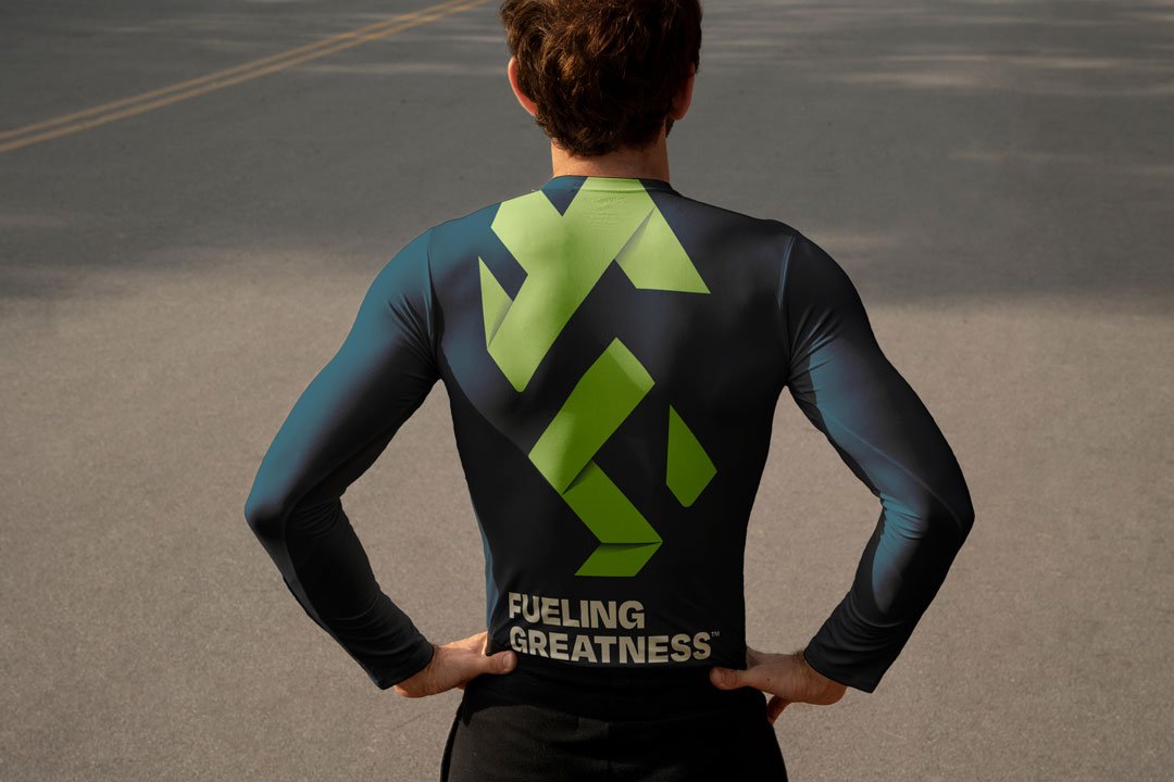
The centrepiece of the brand is a dynamic monogram — a mark designed to suggest athletic movement, strength and progression without borrowing the visual vocabulary of the industry it's deliberately departing from. It carries a sense of momentum and physical intent while remaining clean, scalable and adaptable across the full range of contexts the platform operates in.
Typography was chosen to do the work that the mark leaves implicit. Intelligent, considered, modern — the kind of type that communicates authority without volume. Paired with a bold but restrained colour palette, the system reads as high-performance and credible in equal measure. Nothing about it feels approximate or assembled from convention.
The colour direction in particular was a considered departure from the category norm. Premium over hyper-masculine. Controlled over loud. The palette holds its own alongside the established visual languages of elite sport and professional services — which is exactly the territory Fueling Greatness occupies.
Built for a multi-channel platform
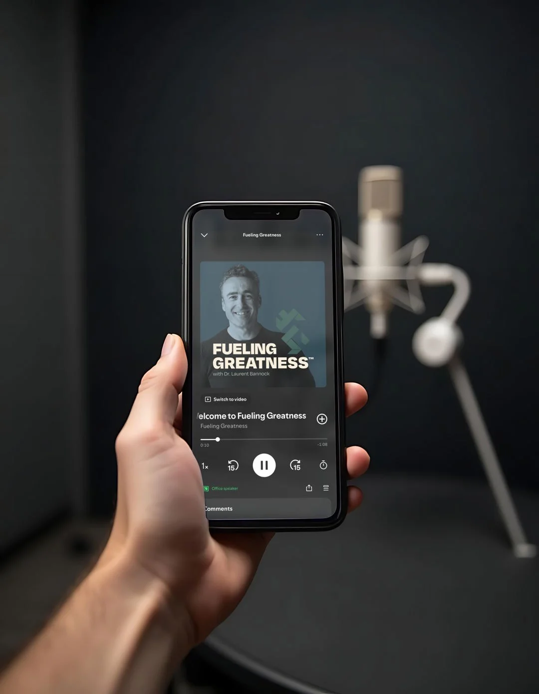
The rollout requirements shaped the identity system throughout the design process. A brand appearing across podcast artwork, social graphics, digital learning platforms, course materials, presentation environments and potential merchandise needs to function consistently across very different formats and scales.
The Fueling Greatness identity was built with that breadth in mind from the outset rather than designed for one application and adapted for the rest. The monogram works at thumbnail scale on a podcast platform and at large scale on a presentation slide. The typography holds its authority in a social graphic and in a course interface. The system is flexible enough to grow alongside the platform as new channels and formats are added.
Tone and positioning
The brand tone — intelligent, elite, grounded in expertise, modern and accessible despite the high-performance audience — informed decisions throughout the project. Dr Bannock's existing platforms, including We Do Science, had established a voice that was rigorous and credible without being inaccessible. The visual identity needed to carry that same quality.
For an audience of Olympians and CEOs, the brand is itself a signal. It tells a prospective listener, course buyer or consulting client that the level of thinking behind the content matches the level at which they operate. Getting that signal right — and sustaining it consistently across every touchpoint — was the primary objective of the project.
What it sets up
Fueling Greatness now has a brand platform capable of carrying Dr Bannock's expertise into a significantly wider audience. The identity reflects the ambition of the project and the authority of the person behind it — built to scale across an expanding ecosystem of content, education and coaching without requiring revision as the platform grows.
For a practitioner at this level, the brand is an extension of professional reputation. It was treated accordingly.
Are you an online creator, professional or podcaster who needs help with a personal brand?
