
Ailey Mae Chocolate
Leann and Nathan built Ailey Mae Chocolate into something genuinely loved. A raw chocolate brand rooted in thoughtful ingredients, handcrafted production and a personality that customers connected with. Based in North Berwick, the business had developed a loyal following and a product range that consistently delivered on quality.
The challenge wasn't the chocolate. It was everything around it.
The original brand had done its job in the early stages — warm, colourful and full of personality. But as the business grew and the ambition to reach more stockists and a wider audience developed, the visual identity had started to hold things back rather than push them forward. The packaging wasn't working as hard as it could on shelf. The ecommerce experience needed attention. And the overall positioning needed to better reflect the quality of what was actually inside the wrapper.
The brief
The rebrand brief required a particular kind of care. Ailey Mae Chocolate had existing customers who loved the brand as it was — the colour, the warmth, the handcrafted feeling that ran through everything. The task wasn't to discard that equity but to evolve it. To retain what made the brand recognisable and loved while giving it the polish and coherence needed to compete confidently in a wider market.
That balance — refinement without erasure — is one of the more precise challenges in brand development. Get it wrong in either direction and you either lose your existing audience or fail to reach the new one.
The identity
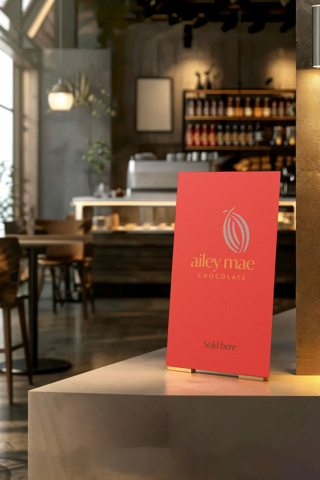
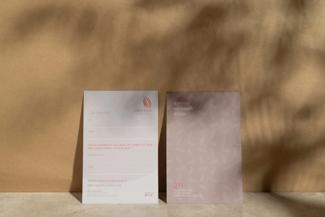
The new brandmark takes a simplified and more elegant approach — cleaner in its construction, more considered in its proportions, and built to scale gracefully across the range of applications a growing chocolate brand needs. It retains the character of the original without carrying its limitations.
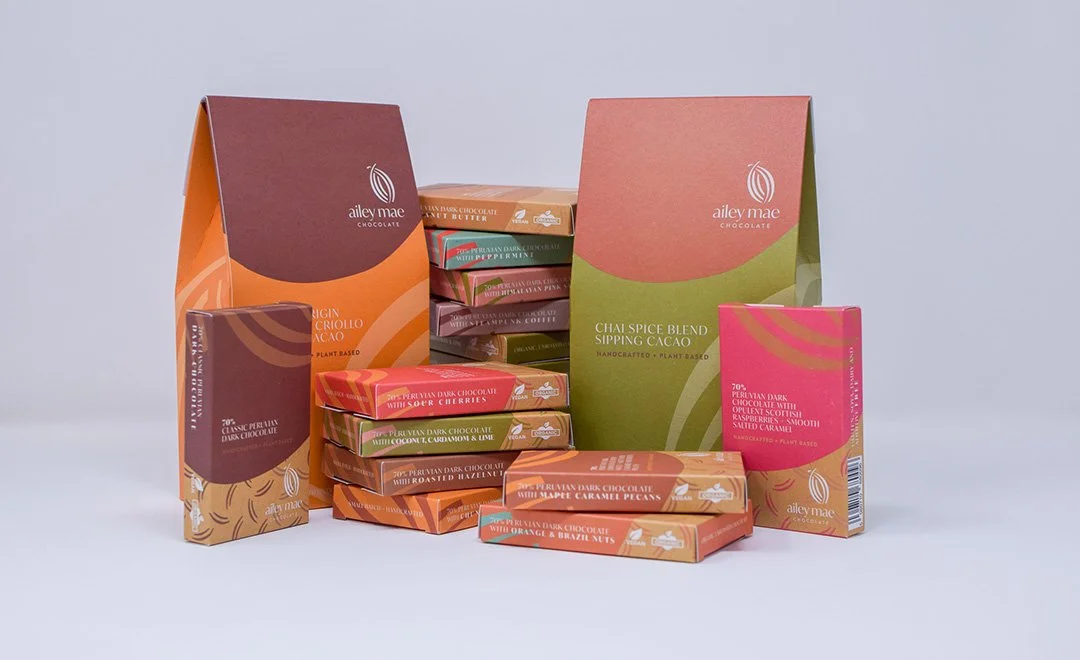
The wider visual language keeps the colour and warmth that existing customers respond to, but in a more muted and grown-up register. Think the same spirit, better dressed. The palette shifted towards tones that feel decadent and artisan rather than playful — a distinction that matters considerably when a brand is trying to earn its place on the shelves of independent retailers and specialist food stockists.
Packaging
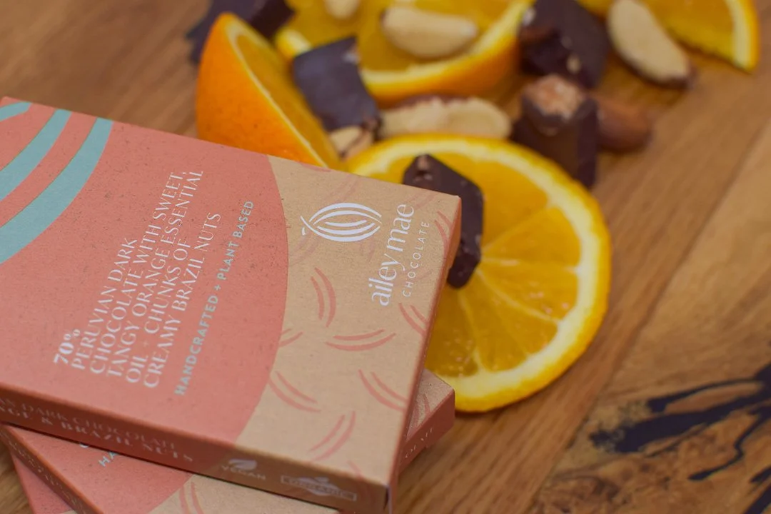
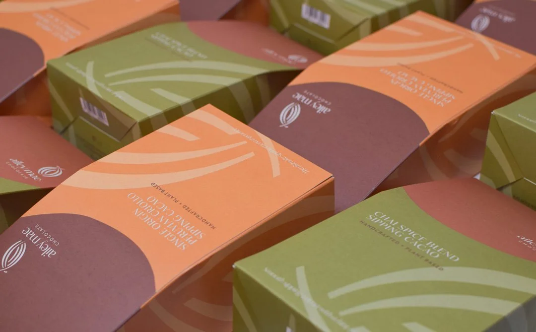
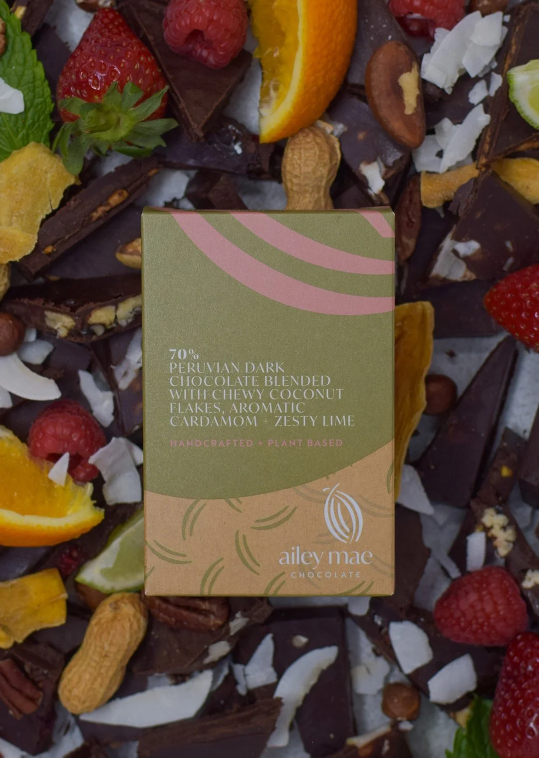
The packaging redesign was central to the commercial ambition behind the project. Stockists make decisions based on shelf presence — on whether a product looks like it belongs alongside its peers and whether it communicates its quality clearly enough to justify its price point without explanation.
The new packaging addresses that directly. Hand-wrapped bars with food-safe foil, FSC-certified stock and recyclable materials throughout — choices that reflect both the brand's values and the expectations of the conscious consumer market Ailey Mae Chocolate sits within. The range reads as a cohesive collection while giving each product enough individuality to stand on its own.
Practical considerations shaped the process alongside the aesthetic ones. Packaging efficiency, print lead times and fulfilment logistics were all factored in — a necessary part of designing for a small-batch producer where every operational decision has a real cost attached to it.
The Shopify website
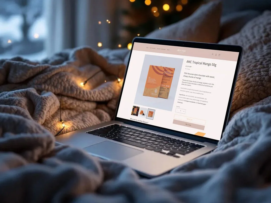
The ecommerce build was driven by operational needs as much as design ones. Leann and Nathan needed a platform that made it easier to manage stock, process orders and give customers a smoother purchasing experience — particularly as the range expanded and order volumes grew.
Shopify was the right choice for a product-led business at this stage of development. Its inventory management, order handling and payment infrastructure gave the business the operational backbone it needed, while the design brought the new brand identity into a digital experience that felt consistent with the packaging and positioning.
The user journey was simplified throughout — from browsing the range to completing a purchase. For an artisan food brand where gifting represents a significant portion of sales, that clarity of experience matters. A customer who finds what they're looking for quickly and checks out without friction is more likely to return and more likely to recommend.
A note on the process
This project didn't run in a straight line. Between commission and completion, the business navigated lockdowns, stock shortages, extended printer lead times, illness and everything else that the intervening period threw at small food producers. The rebrand was delivered in the context of real life — which is worth acknowledging, because it shaped the pace and the decisions made along the way.
The outcome is stronger for the patience on both sides. A rebrand done properly, even when the circumstances complicate the timeline, produces better work than one rushed to meet an arbitrary deadline.
What it sets up
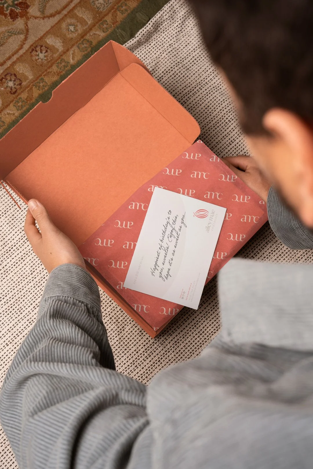
Ailey Mae Chocolate now has the brand foundations to grow into the next stage of the business. A more refined identity, packaging that works on shelf and in the post, a website that handles the operational side with less friction, and a visual language coherent enough to carry the brand into new stockists and new audiences without requiring constant explanation.
The chocolate was always good. The brand now reflects that.
We’d love to help you create a strong visual identity for your food business.
