
Claire Drinks Master of Wine
Claire Blackler is one of 151 women in the world to hold the title of Master of Wine. 418 in total globally, across all genders. It's one of the most demanding qualifications in the drinks industry, and it carries real weight in a sector where credibility is everything.
In 2005, Claire founded Case Studies Wine School, building a well-regarded education business over the following years. By 2021, the offering had expanded well beyond wine — into spirits, beer and wider drinks experiences — and the existing brand no longer reflected where the business was heading. A rebrand wasn't just cosmetic. It was a necessary repositioning.
Claire Drinks was the new chapter. A broader name for a broader offer, with the ambition to become the leading provider of online drinks education in the UK and grow towards a genuinely global audience.
The brand
The identity needed to hold two things in balance: the authority that comes from Claire's qualifications and depth of expertise, and the warmth and accessibility that makes a course provider someone people want to learn from.
Too formal and the brand risks feeling like a professional body rather than an educator. Too casual and it undersells the credentials that make Claire's courses worth choosing over the alternatives. The solution was typographic — a system built on contrast and character rather than decoration.
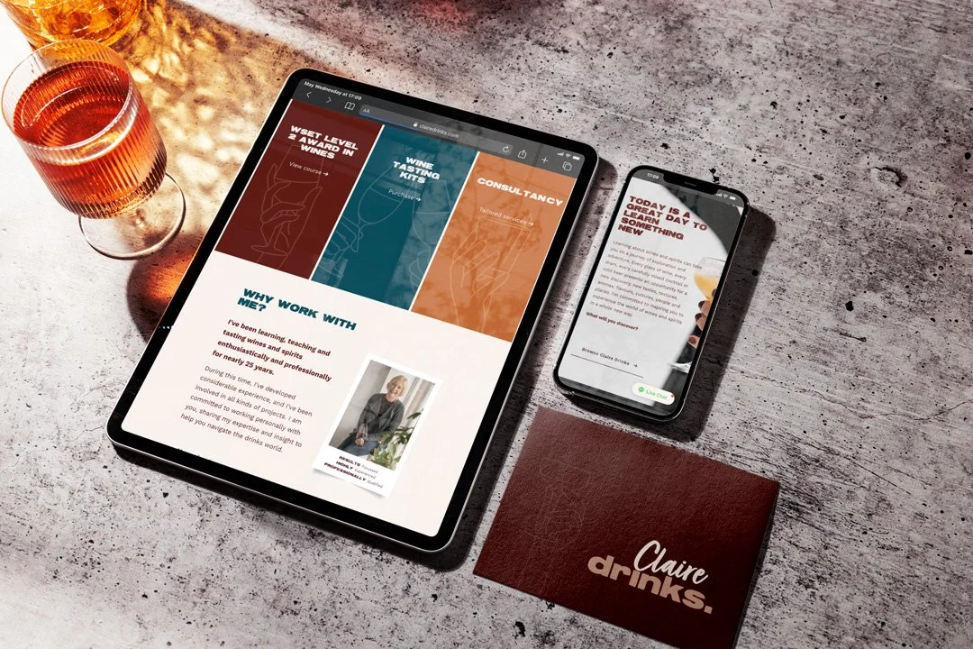
A scripted treatment of Claire's name brought personality and a personal quality to the mark — the sense of someone's direct involvement in what they're teaching. Paired with a bold, authoritative typeface for 'Drinks' and finished with a full stop, the combination communicates confidence without stiffness. The full stop in particular does quiet but effective work — it's decisive without being aggressive.
A bespoke monogram, intertwining the C and D, was developed for smaller applications where the full wordmark wouldn't sit comfortably. Alongside the core identity, a suite of bespoke illustrated graphics representing different drinks categories gave Claire the tools to create her own assets and communications in the future — an important consideration for an educator working across multiple course types and platforms.
The visual identity was applied across tasting mats for course workbooks, sample pouch stickers, business cards and Canva templates. The brand was built to be usable from day one, not just admired.
Words from the client
“Sarah, thank you so much for all your help with my branding and website, I love my new image and the website has proved very easy to edit so far! I am confident that my site can be easily found, reflects who I am and what my business offers and makes it easy for candidates to book online.”
The website
The digital brief was substantial. Case Studies Wine School had an established WordPress site — well-trafficked but outdated, functionally limited and no longer capable of supporting the direction Claire wanted to move in. The new platform needed to handle considerably more.
Online course purchases and registrations across eight WSET programmes. Workshop and masterclass bookings. Gift voucher sales. A content structure capable of supporting an informative, authoritative resource for drinks education across multiple categories. And all of it designed to work for a growing international audience, not just a UK one.
The build began with a sitemap — agreeing the full structure of the site before a single page was designed. Wireframes followed, mapping the layout of key pages and ensuring the content being produced would be housed properly before the design phase began. That sequencing matters on a large-scale ecommerce build. Getting the architecture right early prevents significant problems later.
The Squarespace platform was designed and built using the new brand identity throughout — colour, typography, photography and brand graphics all integrated into a site that felt cohesive rather than assembled. Claire commissioned a photographer during the design phase to capture headshots and lifestyle imagery, which brought the personality of the brand into the site in a way that stock photography never could.
Automated email communications were styled and rewritten so that every purchase confirmation and course registration carried the brand through to a customer's inbox. It's a touchpoint that's easy to overlook and surprisingly impactful when it's done well.
The transition
Moving from a well-established brand and domain to a new one carries genuine risk. Case Studies Wine School had years of search equity and an audience accustomed to finding it in a particular place. A poorly managed transition can lose that traffic permanently.
A comprehensive redirect strategy was built before launch, mapping old URLs to their new equivalents and ensuring that anyone finding their way to the old site was directed cleanly to the right place on the new one. No traffic lost. No broken journeys. The transition was handled as carefully as the build itself.
The outcome
Within one week of launch — with no formal promotion — Claire Drinks recorded its first course sale. That's a meaningful early signal for an ecommerce platform: it means the site is navigable, the purchase journey works and the brand communicates enough confidence to convert a visitor who arrived organically.
The platform gave Claire's business the foundations it needed to grow — a scalable ecommerce system, a brand with the range to work across multiple drinks categories and a digital presence built for an audience well beyond the one it started with.
If you’re thinking of branding your personal service and taking your business online then we’d love to talk to you and help make it happen.
