
Revivre Swimwear
Revivre occupies a specific and increasingly important space in fashion — slow, sustainable and genuinely committed to what those words mean in practice.
The collections are made from repurposed ocean plastics, designed to be reversible and built to last. The audience is ethically conscious, visually literate and drawn to brands that can hold their values and their aesthetic in equal measure. That combination of sustainability and aspiration is a particular design challenge. Environmental credentials alone don't make a brand feel desirable, and desirability alone doesn't communicate purpose. The identity needed to carry both without one undermining the other.
Starting point
Revivre came with a strong sense of their own identity — a clear understanding of their customer, their values and the visual world they wanted to inhabit. That foundation made the creative work more focused from the outset. Rather than building a brand from scratch, the task was to give something already well-formed a visual language precise enough to grow with.
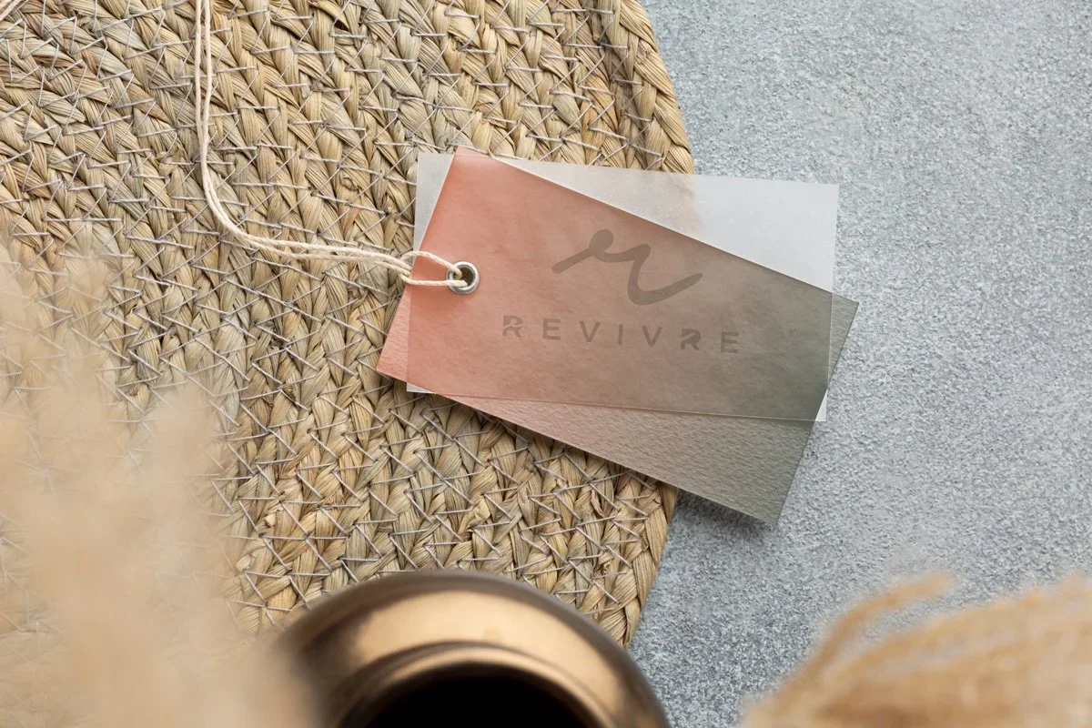
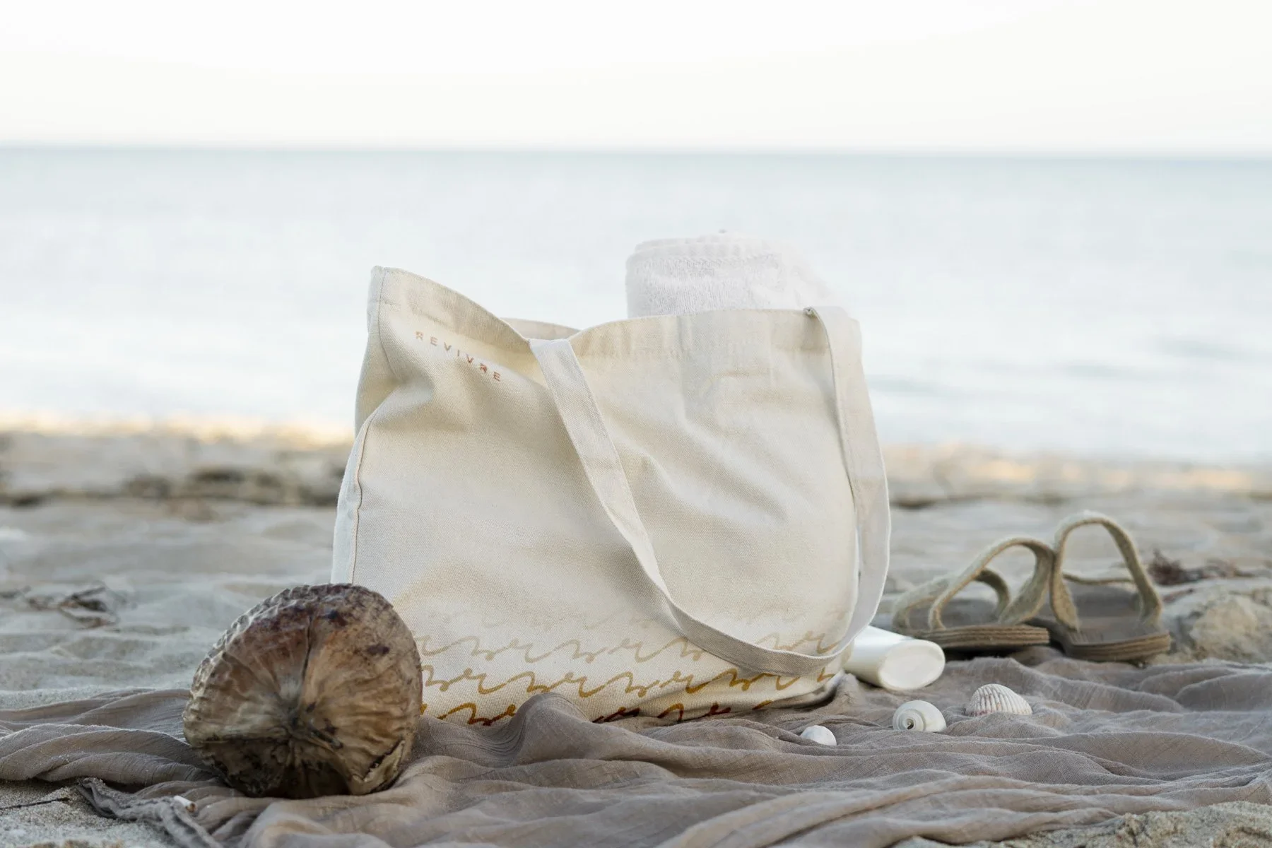
Moodboarding led to a colour palette built around four key tones — earth, ocean and plant-based references that felt organic without being obvious. The palette works across contrast and gradient, and was designed to move between brand assets and social media interchangeably. For a brand whose social presence is a significant part of how it builds community and reaches new customers, that flexibility wasn't incidental. It was a core requirement.
Words from the client
“Studio Creates provides and exceptional level of creativity in their work, and our partnership has enabled our brand to establish itself within the luxury swimwear market in Europe. Their professionalism and imagination prevails throughout our projects and we’ll continue to look to them for future projects.”
The mark
The logo centres on a wave-form cursive R — a mark that carries movement and water without resorting to the kind of literal ocean imagery that saturates sustainable fashion branding. It has a lively, natural quality that reads as modern rather than rustic, premium rather than craft-market. The distinction matters for a brand positioning itself at the aspirational end of the sustainable fashion market.
The mark works both as a standalone icon and alongside the full brand name, which gives it genuine flexibility across applications. It holds its character at large scale and small, in colour and in single ink — the kind of versatility that only becomes apparent when a brand starts operating across a full range of touchpoints.
Designing for garments
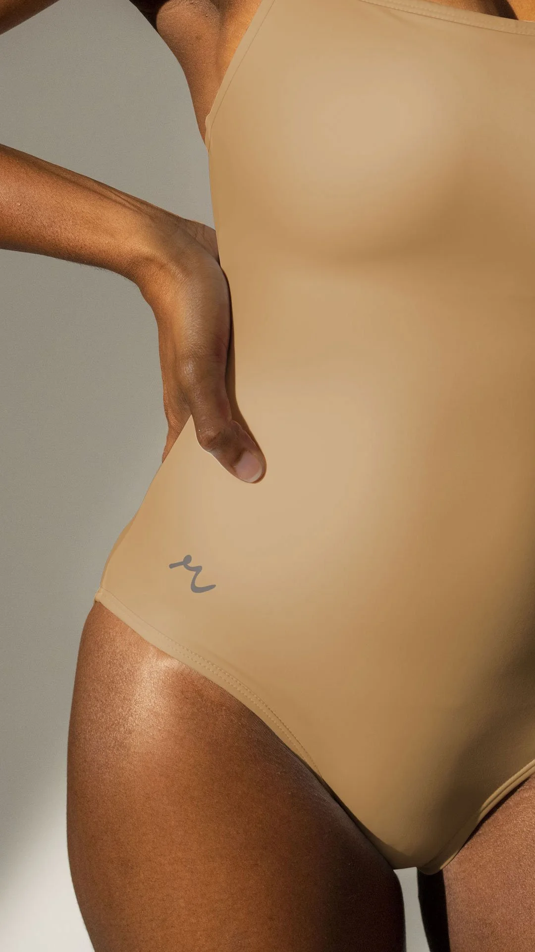
A swimwear brand's logo faces a specific technical challenge that most identities don't: it needs to work on fabric, under embroidery constraints, at small scale and in the kinds of colour combinations that garment production throws at it.
The R mark was adapted into an icon version set within an imperfect circle — a deliberate choice that gave the embroidery a natural, organic outline rather than a rigid geometric frame. Imperfect circles in this context feel handcrafted and considered, which aligns with the slow fashion values behind the brand. More practically, the form kept the integrity of the R mark within the parameters that embroidery actually allows, rather than designing something that would have to be compromised in production.
That kind of thinking — anticipating how a mark translates into a physical medium before the garments are in production — saves significant problems later and results in a brand that holds up as well on a swimsuit as it does on screen.
A system built to grow
The full identity system; mark, icon, palette, variants — was built with Revivre's growth trajectory in mind. New collections, new platforms, new markets. A brand that needs to be revisited every time something expands isn't built properly. The Revivre identity has the range and structure to develop alongside the business without losing what makes it recognisable.
For a label at the earlier stages of building its following, that foundation is one of the most valuable things a brand project can deliver. Consistency compounds over time, every touchpoint that feels right reinforces the one before it, and the community around the brand grows with something solid to identify with.
We’d love to help bring your independent clothing brand to life! (We’ve done it before…)
