
Lettings of Distinction
A change in management is one of those business moments that tends to bring questions about brand to the surface. The fundamentals of the business remain — the reputation, the relationships, the knowledge — but there's a natural instinct to ask whether the visual identity still reflects where things are headed.
For Lettings of Distinction, the answer was that it didn't quite. The brand had done its job, but the new chapter called for something more considered. Not a reinvention — the equity built under the previous identity was worth protecting — but a meaningful refinement that brought greater polish and coherence to the way the business presented itself.


The challenge
Property is a sector where trust is everything. A lettings brand that feels dated or inconsistent creates subtle friction at exactly the moments it can least afford to — when a landlord is deciding who to appoint, or when a prospective tenant is forming their first impression.
The brief, then, wasn't simply aesthetic. It was about ensuring the brand communicated the professionalism and reliability that Lettings of Distinction had built its reputation on, while bringing the visual identity in line with where the business was heading under new management. Contemporary without abandoning familiarity. Polished without feeling like a different business altogether.
That balance — evolution rather than revolution — requires more precision than starting from scratch. When there's existing equity to protect, every decision carries more weight.
The work
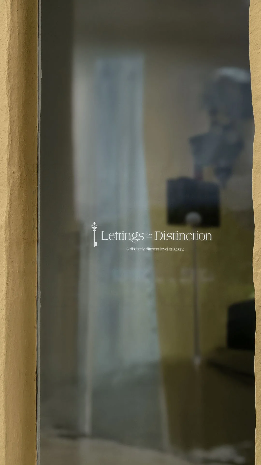
The refresh focused on tightening and elevating what was already there. Typography, colour and mark were all reviewed and refined to create a more cohesive and confident identity system — one that worked consistently across the range of materials a lettings business relies on day to day.
Stationery, marketing materials and digital touchpoints all received attention. In the property sector, these applications span a wide range of contexts: from printed particulars and window displays to email communications and social presence. An identity that holds up consistently across all of those, without having to be forced or adapted, is the mark of a system that's been properly resolved.
What it delivers
For a lettings business operating in a competitive local market, a coherent and professional brand identity is a quiet but meaningful advantage. It signals stability. It communicates that the business takes its presentation as seriously as its service. And in a sector where clients are making significant financial decisions, that kind of signal carries weight.
Lettings of Distinction now has an identity that reflects the quality of the business behind it — refined, professional and built to serve the next chapter as confidently as it serves the current one.
We’d love to discuss your letting agency’s branding with you.
