
Le Tee Paris Clothing
Le Tee Paris was born from a clear and personal vision. Its Scottish founder, living in Paris, wanted to create a small clothing line rooted in the kind of effortless style the city does so well — understated, considered and built around the quiet confidence of really good typography.
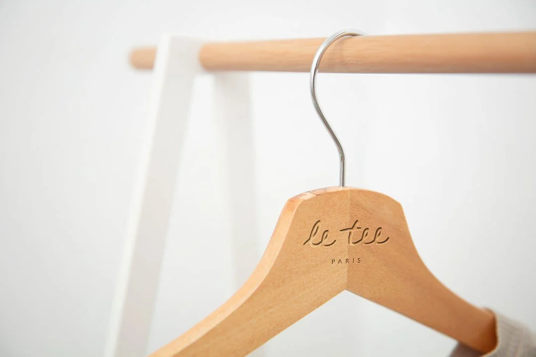
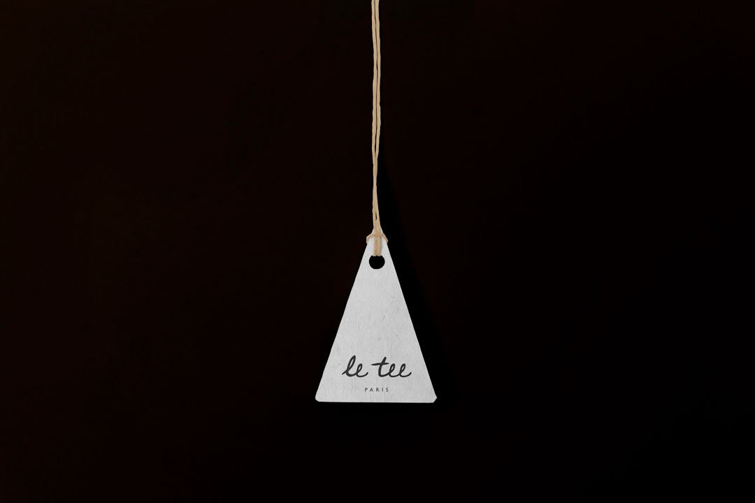
That last part is what made this project particularly interesting. For a fashion label where the garment itself is often the simplest thing in the wardrobe, the logo carries a disproportionate amount of the brand's character. It has to work on fabric, on labels, on tissue paper and eventually across slogan applications — and it has to do all of that while feeling like it was never designed at all.
Why bespoke lettering
The brief pointed towards hand-drawn lettering early on, though the route to the final identity involved considerably more exploration than that summary suggests.
Off-the-shelf fonts were considered and set aside. The problem with relying on an existing typeface — even a beautiful one — is that it carries associations and limitations that aren't yours to control. For a brand built on personality and a specific point of view, the letterforms needed to belong entirely to Le Tee Paris.
The process involved extensive exploration of lettering styles before settling on a direction, then careful refinement of that direction into something that felt resolved rather than merely sketched. The quality the founder was drawn to — relaxed, slightly imperfect, genuinely human — is easy to describe and surprisingly difficult to achieve. Too polished and it loses the effortlessness. Too loose and it loses the elegance. The final lettering sits in the space between those two extremes, which is exactly where it needed to be.
Building the system
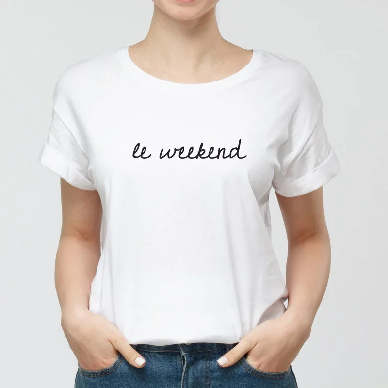
A logo identity for a clothing line has to think beyond the primary mark from the outset. How does it sit on a garment label at small scale? How does it translate to embroidery? What happens when it's applied to a slogan tee alongside secondary typography?
These questions shaped the process alongside the lettering itself. A complementary type system was explored for wider brand and slogan use — something that could sit alongside the handwritten logo without competing with it, and that gave the brand room to develop across future collections.
The result is a system with enough flexibility to grow as the label does, without requiring the identity to be revisited every time a new application appears.
Distinctly Parisian, not performatively so
There's a particular risk with fashion branding that references a specific cultural aesthetic — it can tip into pastiche. Parisian style is one of the most referenced and most imitated aesthetics in fashion, which means the margin between feeling genuinely rooted in it and simply borrowing its surface is narrower than it looks.
The Le Tee Paris identity navigates that carefully. It feels Parisian in the way the founder does — through lived experience and genuine sensibility, not through borrowed iconography. Simple, feminine and confident, without reaching for any of the obvious visual clichés the brief could have leant on.
What it sets up
Le Tee Paris now has an identity with real longevity. The bespoke lettering is entirely its own — nothing off a shelf, nothing that another brand could reach for. The type system gives it room to develop. And the overall identity has the kind of quiet elegance that fashion labels spend years trying to establish.
For a founder building something from the ground up, getting those foundations right from the start matters considerably. The identity reflects not just where Le Tee Paris is now, but where it has the foundations to go.
Looking to partner with the perfect studio to bring your clothing brand to life?
