
CopperCairn Whisky Tours
CopperCairn operates at the intersection of expertise and experience. Based in Speyside — one of Scotland's most celebrated whisky regions — the consultancy works with whisky brands and visitors navigating an industry that's rich in tradition but increasingly global in its reach. It's a business that needs to speak credibly to industry insiders and feel genuinely welcoming to enthusiasts arriving in the region for the first time.
That dual audience is an interesting design challenge. Too heritage-heavy and the brand risks feeling exclusive or inaccessible. Too contemporary and it loses the authority that comes from being rooted in place and craft. The brief was to find the balance between the two.
A connected identity
CopperCairn sits alongside CopperBroc — the whisky-themed holiday cottage in Speyside that we'd already developed a brand identity for. The two businesses share more than a postcode; they share an owner, an ethos and, now, a visual family.
Designing a complementary identity rather than a matching one required some care. The goal was for the two brands to feel clearly related without one feeling like a derivative of the other. CopperBroc carries warmth and character through its hand-drawn illustration. CopperCairn needed to occupy different ground — more considered, more polished, more explicitly professional — while still sitting naturally alongside it.
Words from the client
“Sarah at Studio Creates is an absolute genius at what she does. First class personal service and I will now not work with anyone else for my logo and website design! I have had so many positive comments on the logos she has done for my business. Highly recommend her!!”
The identity
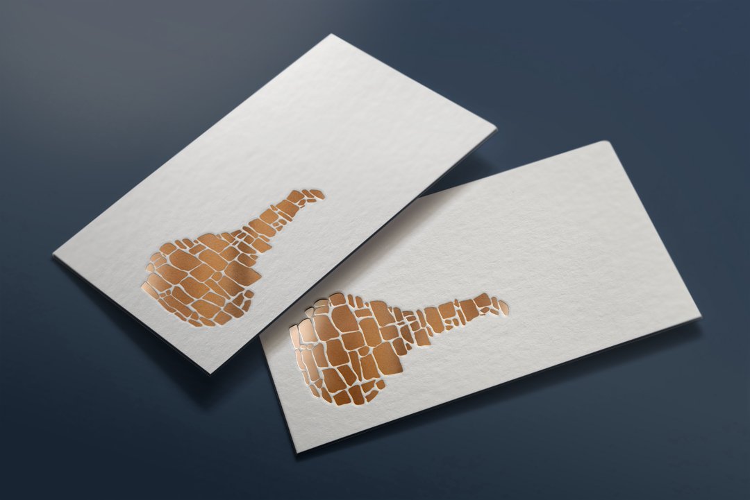
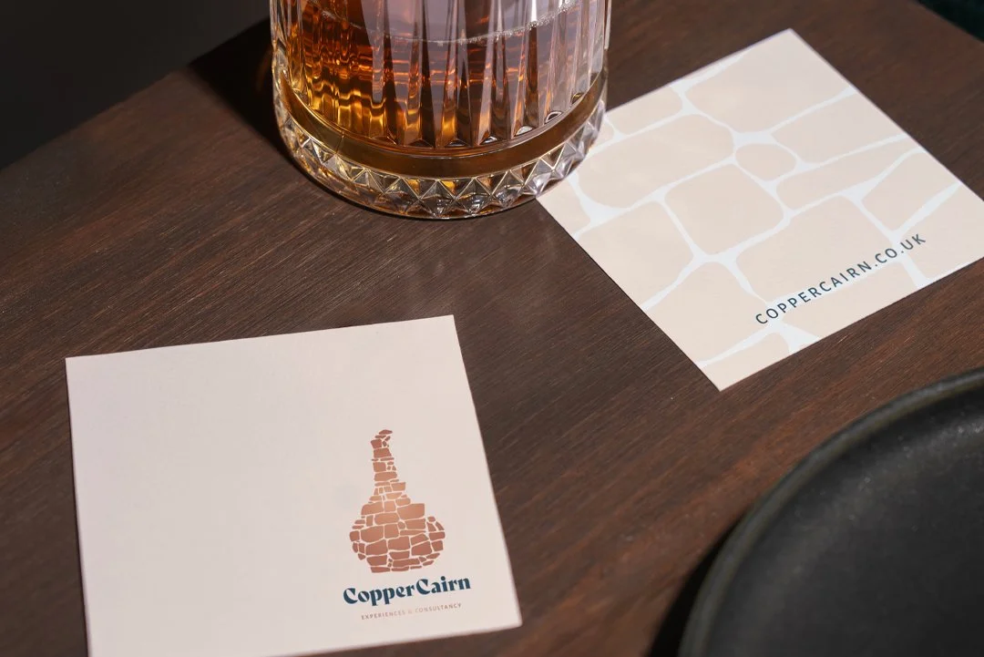
The resulting brandmark draws on traditional references appropriate to the whisky industry and the Speyside region without leaning too heavily on the visual language that saturates the category. Whisky branding has its clichés — crests, distillery silhouettes, overly ornate typography — and navigating around those while still feeling genuinely rooted in heritage takes a degree of restraint.
Clean, contemporary typography does significant work here. It keeps the identity legible and modern across applications while the mark itself carries the weight of tradition and place. Together they create something that reads as premium without the stiffness that premium whisky branding can sometimes carry.
Built for flexibility
CopperCairn operates across a range of touchpoints — print materials, digital presence and the hospitality environments that come with working in and around the Speyside visitor experience. The identity system was built with that range in mind.
A brandmark that only works on a letterhead, or only reads well at large scale, isn't fit for purpose in a business like this. Flexibility isn't a nice-to-have in hospitality and consultancy branding — it's a practical requirement.
What it adds up to
CopperCairn now has an identity that holds its own in a category where heritage and authenticity are table stakes. It communicates expertise without formality, and warmth without casualness — a balance that reflects the nature of the business itself.
Alongside CopperBroc, it also demonstrates something more broadly useful: that a family of brands can feel visually coherent without being visually identical. Shared values, shared region, shared owner — but two distinct identities, each doing its own work.
We’d be delighted to discuss your tour guide or travel agent business branding with you!
