
CopperBroc Holiday Home
CopperBroc is a holiday cottage in Speyside, thoughtfully restored by its new owners into something genuinely characterful.
The kind of place that earns its own personality rather than borrowing one from a style guide. When they came to us, the brief was to build a visual identity that matched the warmth and individuality of the cottage itself — something that felt rooted in its setting without defaulting to the usual tropes of Scottish accommodation branding.
That last part is worth dwelling on. The self-catering and holiday let market is crowded, and a lot of it looks the same. Tartans, stags, generic serif logotypes. The challenge wasn't just to design something attractive — it was to design something that actually stood apart.
Two directions
The early concept stage explored two quite different creative routes, which is sometimes the right approach when a brand's personality hasn't fully crystallised on paper yet.
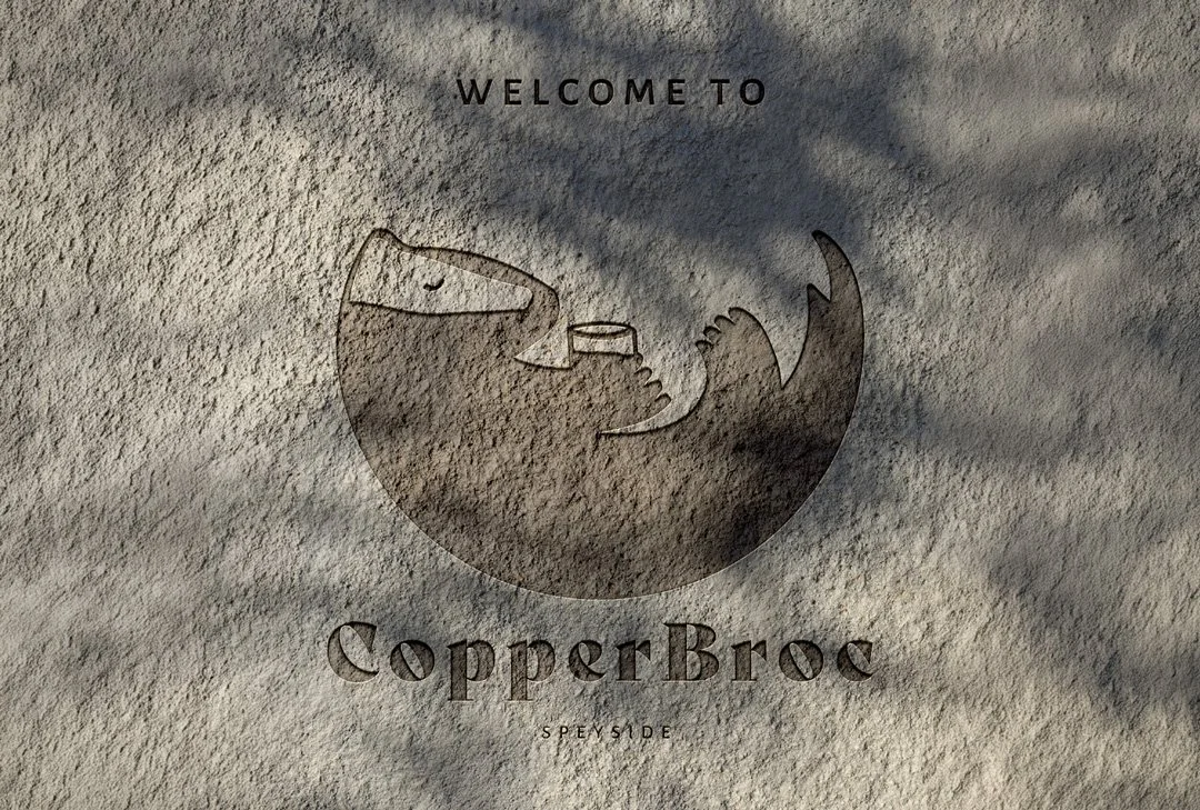
The first direction was more considered and traditional — a strong illustrated badger paired with a colour palette drawn directly from the Farrow & Ball paints used throughout the cottage interiors. It felt grounded and refined, with an authenticity that came from tying the brand so closely to the physical space.
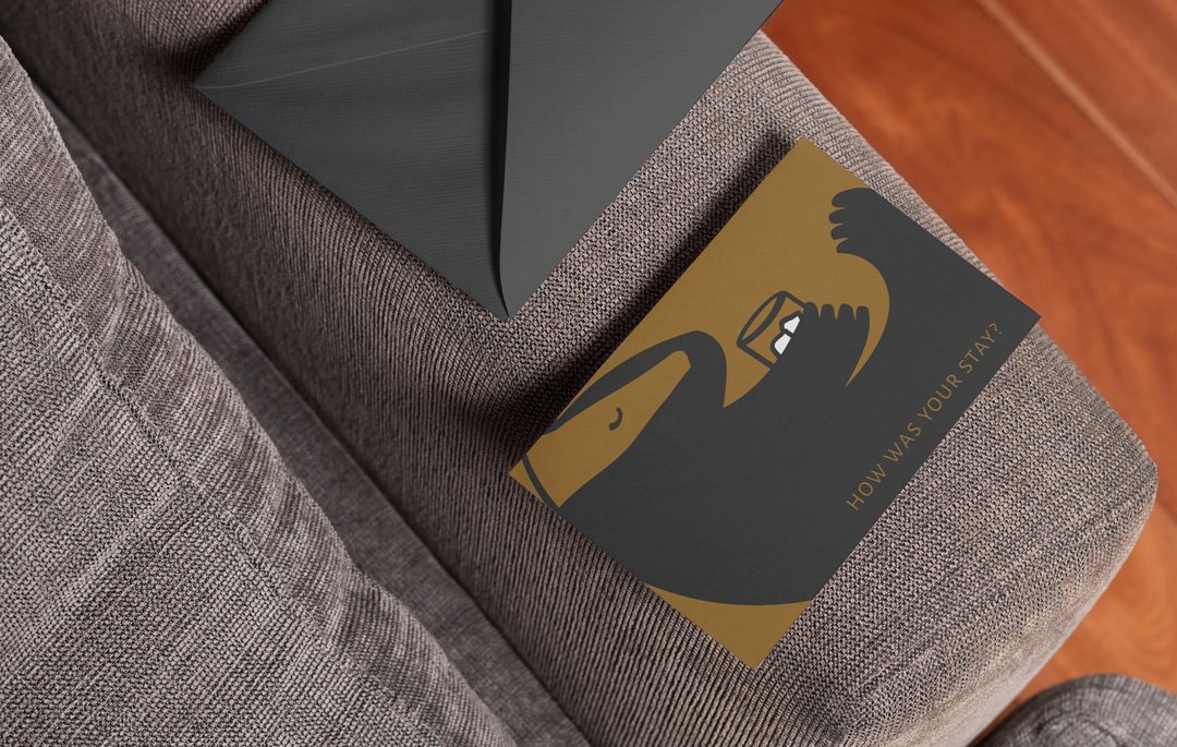
The second took a lighter touch. The same badger, but this time caught mid-dram — relaxed, a little knowing, thoroughly at home in Speyside. It brought humour into the brand without pushing it into novelty territory. There's a difference between a brand that's playful and one that's a joke, and the illustration walked that line well.
The final direction
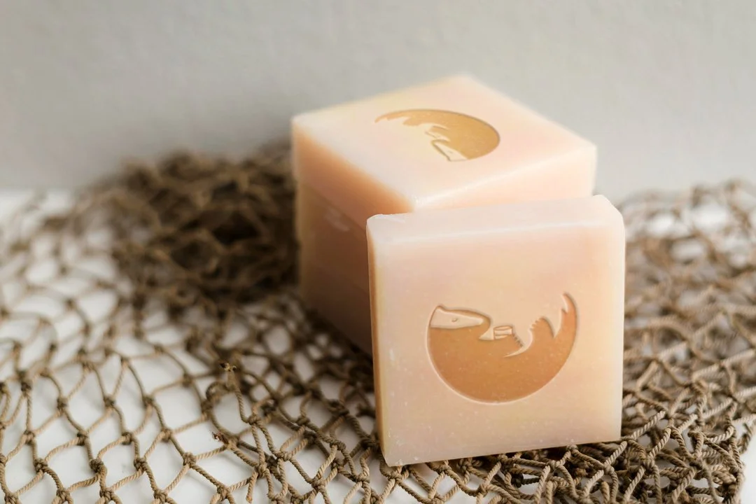
The chosen identity brought both instincts together. Charm and sophistication, rather than one at the expense of the other. Hand-drawn illustration remained central — it's what gives the brand its crafted, personal quality and separates it immediately from anything that could have been assembled from a template or stock library.
The palette, informed by the cottage interiors, creates a subtle continuity between the physical experience of staying at CopperBroc and the brand a guest encounters before they arrive. That kind of considered connection — between a brand and the real space it represents — is easy to overlook in hospitality branding and makes a difference when it's done properly.
Words from the client
“Sarah at Studio Creates is an absolute genius at what she does. First class personal service and I will now not work with anyone else for my logo and website design! I have had so many positive comments on the logos she has done for my business. Highly recommend her!!”
What it adds up to
The finished identity is characterful without being cartoonish, distinctive without being difficult. It carries the warmth of the cottage and the quiet confidence of somewhere that knows exactly what it is.
For the accommodation market specifically, that clarity of character is genuinely valuable. Guests choosing between holiday lets are often making emotional decisions, and a brand that communicates personality and care — before anyone has even looked at the booking page — does meaningful commercial work.
CopperBroc now has an identity that feels as considered as the renovation behind it.
Looking for something similar for your brand?
