
Seilich Botanical Skincare
Seilich Botanicals had built a reputation on the quality of what went into their products. The packaging, though, hadn't quite kept pace with that story. When they came to us, the goal was clear: design a packaging system that felt as considered as the formulations it was protecting.
This wasn't a new relationship. We'd worked with Seilich across various projects over the years, which meant we already understood the brand's character — its quietness, its integrity, its connection to the natural world. That existing trust gave us a strong foundation to work from, and the scope to be ambitious about where the packaging could go.
The Range
Sixteen skincare products. Each one needed its own distinct identity. All of them needed to sit together as a coherent, recognisable collection.
That balance — individuality within consistency — is one of the more interesting challenges in packaging design. Get it wrong and the range feels either homogenous or chaotic. Get it right and the shelf presence does its own work.
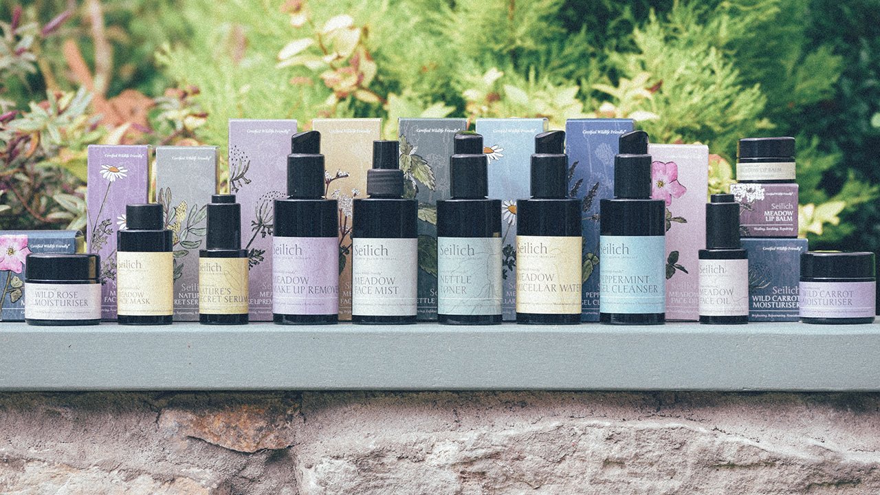
Illustration as a core design decision
The botanical at the heart of each product became the hero of each design. To make that work properly, we needed illustration rather than photography — something with warmth and precision in equal measure.
We researched extensively before settling on an illustrator. The shortlist was longer than it might appear from the outside; finding someone whose style genuinely matched the Seilich sensibility took time. The illustrator we eventually worked with had a quality that's harder to define than it sounds: she could capture natural softness without losing botanical accuracy. The illustrations feel alive without being fussy.
Each piece was then refined carefully for print — colour-adjusted, scaled, and positioned to work within the label and box formats rather than simply placed on top of them.
Building a colour system
Seilich had existing brand colours that we wanted to honour rather than override. The solution was a complementary palette that layered on top of the existing foundations — distinct enough to give each product its own character, unified enough to read as a family.
Across sixteen products, the palette does real work. It creates visual rhythm across the range and helps a customer navigate the collection without signage or explanation. On a retail shelf, that kind of legibility matters.
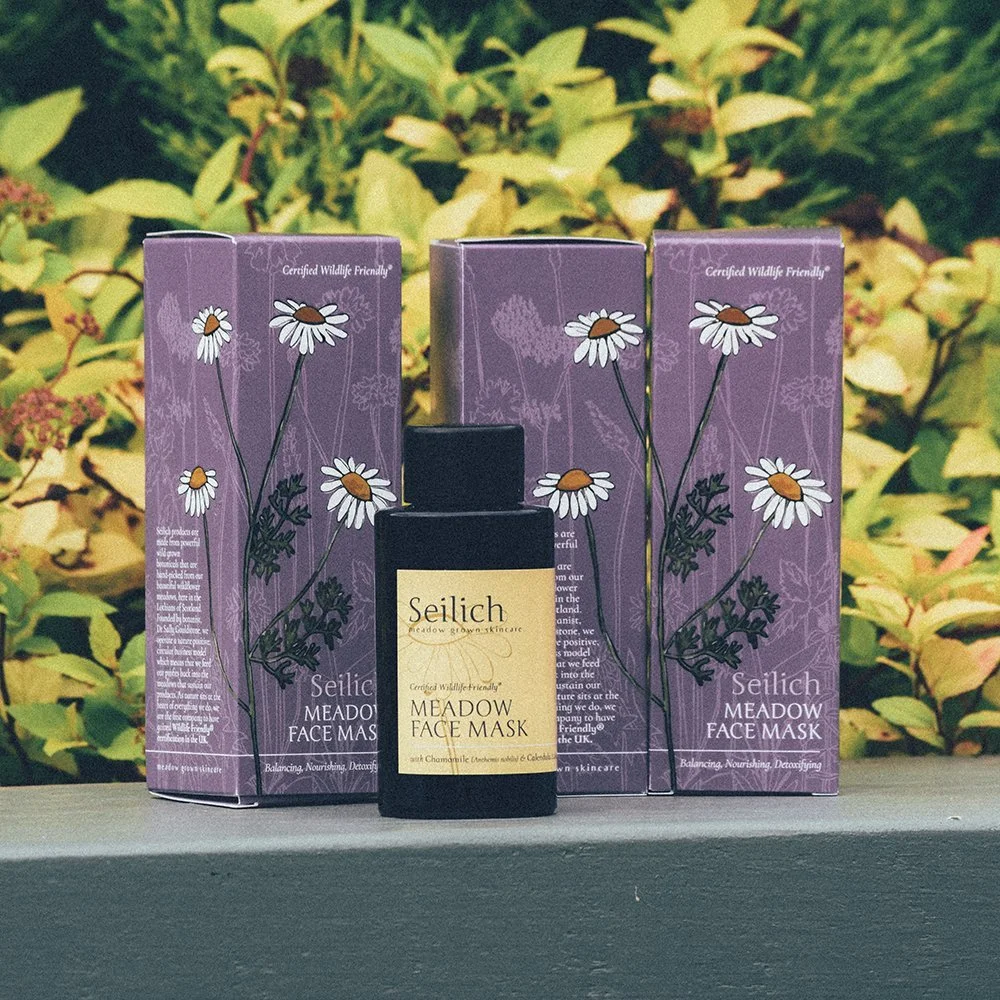
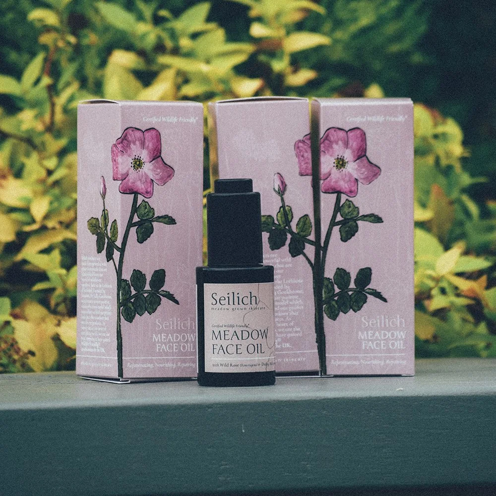
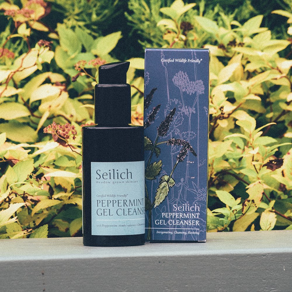
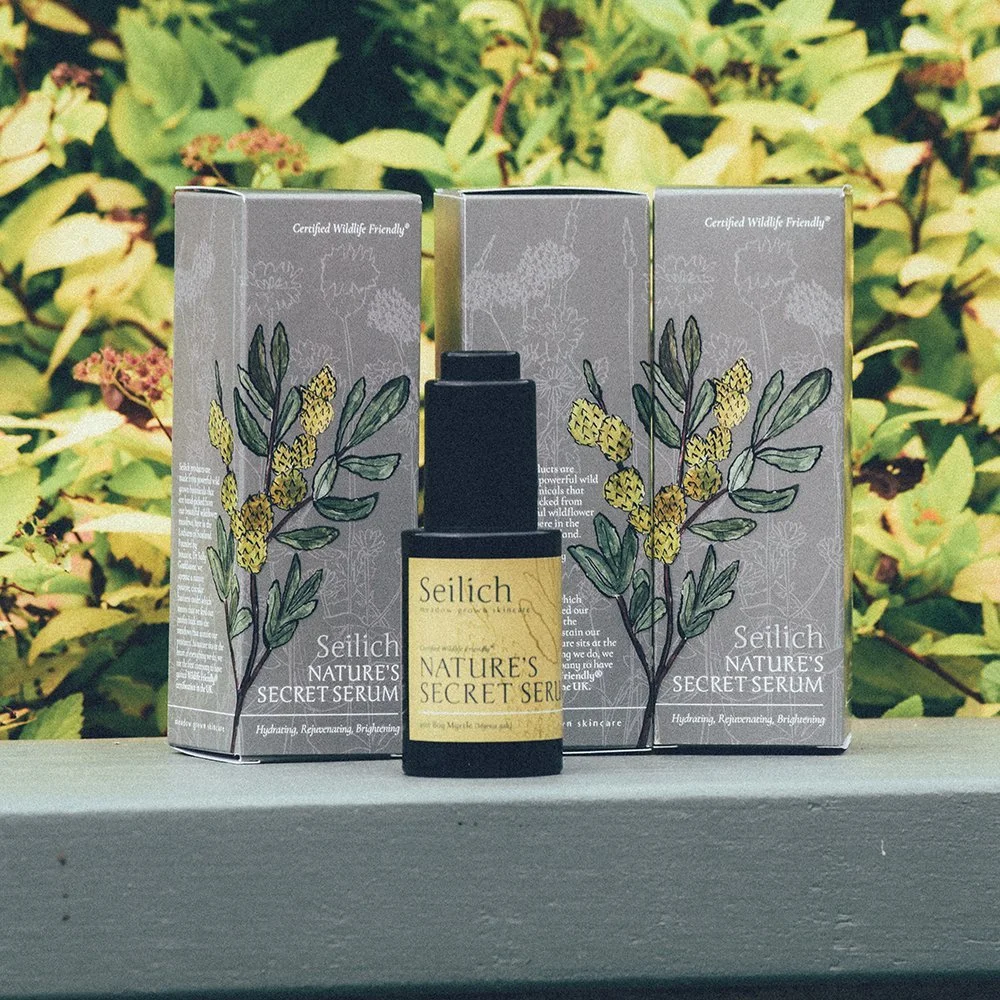
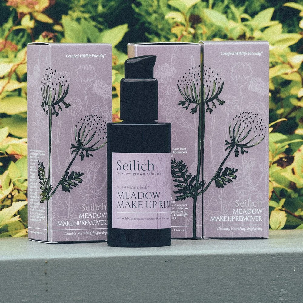
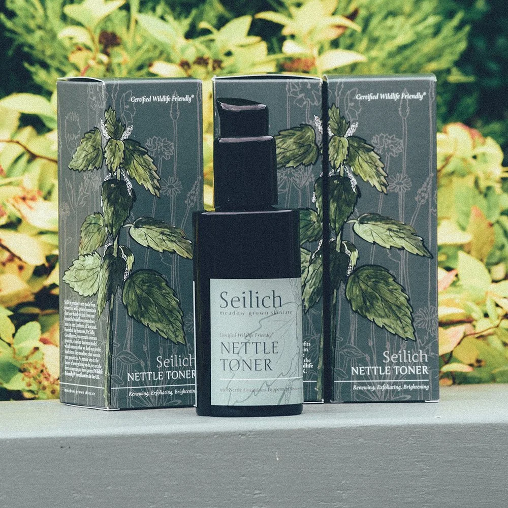
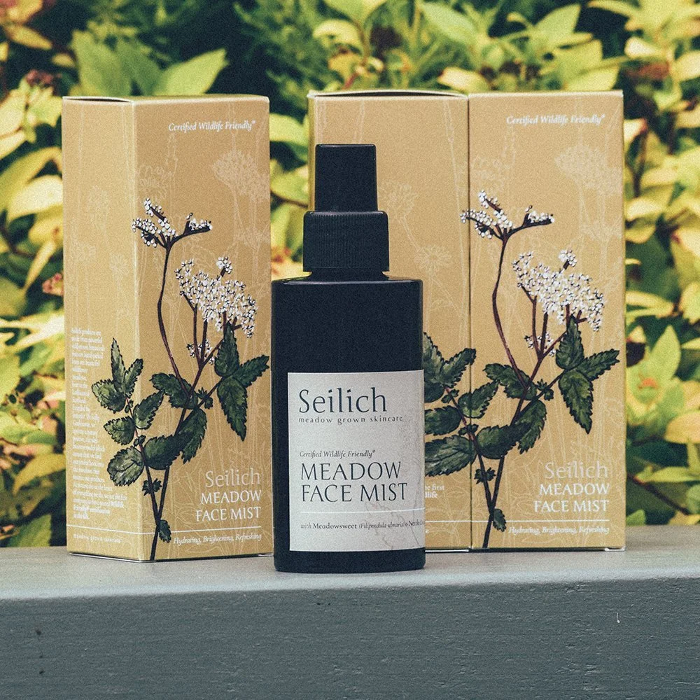
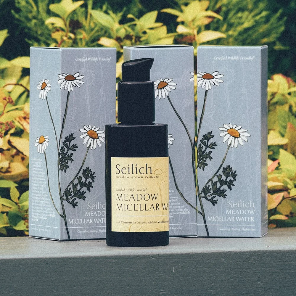
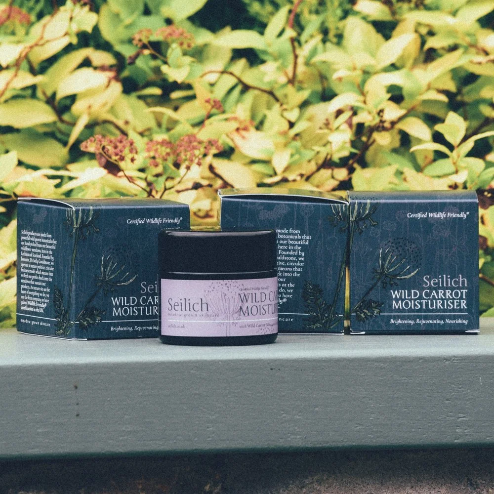
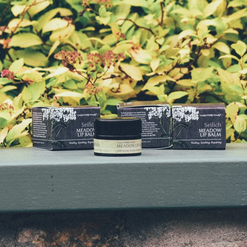
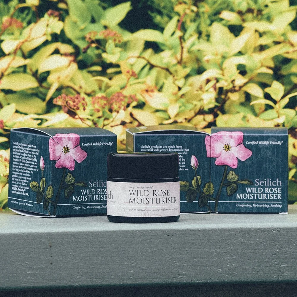
video showing the outer box packaging for seilich botanical with special print finishes
Production in Scotland
Production was kept within Scotland throughout. We worked closely with NSD Labels in Dalkeith and J.T. Thomson in Glasgow — suppliers we know well and trust to deliver to a high standard.
The finish across the range is satin, with spot gloss detailing applied selectively across the botanical illustrations and logo. It's a combination that photographs well and feels even better in the hand. The tactility was deliberate: this is a skincare brand, and the moment someone picks up the product is part of the brand experience.
The outcome
The finished packaging repositioned Seilich Botanicals within a competitive natural skincare market. The range now reads clearly as a premium, cohesive collection — and the shelf presence reflects the quality of what's inside. Since launch, the work has received positive industry attention and strengthened the perception of the brand among both existing and new customers.
For us, it's a good example of what considered packaging design can do. A system that carries a brand's values all the way to someone's hands.
If you’re launching a product-based business and want branding that balances personality, purpose and long-term scalability, we’d love to talk.
