
Porteous & Co Fine Goods
Porteous & Co Fine Goods opened in Glasgow in 2017 with a clear sense of what it wanted to be: a retailer rooted in quality, craftsmanship and the kind of considered simplicity that doesn't date. The brand identity needed to reflect all of that without overcomplicating it.
There's a particular discipline required when the brief is essentially about restraint. Knowing what to leave out is as important as knowing what to put in, and with heritage-led retail branding the temptation to layer in detail — crests, flourishes, ornamental typography — can work against the very qualities the brand is trying to communicate.
The approach
The creative direction centred on clean, understated design that could carry the weight of the brand without relying on decoration to do it. Strong visual recognition, in a mark like this, comes from proportion, confidence and clarity — not complexity.
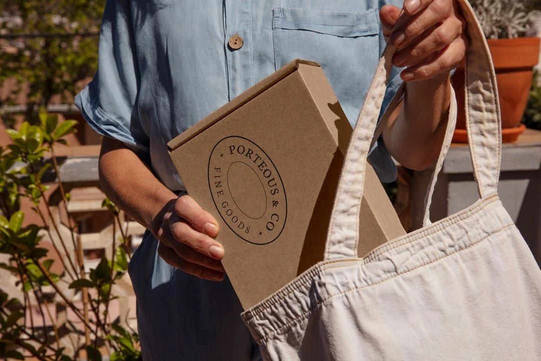
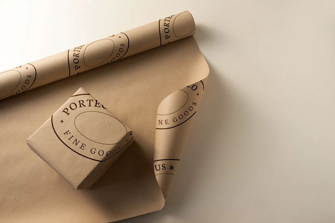
A key practical consideration shaped the design from early on. The identity needed to function as a stamp mark — applied directly to materials, packaging and products across the business. That requirement immediately ruled out anything too fine, too detailed or too dependent on colour to read properly. A stamp mark has to hold up when it's pressed into paper, embossed onto card or printed in a single ink. Designing for that constraint tends to produce better, more resolved work.
Words from the client
“When we launched our retail business a few years ago Studio Creates helped us to create our brand logo. We found Sarah to be professional, efficient and easy to deal with and we were very happy with the work she did.”
The identity
The finished mark balances timelessness with practicality. It reads clearly at small sizes, holds its integrity across materials and applications, and carries the character of a business that takes its offer seriously without needing to announce it loudly.
That kind of quiet confidence is harder to achieve than it looks. A mark that says very little but means a great deal requires the design to do precise, considered work at every level — letterforms, spacing, weight, proportion. Nothing can be approximate.
Built for physical application
For a fine goods retailer, the physical touchpoints are where the brand earns its keep. Packaging, wrapping, labels, product markings — these are the moments when a customer's hands are on the brand, and the identity has to hold up under that scrutiny.
Designing with physical application as a primary consideration, rather than an afterthought, changes the decisions made throughout the process. The Porteous & Co identity was built for the real world from the outset, which is why it works as naturally on a stamped wax seal as it does on a printed label.
What it adds up to
Porteous & Co now has an identity that will still feel right in twenty years. It doesn't follow a trend, it doesn't rely on a moment. It sits in a lineage of considered, craft-led retail branding that earns its longevity by being well made rather than fashionable.
For a business built on fine goods and craftsmanship, that alignment between the brand and the values behind it matters. The identity doesn't just represent Porteous & Co — it reflects the same standards the business applies to everything it sells.
We’d love to discuss your small retail business’ branding.
