
Natural Larder Collective
The Natural Larder Collective grew from an ambition to take everything built through The Scottish Bee Company — the relationships, the retail presence, the knowledge of what it takes to build a trusted food brand — and apply it at a wider scale.
The collective brings together brands that share a set of values: no GMOs, no additives, no preservatives, no ultra-processed ingredients. Food that tastes good and can be trusted. Products worthy of Ocado, Waitrose and the kind of premium independent delis and farm shops where provenance and integrity actually matter.
The brands currently sitting within the collective include The Scottish Bee Company, Nuisance Drinks, the Big Cheese Making Kit and Repollinate — each distinct in category and character, each sharing the same foundational commitment to natural, ethical production.
The brief and what it required
The client brief was, by their own admission, fairly sparse. What came through was a clear sense of values and a commercial ambition, but the strategic architecture needed to underpin a brand of this nature — the audience definition, the competitive positioning, the tone, the visual language — required Studio Creates to develop that thinking from the ground up.
That's a particular kind of brief to work with. When there's limited direction, the creative work has to earn the decisions it makes rather than execute against them. A full brand strategy document was developed before any visual exploration began: articulating purpose, mission, brand values, audience personas, competitive landscape and the key challenges the collective would face as a newly formed identity in a market dominated by more established names.
The four brand pillars that emerged from that process — trustworthy, transparent, sustainable and premium — became the reference points against which every subsequent creative decision was tested.
The strategic considerations
A few things shaped the creative direction in particular. The first was the challenge of standing out in a category where natural and ethical food branding has developed its own set of visual conventions — muted tones, rough textures, the aesthetic shorthand of the artisan market. The risk was blending in rather than being noticed. The ambition was to sit clearly within the sector while having enough visual confidence to be immediately distinct from everything around it.
The second consideration was the collective's structural role. The Natural Larder Collective identity needed to work alongside its member brands rather than dominate them. It would appear on websites, packaging and digital communications in contexts where Scottish Bee Company, Nuisance Drinks and others were also present. A logo that was too visually assertive would create friction rather than coherence. The decision to build primarily around typography — a wordmark rather than an icon-heavy mark — came directly from that practical reality.
The third was the communication challenge facing any brand in this space: consumers broadly understand that natural food is preferable but often don't understand the specific terminology — what GMOs actually are, what ultra-processed means, what particular ingredients or chemicals to be concerned about. The tone of voice strategy was built around making that knowledge accessible without being condescending, knowledgeable without being clinical, and warm enough to feel like a trusted source rather than a lecture.
The identity
The moodboarding phase explored a wide range of visual directions — from hand-drawn and rustic to abstract and modern — before settling on something that balanced natural warmth with quiet confidence. The creative direction was described during the presentation as "quietly confident — a curated pantry is designed, not thrown together." That distinction mattered: the identity needed to feel considered and trustworthy, not accidental or overly artisanal.
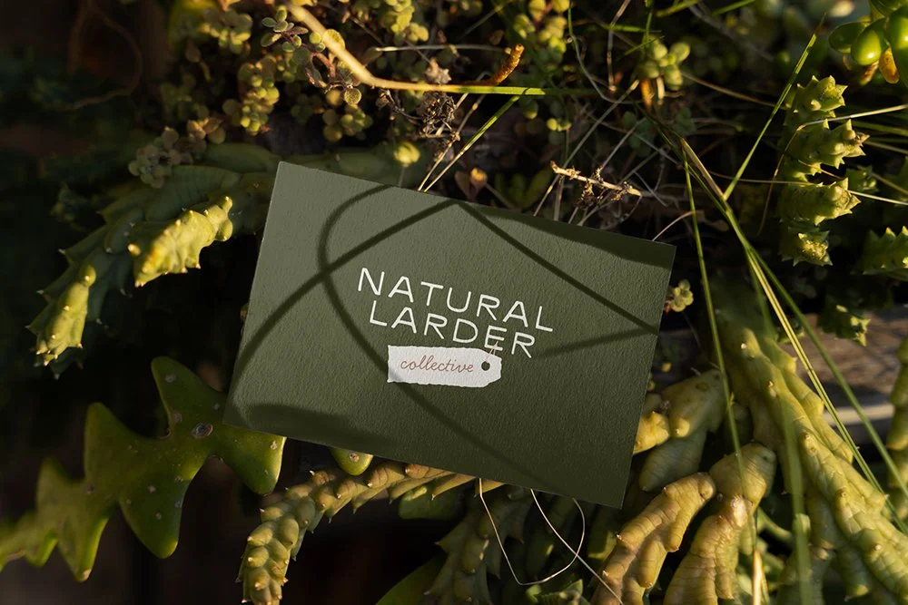
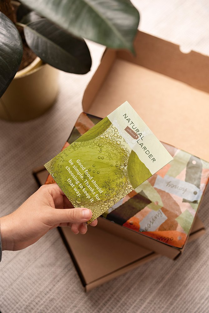
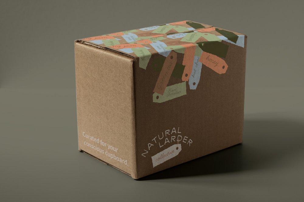
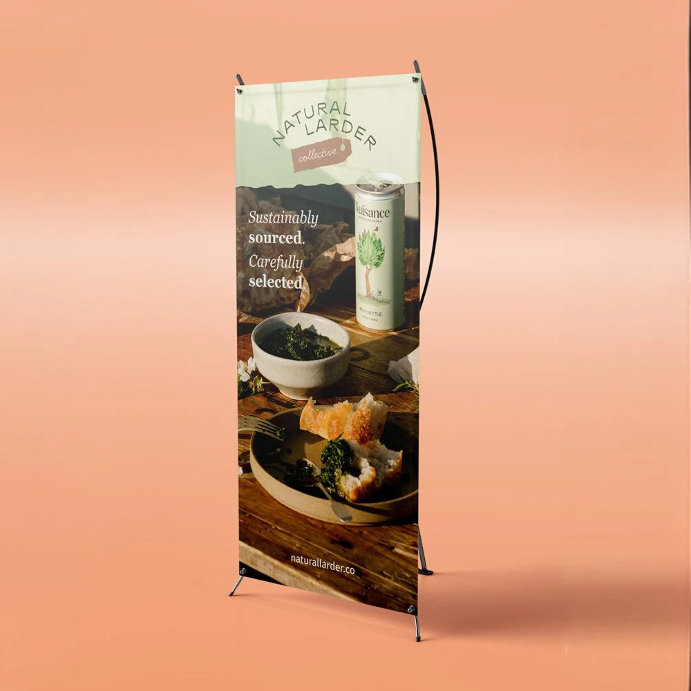
The final mark uses a typographic approach with a subtle curve in the lockup — a nod to the organic and the natural without being literal about it. The palette was developed to feel rooted in nature while having enough life and personality to stand apart from more muted category conventions. Warm, earthy primary tones sit alongside a blue and green that nod to Nuisance Drinks and the wider product ecosystem. A warm linen replaces white at the light end, and a deep wild green anchors the dark end — avoiding the coldness of stark black while maintaining the authority the brand needed to project.
Typography pairs a considered serif for headings — bringing an elevated, editorial quality to product titles and page headers — with a clean sans-serif body font that keeps everything accessible and easy to read. The combination signals premium without pretension.
Mockups were developed across delivery box design, tissue paper, pop-up banners and digital applications, demonstrating how the identity would function across the commercial touchpoints the collective needed to inhabit — including the particularly satisfying detail of a delivery box whose opening mechanism mirrors the idea of the collective itself: curated things, revealed.
The identity was signed off without amends at first presentation.
Ongoing support
Studio Creates continues to support the Natural Larder Collective as part of an ongoing retainer, managing Shopify development and optimisation — theme updates, feature consultancy, site structure and performance improvements — alongside a wider team that includes paid advertising and email marketing specialists.
That coordination role — joining the dots between the website, the digital advertising and the email strategy — is increasingly central to how the collective operates online. As with The Scottish Bee Company, the relationship has evolved from project-based work into something closer to an embedded creative and digital partner, contributing to the commercial growth of the collective as a whole rather than delivering discrete outputs against individual brie
If you have a new business idea which needs professional visual identity and a strategic approach to its online presence, then we’re the ones for you.
